Download
1 / 27
270 likes | 293 Views
Learn about colour properties, schemes, and how to use them effectively in UI design. Explore the impact of images on colour schemes and branding. Apply colour principles to create visually appealing UI designs.

E N D
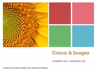
Colour & Images COMPSCI 345 / SOFTENG 350 Prepared by Safurah Abdul Jalil and Beryl Plimmer
Learning outcomes • Describe colour properties • Value • Hue • Saturation • Describe and identify colour schemes • Monochromatic • Analogous & Complimentary • Ready made colour schemes • Explain how colour is used for branding • Explain how images contribute to the colour scheme of a UI • Apply colour principles to a UI design
Colour • Colour has three distinct properties: • Value - lightness or darkness (luminance) • Hue - spectral colour name (blue, red..) • Saturation - brightness or dullness • Colours with the same brightness levels can appear lighter or darker than each other Light and dark coloursgrayscale Light and dark colours
Colour: Value • Value is defined as the lightness or darkness of a colour. • Value can be used to increase/decrease Contrast • Low contrast (high key) • Low contrast (low key) • High contrast • High contrast (inversed) • These examples, the light value recedes into the light background, and vice versa. • greater contrast makes the darker object more dominant. • Inverse is harder to read – should only be used for titles or emphasis Light and dark colours
Value • Create Movement • Objects of the same value create a static design with all objects equal in visual importance. • varying values gives a more dynamic appearance and creates a 'pecking order'. Some stand out while others recede. • Highest contrast is most important • Mix elements of different values to add visual movement to your design or to create a hierarchy of importance.
Colour: Hue • Colours at the lower end of the spectrum (blues) are more comfortable to look at • Based on vector value moving from 0 to 360 degrees on a colour wheel http://www.wou.edu/las/physci/ch462/tmcolours.htm http://realcolourwheel.com/
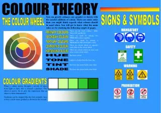
Colour wheel • The 12 part colour wheel (Johannes Itten) is based on the three primarycolours: • Red • Yellow • Blue • Between the three primaries are the secondary colours: • Green • Orange • Violet (They are mixtures of the two primaries they sit between). • The tertiary colours fall between each primary and secondary. For example: • between yellow and orange is yellow orange • between blue and violet is blue violet • …and so on. http://inventoropinion.blogspot.com/2009/05/i-want-to-invent-something-step-9.html http://www.johnlovett.com/colour.htm
Colour: Saturation • All the colours at the top of the images below called saturated colours. They contain no black, no white and none of their complimentary or opposite colour. • Intensity of colour in percentage scale: 100 percent is pure colour, 0 percent is black, white or gray http://www.xaraxone.com/webxealot/workbook40/page_5.htm
Colour: Saturation • Highly saturated, or pure, colours • E.g. brilliant yellows, reds, and greens, … • Advantages: • Evoke energy, vividness, brightness, and warmth. • They are daring; they have character. • Disadvantages: • When overused, they can tire the eyes. • Most UI designers use them sparingly. • Muted colours, either dark or light (tones or tints, respectively), make up the bulk of most colour palettes.
The green-and-blue Zen Garden design above gets away with two saturated colours by using white borders, white text, and dark halos to separate the green and blue. Even so, you probably wouldn't want to stare at that green all day long in a desktop application. PureBlue with black font…. Not so good!
Computer colour pickers • Windows colour picker • As you move the cursor around watch the rgb values changing • White 255,255,255 • Black 0,0,0 • Red 255,0,0 • Note the transparency • White background adding white • Black background adding black
Colour Schemes: Monochromatic • Monochromatic • This colour scheme involves the use of only one hue. The hue can vary in value, and black or white may be added to create various shades or tints. • Monochromatic + White • Many interfaces are white background and monochromatic elements
Colour Schemes: Monochromatic • Primary colour: blue monochrome • Secondary colour: green monochrome
Monochrome and White • Many interfaces are white background and monochromatic elements
Colour Schemes: Analogous & Complimentary • Analogous • Colours that are adjacent on the colour wheel. • The hues may vary in value. • The colour scheme for this example is analogous, with the colours varying only slightly from each other. • Analogous colour schemes look harmonious • Complimentary • colours that are located opposite on the colour wheel such as red and green, yellow and purple, or orange and blue (as per this example). • Complementary colours produce an exciting, dynamic pattern. http://www.richardancheta.com/html/decoration/STAIR-FAUX-FINISH-PAINTING-DECORATION/stair-faux-finish-painting-decoration.htm http://www.digitalscrapbooking.co.za/modules.php?name=News&file=article&sid=11 http://www.usask.ca/education/coursework/skaalid/theory/cgdt/colour.htm
Colour Discord • Monochromatic, analogous, complementary or triadic colour schemes are harmonious • some colour schemes are dissonant. • Discordant colours are visually disturbing - we say they clash. • Colours that are widely separated on the colour wheel (but not complementary or triadic) are discordant. • Discordant colours can be eye-catching and are often used as attention-getting devices in advertising. BUY ME!
Making a Colour scheme • Quite a number of tools have predefined colour schemes • Companies often have an existing colour scheme (look at logos, stationary, brochures)
Colour scheme: Branding • Colour is a crucial element of a brand identity. • Have a look at the image colours on one of these websites
Colour Scheme & Images: • Images are made up of colours • the colours of images you choose can reflect upon the colour scheme of your interface. • Basing colour schemes around photos is a also great technique. http://vltoday.blogspot.com/
Colour contrast • Contrast sensitivity decreases significantly with age • Contrast • Because black and white have the highest contrast • Luminance (black and white) contrast is more significant than colour contrast • One way easy to check your contrast to save an image as grayscale
Summary • Colour is a fundamental element of aesthetics • High contrast is important for readability • Monotone colour schemes are the easiest to ‘get right’ • More complex colour schemes can be ‘borrowed’ from colour palettes or company branding • Images are a part of the colour scheme
Learning outcomes • The colour properties • V.. • H.. • S… • Colour schemes • M… • A… & C… • Colour and branding • Images and the colour scheme of a UI • Design a UI colour scheme (in your assignment)
Reference • http://daphne.palomar.edu/design/Default.htm • http://www.leonardo.info/isast/articles/behrens.html • http://www.digital-web.com/articles/principles_of_design/ • http://www.seosmarty.com/brand-colour/ Prepared by Safurah Abdul Jalil and Beryl Plimmer