Download
1 / 42
430 likes | 796 Views
The Principles of Design. The Structures Behind Improved Print Design . The elements and principles of design are the building blocks used to create The elements of design can be thought of as the things that make up a layout

E N D
The Principles of Design The Structures Behind Improved Print Design
The elements and principles of design are the building blocks used to create • The elements of design can be thought of as the things that make up a layout • Good or bad - all layouts will contain most of if not all, the seven elements of design ELEMENTS OF DESIGN
Line can be considered in two ways: • the linear marks made with a design toolor the edge created when two shapes meet Elements of Design: the line
A shape is a self contained defined area of geometric or organic form • A positive shape in a design automatically creates a negative shape (aka white space) Elements of design: SHAPE
All lines have direction - Horizontal, Vertical or Oblique. • Horizontal suggests calmness, stability and tranquillity. • Vertical gives a feeling of balance, formality and alertness • Oblique suggests movement and action Elements of Design: Direction
Size is simply the relationship of the area occupied by one shape to that of another • Size can denote importance ELEMENTS OF DESIGN: SIZE
Texture is perceived surface quality • Print design largely uses implied texture (the surface of an object looks like it feels. The texture may look rough, fizzy, gritty, but cannot actually be felt) ELEMENTS OF DESIGN: TEXTURE
aka swatches (in InDesign) • Considered to be the most expressive element • Can create illusionof depth • Can draw attention to a particular part • Increases visual appeal • Complementarycolours help create contrast • Monochromatic colours are tints and shades of the same colour • Warm colours: reds, yellows, oranges • Cool colours: blues, greens, and purples ELEMENTS OF DESIGN: COLOUR
aka tone • Value is lightness or darkness of a colour • Add black to a pure colour to create a shade • Add white to a pure colour to create a tint • Value gives objects depth and perception Elements of Design: Value
The 3fs (FFF) • Form Follows Function • (what it looks like is not as important as the job it is supposed to accomplish) • A layout should help NOT hinder the message • It should be transparent in nature (ie. your viewer should not be remarking on the layout, but rather focusing on the content) THE #1 RULE OF PRINT DESIGN
The Principles of design can be thought of as what we do to the elements of design • How we apply the Principles of design determines how successful we are in creating layout Principles of Design
Balance in design is similar to balance in physics • A large shape close to the center can be balanced by a small shape close to the edge • A large light toned shape will be balanced by a small dark toned shape (as the darker the shape the heavier it appears to be) PRINCIPLES OF DESIGN: BALANCE
Gradation of size and direction produce linear perspective. • Gradation of colour from warm to cool and tone from dark to light produce aerial perspective. • Gradation can add interest and movement to a shape. A gradation from dark to light will cause the eye to move along a shape. Principles of Design: Gradation
Where else have you seen gradation used today to present information to you? A Pause forGradation
Dominance gives a layout interest, counteracting confusion and monotony • Dominance can be applied to one or more of the elements to give emphasis PRINCIPLES OF DESIGN: DOMINANCE
Nothing should be paced on the page arbitrarily • Every element should have some visual connection with another element on the page • Creates a sophisticated look Principles of Design: ALIGNMENT
Repetition with variation is interesting • without variation repetition can become monotonous Principles of design: Repetition
Items relating to each other should be grouped close together • Items in close proximity become one visual unit instead of several separate items • Helps organize information, reduce clutter, and give structure Principles of Design: PROXIMITY
Contrast is the juxtaposition of opposing elements e.g.. opposite colours on the colour wheel - red / green, blue / orange etc. Contrast in tone or value - light / dark. Contrast in direction - horizontal / vertical • The major contrast in a layout should be located at the center of interest • Too much contrast scattered throughout a layout can destroy unity and make a work difficult to look at. Principles of design: contrast
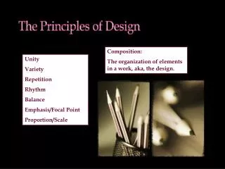
Unity is staying on the story, telling only one thing at a time • Unity is staying in style throughout the design • It helps provide clear and complete communication Principles of Design: Unity
A PAUSE FOR UNITY • Where else have you seen unity used today to present information to you?
TheEND shaun_perry@bwdsb.on.ca