Download
1 / 31
310 likes | 338 Views
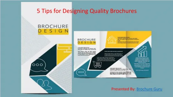
Learn how to create effective brochures with a long lifespan that can engage multiple audiences. This guide covers brochure layout, design, font, content, usability, and production.

E N D
brochure genre • Long life span (frequently used for several years) • Multiple and varied audiences • Audience must be persuaded to pick up and read
components of brochure • layout • design • font • content • usability • production
brochure layout Determine layout and order of panels based on content and audience. Create a mockup of folds and number panels on inside and out outside panels 3 6 1 back front inside panels 2 4 5
individual panel layout • Front panel • Provide clue to brochure’s topic • Develop a design that makes reader open and read info • Incorporate a meaningful graphic or illustration that coordinates with the text (visual clues to topic)
individual panel layout • Back panel • Include contact information • Contact names, addresses, phone numbers, email, and websites • Or function as a mailer • Inside panels • Carefully consider sequence of information
brochure design Incorporating four design principles into your brochure will help organize the information and make the brochure visually appealing: • proximity • contrast • alignment • repetition
proximity • Begin by taking inventory of the different elements and information you will need to include and organizing like information together. • Include descriptive headings of those chunks of information.
contrast • Use the notion of contrast to emphasize difference and importance: • If information is different, visually show this difference with a different font, font size, value, color. • Bold important information such as headings
repetition Create repetition in your brochure by using the same: • Size and style bullets • Size and font headings • Thickness of lines • Design elements
alignment Use alignment to create a visual and intellectual connection among ALL elements. Every element (text, heading, image, lines should be horizontally or vertically aligned with something else on the page).
tone & image • Talk with client about the organization’s purpose, values, & image and about the desired tone of the brochure • Draw from both the Wysocki visual analysis and Barthes’ visual analysis to determine what fonts, colors, designs, & graphics illustrate this purpose, image, and tone • Test your choices with users to confirm image & tone
Wysocki’s visual analysis Look at the page itself • What are the elements? • What relationship is suggested by their arrangement? • How might the document change to better accommodate the specific audience, purpose, context?
Wysocki’s visual analysis Look at contents of page • What are the elements? • What relationship is suggested by their arrangement? • How might the document change to better accommodate the specific audience, purpose, context?
Wysocki’s visual analysis Look at what helps readers make connections among the pages of the document • What are the elements? • What relationship is suggested by their arrangement? • How might the document change to better accommodate the specific audience, purpose, context?
Wysocki’s visual analysis Look at what contains the page • What are the elements? • What relationship is suggested by their arrangement? • How might the document change to better accommodate the specific audience, purpose, context?
Barthes visual analysis • Linguistic message • Denoted text (Parmazi) • Connoted text (Italianicity) • Coded iconic message (Italianicity) • Uncoded iconic message (tomatoes, pasta, parmesan cheese) (similar to Wysocki’s elements on the page) • Anchorage—tells reader how to interpret image • Relay—complements image
font • Fonts fall into 2 primary categories: serifand sans serif. • Limiting your fonts to one from each category will create help emphasize important information and create visual contrast.
font • Serif fonts (such as times new roman, palatino, Garamond) are often best for body text in printed material. • Sans serif fonts (such as arial, verdana, century gothic, and avant guard) are useful for headings and online material.
font The font helps determine the tone for the brochure. Tone should fit audience and purpose of brochure. times new roman arial comic sans ms tempus Sans courier he_Terminal century gothic haettenschweiler
design decisions • These three frameworks should work together with information from client and users to inform every single element on the page—from color to organization to font to image to size and shape.
content • “Chunk” text into small blocks where like information is together • Ensure text delivers what headings promise • Create coherent panels • Confirm that information answers questions your audience will have
questions for client Brochure purpose • What is the purpose of the brochure (what do you hope to accomplish with the brochure?) • What information do you want to emphasize? (what is the most important piece of information for the readers?) • What additional information do you want to emphasize?
questions for client Reasons for redesign • What are the main reasons you would like the brochure redesigned? • What is the main problem(s) you hope to solve with the redesign? • Are there any specific requirements or aspects you want the final brochure to have?
questions for client perception & image • Describe how you would like the reader to perceive the brochure? (What tone or image should the brochure have?—formal, serious, playful, sophisticated, etc.) • Describe how you would like the reader to perceive the organization? • How would you like to differentiate Healthy Miami from other brochures? • Do you have a particular color scheme in mind for the brochure? • Do you have initial ideas about the design of the brochure?
questions for client Audience/users • Who is the targeted audience of the brochure? • What are important characteristics of this audience? • What should the brochure enable the audience to do? • Who might be appropriate participants for usability testing?
questions for client Production & Logistics • Does your budget (or printer) allow for color? • Do you want images on the brochure—do you have images we can use? • Will the brochure be mailed? If so, will it need an address panel or will it be mailed in an envelope? • How many brochures do you plan to distribute?
usability • Usability testing seeks out members of your audience and asks them to evaluate the brochure before it is widely distributed • Usability testing can help you confirm that the information is what the reader needs and wants • Usability can also indicate what information is missing or what layout is confusing
Designing thumbnails • Remember that invention (or play) is a key component to design. • Try sketching different page grids that accommodate all elements and achieve a coherent modularity. • Use Schriver’s heuristic to take inventory, consider, and organize all design elements • Thumbnails can help (scale for page or single table) • Fold a piece of paper into quarters • Sketch page layouts based on all principles, analyses, and heuristics—use readings for examples and ideas • Show where headings, images, columns, footers, all elements would be • Try different layouts in thumbnails
production • Use consistent and ample margins • Use 65 lb. paper stock to provide durable weight and prevent ink bleed through. (Typical writing paper is 20 – 24 lb.) • Paper color can replace spot color • Chose spot color carefully—especially if you include photos
parting tips • Avoid boxing information • Consider mailing options • Analyze existing brochures to gather ideas • Get audience input!