Download
1 / 16
160 likes | 205 Views
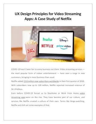
During COVID-19, video streaming apps have been the most popular entertainment source. An excellent user experience design is what keeps us hooked to these video streaming apps besides the content. Read more to know what are the UX design principles for video streaming apps via Netflix case study.

E N D
UX Design Principles for Video Streaming Apps: A Case Study of Netflix COVID-19 hasn’t been fair to every business out there. Video streaming services — the most popular form of indoor entertainment — have seen a surge in new customers, bringing in more business than usual. Netflix added 15.8 million new subscribers worldwide in their first quarter of 2020. With subscribers now up to 139 million, Netflix reported increased revenue of $4.19 billion. Even before COVID-19 forced us to StayHome or Work From Home, video streaming apps were on the rise. They have become part of our culture, and services like Netflix created a culture of their own. Terms like binge-watching, Netflix and chill are some examples of that.
– Netflix – Prime Video – Hulu – Disney+ What Keeps Us Hooked to These Services? Content, of course, is the main reason why we buy access to these services in the first place, but what happens once we have access to all that content? It can get overwhelming to search through hundreds of thousands of TV shows and movies without knowing which ones match your taste. Some people used to turn to listicles to get recommendations for what they should watch next. Streaming apps have eliminated a lot of friction between users discovering and watching content online. With a number of techniques to help you discover your kind of content, and effective User Experience Design that enables you to take the right actions — these services make it easier to stay hooked and keep you binge- ing. So, what qualifies as good UX design principles for video streaming apps?
Personalization Probably the most famous technique used by businesses to connect with their customers. It just works. Personalized content is far more likely to be consumed, compared to content that is listed randomly. Your YouTube homepage is the first and biggest example of this. Let’s see how the likes of Netflix implement UX personalization — an example: Netflix’s ‘Who’s Watching’ Page Personalization on Netflix starts from the get-go. Can you recall the first screen you see when you log into Netflix?
Netflix lets you set up separate profiles for different people who use a single account — keeping content recommendations separate and personal for each profile. Even though you might use the same account, your profile will always reflect your taste.
Everything you see after clicking on your thumbnail belongs to you. Personalized Previews and Thumbnails Netflix even personalizes artworks for their video thumbnails. They use a framework called contextual bandits to deliver the most appealing video thumbnail that can lead a user to take an action. A person who is more interested in romance, and a person who is more interested in comedy may see the same movie title but the thumbnails will highlight romance and comedy differently for each of them. So you and your friend might be seeing different previews for the same movie or TV show. Decrease Cognitive Load Imagine having to search for a show instead of stumbling upon one. How would you like that? You’ll notice how no streaming service has a big search bar on their home page. Instead, the page starts straight with a video, followed by a list of your favorite or previously watched shows.
All of this is done to decrease cognitive load on a user. When you see shows that you previously watched, you’re more likely to watch them again. This is also known as the Default Effect —where a user doesn’t have to think too much about choosing what action to take, and simply goes with the suggested or default action presented to them. An example:
If you don’t want to decide what to watch, you’re more likely to go with what you’ve already been watching. Percent Match Score on Netflix Remember seeing this green percentage text net to the videos on your home screen? It’s called a Percent Match Score. To show how much a movie or TV show matches your taste, Netflix uses Percent Match Score. Higher the percentage, better the match — which makes it easier for a user to decide what to watch.
Information Arch of Content Piece Profile Pages What kind of information do you find on a standard video streaming apps’ home page? For Netflix it’s a non-intrusive navigation bar that includes the Netflix Logo, nav items, and a search bar on top of a big video preview of a featured movie or TV show. Pay close attention to the first section. Netflix displays minimal information overplayed over the video – – A video title: small in size, non intrusive. – Play and More Info buttons: CTAs that Netflix wants you to take. – Audio on/off button: allowing you to view a video with/without audio support.
They only provide information that doesn’t make a user think too much and puts focus on the video being played.
Video Profile Page This is the landing page where you can find all the information about a video. Let’s see how Netflix and Amazon Prime Video handle this differently: Video Profile Page on Netflix:
The video just doesn’t stop playing. Even when you reach the landing page of a specific video, you’ll continue seeing the video preview in the first section itself. All the other information is displayed on the left. But if you want to go through the list of episodes, you have to go for an extra click on the ‘episodes’ button. From here on, you can scroll through seasons, episodes lists and choose whatever you want to watch. Amazon Prime Video handles the same scenario very differently. Here’s how:
There’s no video preview in the first section. Just a photo snapshot and the rest of the information on the left side (similar to Netflix).
On Amazon Prime Video you don’t have to go for an extra click to find the episode list (unlike Netflix). You can simply scroll down and see the whole list of episodes, and right below the video title there’s a drop down that lists all the seasons. Prime gives you access to all this in one page as soon as you arrive. Netflix vs Amazon Prime Video: Lets Compare the Two While Netflix has a more interactive, more visual landing page for its videos (because of the video preview), it also has room for more discovery, allowing users to choose differently in case they change their mind. Amazon Prime Video has a static image on top, with a quick way of accessing the episode list, and no content discovery options, no way to see trailers for the video you’re about to watch. Conclusion There’s no way of saying which of these UX design strategies works best, but the market for video streaming apps is still developing, and there’s a lot of potential for new, innovative startups that can carve out a niche (just look at Etsy). That’s probably one of the biggest shortcomings of big players like Netflix – they are
unable to cater to specific demands for video streaming – which gives an advantage to start ups. Source - https://www.netsolutions.com/insights/video-streaming-apps-ux-design/