How To Intelligently Apply Data Integration And Visual Analytics Tools
60 likes | 75 Views
Data in digits are always easier and clearer to look at and work on. The data allows you to spot the trends with nothing more than a quick peek. Where the aspect of analytics come from? Visual analytics is unique that involves statistical work, data mining, or other analytical work to visualize the data.<br><br>

How To Intelligently Apply Data Integration And Visual Analytics Tools
E N D
Presentation Transcript
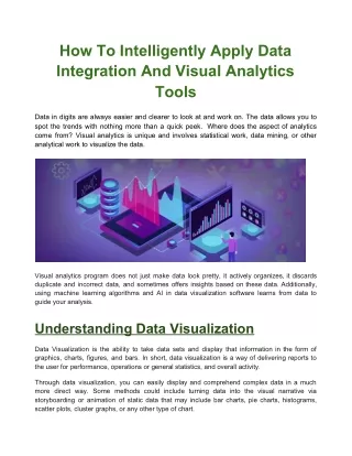
How To Intelligently Apply Data Integration And Visual Analytics Tools Data in digits are always easier and clearer to look at and work on. The data allows you to spot the trends with nothing more than a quick peek. Where does the aspect of analytics come from? Visual analytics is unique and involves statistical work, data mining, or other analytical work to visualize the data. Visual analytics program does not just make data look pretty, it actively organizes, it discards duplicate and incorrect data, and sometimes offers insights based on these data. Additionally, using machine learning algorithms and AI in data visualization software learns from data to guide your analysis. Understanding Data Visualization Data Visualization is the ability to take data sets and display that information in the form of graphics, charts, figures, and bars. In short, data visualization is a way of delivering reports to the user for performance, operations or general statistics, and overall activity. Through data visualization, you can easily display and comprehend complex data in a much more direct way. Some methods could include turning data into the visual narrative via storyboarding or animation of static data that may include bar charts, pie charts, histograms, scatter plots, cluster graphs, or any other type of chart.
Its data visualization needs differ based on the type of data you are analyzing. As aforementioned, data visualization is used for presenting any kind of data, from monthly revenue to lead generation to warehouse inventory levels. This is useful in gaining insights into any process that needs to be improved. Whether it is discovering the dipping of revenue or comparing marketing strategies, data visualization helps in simplifying your analysis. Read Also:– Best Ways to Boost Your Mobile App Development Some features of Data Visualization Dashboards Dashboards allow the data to represent visually through charts and graphs for specific data, constantly updating with the latest real-time information. Dashboards are great for at-a-glance or ad-hoc analysis when needed to quickly check data. One of the most used dashboards is real-time dashboards. Real-time dashboard updates its visualization at regular intervals. It also allows you to monitor the status of whatever data you are tracking, ability to notice or discover issues as they arise in real-time to address them quickly. Since a swiftly growing supply-chain faces many issues and fixing them quickly is a must. Thus a real-time dashboard reduces the number of setbacks, such as the warehouses with too many inventories or shipments arriving late. Other benefits of Real-time dashboards are monitoring KPIs, driving accountability, and saving employees time and money.
Collaboration Without a team, no project can be successful. Similarly, data visualization enables the data, and other analysis processes siloed to provide easy access to other users within the organization. With the help of this feature, you can allow multiple users to view and work with the same data. This lets you decide on the type of analysis to perform as a group. Moreover, the feature leverages the ability to share the analysis you made with other business users, add comments on different visualizations, and hold discussions in the visual analytical platform. Integration with Multiple Data Sources In order to visualize, data needs to be collected and stored from all the sources, which require analysis tools that can communicate with other data sourced to pull down the data and analyze it and then visualize them. The most common source of data sources that can be used by businesses is NoSQL, Hadoop, or a cloud service that are capable of holding millions of data points. Other than these, businesses can integrate with third-party software systems that can pull supplier, distribution, and inventory data from SCM software, customer and lead information from an RM, and employee data from an HR system. System integration is concerned with joining different components or subsystems as one large system, ensuring each subsystem functions as required. It also holds the ability to communicate and cooperate with other platforms, applications, and software. The integrating system consolidates data and makes the sales & marketing teams collaborate and coordinate with each other seamlessly. Understanding and Implementing Data Integration The system can only be integrated when the data is integrated from different sources stored, using appropriate technology. The process of retrieving is called data integration. Companies build data warehouses to store and retrieve aggregated data. This is extremely useful for the researchers for investigation and cooperation with the help of big data when merging with other companies. Integration of the data can be performed using several organizational levels given below.
Manual Integration of Data Manual integration allows the users to collaborate and use the interfaces or different sources of the web pages without viewing consolidated data. Data Integration based on Applications Businesses use data for building different kinds of software. On the other hand, for organizational-level processes, businesses need certain applications that can integrate data. Middleware Data Integration The data integration of an organizational level can easily transfer the data integrated from a particular application to a new layer of middleware. Virtual Integration The advantage of virtual integration is that it provides nil latency of data updates from different sources. However, it provides a uniform view where a user can access customer information transparently obtained from the systems. Physical Integration Implementing Physical Storage is where you create and store data from the sourced systems. The perfect example of common storage is a data warehouse. However, physical integration of data needs a system of its own to handle a huge amount of data. Many can benefit from the never-ending stream of information available such as companies, marketers, data scientists, and researchers. How can Integrated Data and Visualizations Benefit Companies can become advantageous from data integration and visualization by- ● Identifying the strengths, weaknesses, problems, and opportunities in the competitive market. Study customer behaviors and learn about the factors that can influence and attract potential customers. ●
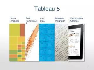
● Identifying strong & weak business areas to improve products and services and help businesses understand purchasing behavior for further business assistance. Immediate grasping and concluding of information to address the problems that can be encountered even before emergence. Sharing of the information for gaining more familiarity over products and services & knowledge on how everything works. ● ● In order to gain the best out of the data visualized, it is essential for businesses to use some of the best tools. Better Analysis with Data Visualization Tools The tools listed below can help you better identify the relevant data when needed. Tableau The big data analytical capabilities of Tableau offers strong solutions for users to create intelligent business reports. The user can view the data through different predefined charts and animated forms to visualize changes across multiple groups. Tableau enables users to perform ad-hoc analytics, the solution capable of predictive, descriptive, and analytical capabilities along with profit analysis that yield trend lines, forecasts, and predictions. Board Onboard, you can select from the wide list of gauges, data views, maps, charts, widgets, tables, and other data-aware objects for data representation. With the help of advanced charting and interactive maps, the user can analyze the gained spatial insights into their data. The advanced feature of the board includes heat maps, treemaps, waterfalls, bubble charts, and radar. Along with it, Board offers advanced analytical capabilities enabling users to build intuitive and interactive dashboards, analysis, or reports and an automated predictive modeling approach – Board Beam for accurate forecasting and scenario analysis. To Conclude –
Among the few data visualization tools are Spotfire, SAS Visual Analytics, and Power BI that provide a customizable dashboard to show real-time data. Data Integration and visualization not just gathers and cooperates data, it also promotes the creative idea and the way analysts and scientists work with data. Thus for a faster response, you can look for Visual Analytics Services. Source:Click Here


![5 Big Data Analytics tools [2020]](https://cdn5.slideserve.com/9947551/session-1-dt.jpg)