Download
1 / 4
40 likes | 41 Views
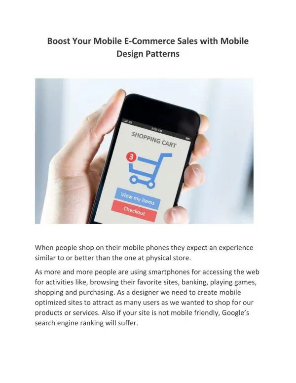
Unique featues in a mobile-friendly Magento e-commerce website for your new business which can help you increase sales and generate more leads.<br><br>Reference Link:https://www.perceptionsystem.com/blog/increase-mobile-magento-ecommerce-sales/<br>

E N D
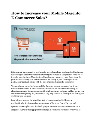
How to Increase your Mobile Magento E-Commerce Sales? E-Commerce has emerged to be a boon for several small and medium-sized businesses. Previously you needed to communicate with your customers and generate leads out to them for your business. Now, the trend has changed customers come flying towards your business while you as an entrepreneur are sitting in your drawing room and posting your products online with the help of a miracle named e-commerce! Yes, running an online business might be daunting on some occasions but if you understand the needs of your customers, develop an advanced understanding of changing consumer behaviors, constantly study consumer patterns, and know what your customers are expecting for you then it is very easy to excel in this digital marketing run world for your business. Smartphones account for more than 53% of e-commerce traffic. Having a mobile-friendly site has now become the need of the hour. One of the best and open-source PHP platforms for developing an e-commerce website in the market is Magento. Due to its rising popularity amongst e-commerce businesses’ who want to
develop a website many Magento development companies have been incorporated which provide Magento development services. Due to the rising mobile – traffic having enough visitors on your website is very challenging on the mobile front. Therefore, here are our 5 key takeaways that help modify your e-commerce website to make it a mobile-friendly site and boost your sales. ● Develop a Strong UI/UX Interface Developing an easy-to-use mobile website for your e-commerce business is very vital for the success of your e-commerce venture. Along with increasing your prospective customers,, it could also help you improve your rankings in the mobile search engine market. Appearing great is just one part of a strong UI and UX interface the other part is that it should work properly. Most often, navigation features are limited for a mobile website in comparison to a desktop, and it may sometimes happen that you may not be having the room to accumulate all tabs and pages which are present on the desktop version of your website. Your mobile website’s UI/UX experience should ensure that the most important pages of your website are easy to locate, clickable, and accessible free of any form of errors or misinformation. These practices will encourage the user to stay on your website for a longer period. ● Focus more on your Mobile Audience Designing, developing, and marketing your website specifically in alignment with your mobile audience could be a very helpful tactic in increasing your mobile e-commerce sales. More importantly, you also need to create separate strategies for your desktop and mobile websites. A mobile website strategy that includes creating specific landing pages for mobile users for increasing engagement, social media conversations with your business community through social media platforms like Facebook, Instagram, Twitter, Linkedin, Whatsapp, and many more, and running a social media advertising campaigns could prove to be cost-friendly and efficient for specifically focusing on your mobile audience.
● Offer Free Deliveries Delivering a product is a very significant part of your online mobile store which could leave an ever-lasting impression about your business to your current and prospective customers. Regardless of the product, always make sure that you provide your customers with a free – shipping option whenever they buy anything from your online store. A free shipping option can boost your sales, attract more customers to your online mobile store, and give you an added advantage over your business competitors’ mobile websites. According to research, most customers add more items to their mobile shopping cart when they see a free delivery option available on the website. ● Interpret Market Trends Whenever there is a festival like Black Friday, Christmas, New Year, Easter, or Eid, mobile shopping traffic grows faster than normal as more people want to share presents with their near and dear ones. When stores are closed, mobile shopping on the website increased more than three times last year. Several other trends like this in the market could attract more shoppers to your business when several events are happening if your website is truly optimized and technically ready to serve them. ● Simplify the Checkout Process If you want to be a successful Magento-run e-commerce website, you need to make sure that the digital shopping experience of your customers is so hassle-free that even for one occasion your customers cannot think of abandoning their shopping carts after adding a product to it. On a lot of occasions, it has been seen that customers have left their shopping carts due to complex and time-consuming checkout processes. Make sure that this is not the situation on your mobile website as it will make some customers never return to your business for making a purchase. Using a 1 step checkout page or integrating 6 pages into
1 page for smooth checkout of your customers will ensure that no cart is abandoned on your businesses’ Magento mobile website. Some Final Words… Optimizing your business website in alignment with your customer experience could sometimes be very difficult. But, don’t worry we at Perception Systems are here to help! Get in touch with our expert Magento team for end-to-end guidance in developing your mobile-friendly Magento website for increasing sales. For further information about our Magento web development services email your business idea to our expert team at enquiry@perceptionsystem.com and we shall look after your Magento development requirements. Reference Link: https://www.perceptionsystem.com/blog/increase-mobile-magento-ecommerce-sales/