Download
1 / 4
0 likes | 19 Views
The term "mobile-first" refers to the approach of designing and developing digital content with the mobile user experience as the primary focus. This shift in mindset stems from the exponential growth of mobile device usage, surpassing traditional desktop access. The digital environment undergoes constant evolution, and a clear trend in 2023 is the dominance of mobile.

E N D
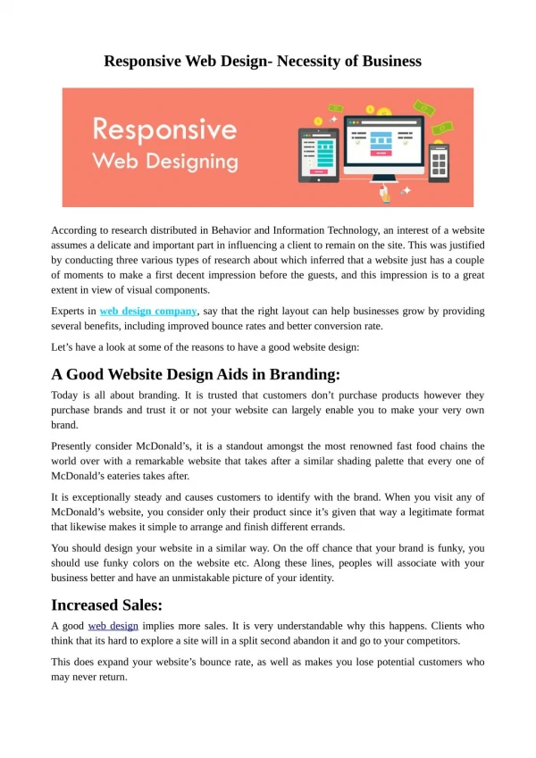
Role of Responsive Design in the Mobile-First Era for Business Success In today's digital age, the mobile-first revolution has become more than just a trend—it's a fundamental shift that businesses can't afford to ignore. With the majority of internet users accessing content on mobile devices, the need for responsive design has never been more critical. This article delves into the significance of responsive design in the mobile-first era and explores its direct correlation to improved user engagement and business growth. Understanding the Mobile-First Era The term "mobile-first" refers to the approach of designing and developing digital content with the mobile user experience as the primary focus. This shift in mindset stems from the exponential growth of mobile device usage, surpassing traditional desktop access. The digital environment undergoes constant evolution, and a clear trend in 2023 is the dominance of mobile. Your business's digital presence must be as adaptable as your users' devices. Responsive design is the linchpin of mobile-first success. - Karen McGrane The Rise of Responsive Design Responsive design is the cornerstone of the mobile-first strategy. It involves creating websites and applications that adapt seamlessly to various screen sizes and resolutions, ensuring a consistent and user-friendly experience across devices. This adaptability is crucial as users switch between smartphones, tablets, and desktops throughout their day. Benefits of Responsive Design in Business Growth
1. Enhanced User Experience and Engagement One of the primary benefits of responsive design is the enhancement of user experience (UX). When a website or application is optimized for mobile devices, users can navigate and consume content effortlessly. Responsive design eliminates the need for users to pinch, zoom, or scroll excessively, resulting in a more enjoyable and efficient interaction. 2. Boosting Search Engine Rankings In the mobile-first era, search engines like Google prioritize mobile-friendly websites in their rankings. Responsive design contributes significantly to search engine optimization (SEO) by providing a consistent URL and content structure across all devices. This not only improves visibility but also helps businesses maintain a cohesive online presence. 3. Reducing Bounce Rates and Increasing Conversions
Source: dev.to Desktops outpace mobile devices in webpage loading speed, with one study revealing desktops to be more than twice as fast. Despite this, the convenience of mobile browsing prevails, as studies found mobile devices contribute to nearly three-fifths of site visits and almost half of total online time. However, responsive design significantly cuts bounce rates, with studies indicating an average 40% decrease on mobile-optimized sites. Unoptimized sites increase the likelihood of user abandonment, while responsive design fosters engagement, driving higher conversions and business growth. 4. Adapting to Evolving Technology As technology continues to advance, new devices with varying screen sizes and capabilities emerge. Responsive design future-proofs businesses by allowing them to adapt quickly to these changes. Whether it's a foldable phone, a larger tablet, or a device with a unique aspect ratio, a responsive design ensures that your digital assets remain accessible and functional. Challenges and Solutions in Responsive Design Implementation While the benefits of responsive design are clear, businesses may face challenges during implementation. These can include navigation complexities, image optimization, and
ensuring consistent performance across different devices. Yet, careful planning, comprehensive testing, and continuous optimization can overcome these challenges. Conclusion: Embracing the Mobile-First Imperative In conclusion, the mobile-first revolution stands not only as a significant shift in user behavior but as a transformative force shaping the digital landscape. Responsive design emerges as the primary factor, enabling businesses to not just adapt but thrive in this era by delivering seamless experiences across a spectrum of devices. Prioritizing user experience becomes the compass guiding businesses through the challenges of the mobile- first era, positioning them for sustained success and growth. Collaboration with partners like Neointeraction Design elevates this journey, guaranteeing the seamless integration of exceptional UI UX design services into the comprehensive product design process, ultimately fostering the triumph of business success. To know more: https://www.neointeraction.com/blogs/role-of-responsive-design- in-the-mobile-first-era-for-business-success-