Download
1 / 3
30 likes | 37 Views
If you want a responsive Web Design Penrith then visit the Make My Website as they have a team of well-trained and qualified web designers Melbourne offers. <br>

E N D
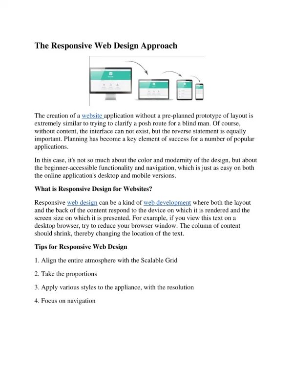
The guide for a responsive Web Design for the year 2021 What is responsive web design? With responsive Web Design Penrith, you create a website that responds to the user’s device by adjusting the functionality and layout to display the content legibly and aesthetically, no matter the size and proportion of their viewing screen. The responsive site is not only about simply creating a “lite” version of the site for smaller devices like mobile phones. Also, many people have now shifted to mobile as their primary web access and expect the mobile site to be completely functional and seamless. When initially the mobiles began to access the websites, it was never guaranteed that people would actually be able to read the webpage on their mobile phones. The web design of a particular website might have tiny texts, might be difficult to navigate, or redirect only to limited mobile sites without having the feature you have been looking for. Nowadays, it is very common to have full access to websites on all types of mobile devices. The question arises here what made this possible? The answer to this is Responsive web design. The website that adjusts itself and reflow to be effortlessly usable and legible across devices needs intentional and thoughtful design. Also, this process has become incredibly easy with the launch of newer techniques in Cascading Style Sheets and no-code programs. However, instead of addressing the cross-device functionality as an afterthought, a skilled web designer should have planned for this throughout their process. The responsive design is one of the most critical elements of your website’s success in today's multi-device world.
Key responsive web design terms ●Fluid grids A grid is an important element that comprises columns and rows where the content can be added. The fluid grid is designed to be set to auto-fit or manually adjust across the breakpoints. ●Flexible images These are the responsive images that are designed to be served to the browser in various sizes that depend upon the size of the image in the layout and the resolution of the user interface. To ensure that the images are responsive, you can prevent pixelated images that are either too small or too large and might slow down the website. ●Breakpoints Breakpoints are the point in the orientation or in the screen size where the website is triggered to adjust its layout. ●Media queries The specific CSS function is designed to receive the information regarding size from the user's device so that the breakpoints can be triggered. ●Viewport It is the visible area on the device of the user where content can be seen. ●Overflow These elements in your web design are outside the viewport or are too large in size as per their container.
●Fixed sizing It refers to the sizing that remains the same whether the other factors affect your website or layout. The fixed size is the only thing a-that is not responsive. ●Relative sizing These are the sizes that change in response to your layout's other elements or as per the user’s device. The relative sizing is responsive. ●Mobile-first This is a design strategy of designing those elements first that are most restricted mobile designs before design for larger devices. The intention of the Web Designers Melbourne here is to push designers to prioritize accessible and successful mobile designs. ●Hamburger menu It is a menu button that is designed to enable the drop-down function for the links of the navbar that helps save space in the restricted designs. It consists of stacked lines that resemble a hamburger. If you want a responsive Web Design Penrith then visit the Make My Website as they have a team of well-trained and qualified web designers Melbourne offers. Visit: https://makemywebsite996097106.wordpress.com/2021/09/16/the-guide-for-a- responsive-web-design-for-the-year-2021/