Responsive Web Design for Universal Access
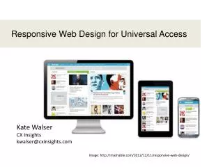
Responsive Web Design for Universal Access. Kate Walser CX Insights kwalser@cxinsights.com. Image: http://mashable.com/2012/12/11/responsive-web-design/. 16 years in usability, accessibility and user experience design Member of TEITAC, or Section 508 / Section 255 refresh committee

Responsive Web Design for Universal Access
E N D
Presentation Transcript
Responsive Web Design for Universal Access Kate Walser CX Insights kwalser@cxinsights.com Image: http://mashable.com/2012/12/11/responsive-web-design/
16 years in usability, accessibility and user experience design Member of TEITAC, or Section 508 / Section 255 refresh committee Principal consultant at CX Insights, the user experience division of Tritus Technologies, Inc. Originally from upstate NY, now call Fairfax, VA (near DC) home Design websites, applications to be responsive Speaker – Kate Walser
Slides http://www.cxinsights.com/print http://www.cxinsights.com/presentations/accessu/responsive-web-design.html http://www.slideshare.net/kwalser
Two sites – Server checks browser / device Present that site Original mobile strategyTwo sites
ResponsiveOne site, Multiple views Photo credit: http://sixrevisions.com/mobile/methods-mobile-websites/
Phone, kindle, tablet, desktop views of TheNextWeb At a glimpse Photo credit: Media Queries Gallery, http://mediaqueri.es/
http://www.texas.gov/Landscape – tablet (iPad, Samsung Galaxy Tab)
http://www.texas.gov/Smart phone (Galaxy III, iPhone, Android)
The goals of responsive web design are to use the same content for different devices but trim and mold the content and features to best fit the device. Goals
Fluid grid (adjustable widths) e.g., column width = 45% (vs. 300px) Flexible images (scalable) e.g., image size is 24em wide by 12em high (vs. 248px x 124px) for desktop viewing, but just 12em x 6em for mobile Media queries (check device / browser width) e.g., if the device width (or the max-width of the viewable area) is 480px wide, then show this version 3 main parts
Wireframes show web page elements and how they look, where they go on different devices “Media Queries,” by Juan Arregin Source: http://dribbble.com/shots/185755-Media-Queries 1. Decide what to show and how to order it
Option A: Link to a CSS file for that max-width <link rel="stylesheet" type="text/css" media="screen and (max-width:480px)" href="minimal.css" /> Option B: As lines in CSS file @media (max-width: 60em) {/* styles for 60em - less*/} @media (max-width: 30em) {/* styles for 30em - less*/} @media only screen and (min-width:321px) and (max-width:480px) {/* Include rules here */} Option C: As import statement in CSS file @import url("minimal.css”) screen and max-width:480px 2. Check maximum (device) width
@media only screen and (max-width: 767px) { /* Mobile */ p, ul, li {line-height: 1.5} .buttons {padding:10px 30px;margin:10px;display:block;} .decoration {display:none;} } @media only screen and (min-width: 768px) { /* Desktop and landscape tablet */ p, ul, li {line-height: 1.3} .buttons {padding:5px;margin:5px;display:inline-block} .decoration {display:inline;width:1.5em;height:1em;} } 3. Use fluid layouts, flexible images (i.e., em or % vs. px)
Looking at the code http://www.austintexas.gov
Another example http://stuffandnonsense.co.uk/
Updated http://stuffandnonsense.co.uk/
Challenge 2“Noise,” “fluff” hinder screen readers http://www.nhl.com/
Responsive design often hides decorations .decoration {display:none} Use for both screen readers and responsive version <link rel="stylesheet" type="text/css" media="speech"href="minimal.css" /> <link rel="stylesheet" type="text/css" media="screen and (max-width:480px)"href="minimal.css" /> Improve readability for all devices
Multiple navigation elements precede the content on the WorldWildlife.org website Challenge 3Many tab stops before content World Wildlife FundDesktop version
Since the AustinTexas.gov uses a responsive design, at narrower widths, the submenus are hidden, making it easier for users to get to main section options or content. Collapsed navigation can* mean fewer tab stops to reach content *The WorldWildlife.org website doesn’t update its CSS to use display:none to “hide” the collapsed options as tab stops and from screen readers.
With drop-down and complex menus, it can be hard to find option you need. Menu doesn’t stay open to let users use ctrl+f to find nav. Challenge 4Finding needed option in complex menus
The alternative presentation often used for mobile navigation drawers displays all or top navigation options in a list. Users can then use ctrl+F to find the option they need more easily. Mobile nav drawers can show all options with ability to search (ctrl+f)
Images designed at one resolution degrade as users, especially those with screen magnifiers, increase their screen magnification. Challenge 5Images that degrade on zoom Images: http://coding.smashingmagazine.com/2012/01/16/resolution-independence-with-svg/
Scalable vector graphics used for responsive web designs also improve screen usage for those with visual impairments. Use responsive, scalable images
Visit the AustinTexas.gov website on a mobile device How does it compare to the desktop version? What works? What could be improved? Group Exercise (15 minutes)Take a look – AustinTexas.gov
AustinTexas.gov: How does it compare to the desktop version? What works?
New or existing? Young or old? Mix? Devices? Consider users
Google Analytics reports include Mobile reports. Check the Devices section, and drill down by screen resolution or browser as a secondary dimension to see what users are using to visit your site. 2. Pick devices
Sample device widths http://www.metaltoad.com/blog/simple-device-diagram-responsive-design-planning
ItalioKitchen.com’s website hides the gallery of different dishes when a user visits from a mobile site. Instead the menu, locations, news, and specials take center stage. Example: italiokitchen.com
1 5. Prioritize features & content 2 4 3
6. See what’s hard to touch http://www.fairfaxcounty.gov/library/
Quick sketches can be enough to create the responsive design. 7. Decide if / how layout changes
8. Convert widths to % (or ems)Fluid width = Desired width / container width .container { width: 660px; } section { float: left; margin: 10px; width: 420px; } .container { max-width: 660px; } section { float: left; margin: 1.51515151%; /* 10px ÷ 660px = .01515151 */ width: 63.63636363%; /* 420px ÷ 660px = .63636363 */ } Source: http://learn.shayhowe.com/advanced-html-css/responsive-web-design
9. Adjust widths, positioning EXAMPLE
Group Exercise (15 minutes)Texas Health & Human Services Commissionhttp://www.hhsc.state.tx.us/index.shtml