Download
1 / 6
60 likes | 172 Views
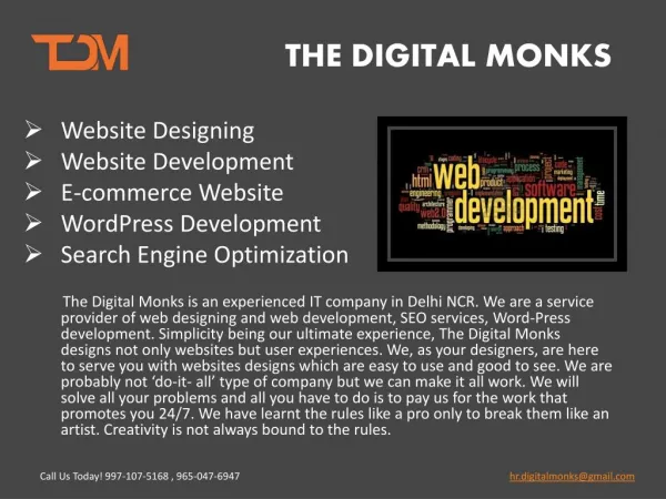
Mobile designs are the fastest growing strategy on the web. Shouldn’t your website be one of those websites that are compatible with your smart phone? If you’re ready to join the mobile revolution, we at Red Spot Design are ready to help you make it happen, quickly, simply and cost effectively. We work hard and diligently to keep up with the latest technology, so we are constantly monitoring our software to be sure it works well with the latest and most up-to-date platforms. The best part of all is that your customers will see your website exactly as you intended. <br><br>Visit www.redspotdesign.com for more details. <br>

E N D
How to Achieve An Attractive Mobile / Responsive Website Design
Red Spot Design is comprised of a team of web-based experts headquartered in the Dallas/Fort Worth Metropolis. Based on our years of experience supporting clients around the globe, coupled with our continuous training and employee education, we know which areas to focus on and which web design aspects need the greatest attention. This is what has earned us our reputation for quality results.
When was the last time you looked at your website from your smart phone? You might be surprised to learn that the layout, the graphics and the design are not showing up correctly because desktop websites were not created to be seen on a mobile device. Websites that have not been designed with a smart phone in mind, are usually not compatible with a mobile device and will in all likelihood appear smaller than you anticipated, contain much larger images and be hard to read.
Make Your Website Accessible Via Your Smart Phone with Responsive Web Design What you may ask is the difference between having a desktop website and a mobile website? The answer is simple. When a visitor tries to access your website on their smart phone, it has to be user-friendly with the mobile device or it’s going to look distorted. If your web design is not optimized and laid out correctly, the viewer may see the wrong content or worse they may view what appears to be a disorganized arrangement of words and design, which of course can’t be good for business.
Mobile Web Designs Are Growing in Leaps and Bounds Each year, over one million cell phones are replaced and traded in for a smart phone, which means millions upon millions of people are using their smart phones to access websites. In fact, more people are now using their smart phones versus their desktops to access the web, so a mobile web design gives you greater reach, more flexibility, and the opportunity to make contact with those looking for your services and products. Remember, if a visitor accesses your website from their mobile device and it’s not compatible, the odds are you will lose that potential customer.
Contact Red Spot Design Today Red Spot Design3010 LBJ Freeway, Suite 1200Dallas, TX 75234 Phone: 214-432-1608 888-636-1344 Visit http://www.redspotdesign.com for more details.


![Intro to Adaptive Web Design [ChaDev Lunch]](https://cdn4.slideserve.com/7566148/intro-to-adaptive-web-design-dt.jpg)