
Fed's Evaluation
E N D
Presentation Transcript
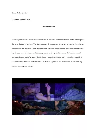
Name: Fedor Spektor Candidate number: 2021 Critical Evaluation This essay consists of a critical evaluation of our music video and also our social media campaign for the artist that we have made ‘The Blue’. Our overall campaign strategy was to present the artists as independent and mysterious with the separation between the girl and the boy. We have constantly kept the gender status to general stereotypes such as the guitarist wearing clothes that would be considered more ‘manly’ whereas the girl has got more jewellery on and more makeup as well. In addition to this, there are a lot of close-up shots of the girls face and mid-section as well showing another stereotypical feature.
Throughout the music campaign we promoted a duo of a male and female artist and we had subverted the classic stereotype of Laura Mulvey’s male gaze theory. Throughout both our music video and social media we have made the girl follow Laura Maulvey’s male gaze theory. In order to do this, we had used a variety of different functions that we have learnt over the last years, Blue was wearing a close to corset top and we had her lying down on the bed. Also, in order to reinforce this, we had also given her the majority of the screen time. Furthermore, in order to keep the male gaze Blue was constantly have either a mid-shot or a bird’s eye view on the bed. This created a classic stereotypical view on Blue, and this contradicts the traditional view on Luke as he was also breaking stereotypes with his painted nails, short hair and earrings. In addition to this, we have used Richard Dyers star theory since we can clearly see that Blue does not fully match the stereotypical girl that matches the strong and sassier girl. Blue we can see from her facial features and personality in the music video along with the behind-the-scenes tiktoks and Instagram videos that she is a lot goofier. We, however, can link this back to Richard’s theory since we can see that he says that celebrities are like commodities of their label. In our case this is true since we had wanted to make sure that Blue is a lot more unreadable in order to make sure that the message that we get across her and Luke is that unknown message of what do they mean to each other? This is done in order to make sure that the audience find them a lot more engaging. Since we had also used a door set up that was both Blue and Luke back-to-back and this reference was the same from ‘Frozen’ and this could suggest that they are more like siblings rather than lovers or anything else to each other and this would increase the ability to market them as well since people would be intrigued. In addition to this, it would make sure that there was a clear distinction between both Blue and Luke as well. This is crucial to constantly have some barrier between the two of them. We also did this in the editing since we can see in one of the set ups, Luke is playing the guitar with one background, yet Blue is singing with a completely different background whilst they are close to each other. This continuity allows for more freedom to post different teasers and other photos and behind the scenes videos on the social media that we have made.
My intention across my campaign was to target the age range of 15–25-year-olds. This is important since we want to make sure that the theme of band remained constant and was not misunderstood by anyone looking to buy it. Throughout our social media and our music video we had used the same colour palette and stereotypes. This links to Richard Dyer’s theory because we have made a start concept in order to attract more people. We have not left their natural persona as such compared to someone like Ed Sheeran. This is because we need them to once again have the idea that they are closer to siblings than dating but we need to make sure that the audience does not know what they are since it leaves them more of a mystery that will leave people thinking. Throughout the digipak we have used yellow and blue keeping the theme of yellow for Blue and blue for Luke. We want the more modern and younger audience to be able to relate and feel relaxed whilst listening to them. Furthermore, these colours are quite bright and also gets the attention on the digipak if people walk past and see it in a store for example. In addition to this, we have referred to Maslow’s Hierarchy of needs. We want to make the audience feel esteem, status and feel a part of a safe and comfortable social group as well. In order to make them feel like they are a part of a group our social media (TikTok) is using lots of quirky behind the scenes and hashtags in order to make them feel a part of a
community. This is very important since our aim is to make everyone in the target audience feel welcome and safe. Branding is also done through images that we had presented on our website. We had a clear unique font that matched the band and was displayed along all of our social media as well that we are branding, and this would allow for people to then buy merchandise and then again create a bigger brand as people will feel more inclusive. Finally, the band engages with the audience as we offered a live zoom call on our social media with the band, and this would allow for the audience to interact with the band and feel like they are a part of the creative process as well since it would allow for potential new album suggestions or other reviews and comments. Our community is very important to look at, so our branding allows for our target audience to voice their opinion and join in on the community. We have managed to engage with the audience because at our demographic age range of our target audience, we have not only put in clothing that everyone can relate to, but also show the audience that they are all included since the guitarist has got painted nails and a more retro-modern look, whereas the girl is wearing a black top and does not really have anything that is out of the ordinary or that is flashy. Furthermore, our slow-paced editing allows for an easy visual viewing experience and is a traditional convention of an indie music video. This once again allows all age and genders to feel included. Interestingly, all our social media and website follow the same colour scheme and easability that all are user friendly in order to engage with the audience as well. In addition to all of this, our product engages with the audience using the simplistic design. Since we had used a bunk bed setup in the majority of the screen of the screen time, it would allow for everyone to see that it is okay to still be around the age of 18-19 years old and still have these ‘childish’ objects today. This would also pass on the message to the audience that they are a band that is not worried about what people think about them and they are a lot goofier and quirkier, and they are easier to engage with.
For our artist I had researched how to stand out from the current crowd and what separates artists from record label to record label and artist to artist. It is very important to see what record labels are looking for. In example, the artist ‘Post Malone’ was an ordinary looking bloke who has nothing special about him. However, the record label has taken that along with his face tattoo’s and made him into this star persona and someone who is presented as quirky yet mysterious. We can see this from his digipak covers as well for his album ‘Hollywood’s Bleeding’ where he is more of a dark knight and is representing the classical masculine stereotypes. They also show him as a fun character on and off camera as well. This includes behind the scenes funny videos on social media. This influenced me to make sure that we can see our guitarist and our singer are not only unique and stand out from other people in their age group but also more importantly other artists as well in order to make sure that they are people that the target audience can relate to. This is further forwarded in our social media and digipak since we can see that they are both not only independent people whose relationship status between each other we do not know, but also, they are quirky and can be down to earth and fun as well since they are not serious all of the time as we had showed on the social media TikTok. We want the audience to be able to not only relate but also feel comfortable and enjoy what they see and hear. This could mean boys relating to having short hair and being okay with painting their nails or wearing exotic colours as well or girls having more of a plain view on the costume side. In terms of conventions being challenged we moved away from the traditional stereotypical male clothing and looks, since Luke had painted nails, short hair, earrings and also wore more standing out colours. To add to this, in our social media campaign we had used hashtags on both TikTok and Instagram in order to engage more people and if people liked what they saw or heard they can then spread the word around quicker. For the digipak we had used a lot of different conventions such as track listing, name of the band and title of the album. This once again gives people the opportunity to understand what the album is about. From the colours they could see that its less futuristic and more of an indie GENRE that the song is. For this genre we had used the stereotypical features such as the colours of brown and more darker colours along with
close up and mid shots that typically get used in indie music videos. Also, we used some clothing to fit the feel of the genre and time we had set the performance. This links to Steve Neale’s theory as he said that many products repeat typical conventions of a particular genre since the audience enjoy the consistency and predictability. However, if they only repeated conventions and did not sometimes challenge them then it would mean that the audience would get bored. Therefore, there need to be small changes in the production in order to not only differentiate different performances but also keep the music video and song interesting for the target audience. Overall, I have learnt a lot about not only how to make a star persona for a band but also implement it in order to stand out of the crowd. It is very important that we create a final product that is not
only sellable but also the band that acts like a role model for their target audience as this would allow for them to have more opportunities in the future to expand their brand image and become more relatable to different types of people as well. Furthermore, by creating matching social media and digipak’s it allows for the brand image to be consistent so if someone came into a shop and saw the cd cover or the digipak, they will be able to not only see what the band is about but also understand what age range the band would like to target. Furthermore, we finally made sure that the song had matched the music video and tried to include as many conventions to the indie theme as possible. This is important because it allows for us to either then challenge conventions or stick with them depending on what we want to contribute and what we want the overall vibe to be of not only the artist but also the music video. 2,041 words.