Download

1 / 5
50 likes | 53 Views
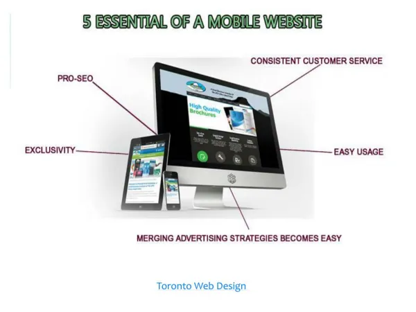
A website may be impressive in design and layout or have a very interesting interface, but if it's lacking in terms of response and navigation, it loses its charm. These measures can be countered, but when it comes to usability in multiple user devices with different screen sizes and user experiences it needs to be taken furthermore than just focusing only on design. These are the 3 essential qualities every web-developer should keep in mind when designing a website. Taking quick action and modifying these pointers is the best way to go for businesses, otherwise, they may risk losing traffic and attention from their customers.

E N D
Mobile-friendly design We live in a mobile-first age. A mobile phone is the most popular device used to connect internet searches and to browse websites. All the sites optimised for search engines should give their websites' mobile layouts equal opportunities rather than just bolting on to simple responsive website design. With massive technological progress and greatly advanced mobile data networks, your future customers are using mobile as the first, and often the only device to interact with your business. To create a truly mobile-friendly network and maximise mobile search results, you must think of mobile users' needs and demands. What a user does on the mobile phone is often far different from what they do on a desktop computer. The crucial first touch may well be on a mobile phone. Mobile-friendliness is a confirmed ranking factor for mobile search. From an SEO perspective, it is worthwhile to mention that, it is the mobile version of your site that the search will take note to review and rank your site. However, more importantly, your prospective customers are searching for your product and browsing your site through mobile. Work hard on optimising user experience for all mobile users, and you will reaptherewardsofyour effortsintermsoftrafficand userengagement.
Page speed Another key consideration in this mobile era is the speed of the page. Users may be impatient, or maybe there is no favourable mobile data connection. Ensuring your pages are lean and simple are some key considerationsin modernSEO-friendlywebsitedesign. Google's mobile-friendly test is a great starting point. This tool gives you feedback on mobile-friendliness, mobile speed and desktop speed. It also wraps everything into a handy little report detailing what exactly you can do to speed things up. The speed of the page is another important consideration. It justifies as to how yoursiteis built anddefines thequalityandviabilityof thehosting.
Usability Effective web usability is a combination of many other factors for device- specific design, page speed, design conventions, and an intuitive approach in putting the site together with the end-user in mind. Key factors to consider include: •Page layout - Important elements should have more prominence. •Visual hierarchy - Make more important elementsbigger. •Home page and site navigation - Make clearsignpost directions for users. •Site search - Large sites need asensibly defined search option. •Form entry - Make forms as simple and easy to fill as possible. •Design - Great design makes everything easier.