Download
1 / 5
50 likes | 241 Views
It shouldn't come as a surprise that color has an enormous impact on how we feel, behave, and interact with a space. There have been volumes written on the psychology of color and color use, but many people are still apprehensive of using too much color in their homes. In this Platinum Series article, Dallas builder Mark Molthan explains how color should be taken advantage of in order to help add some personality to a living space.

E N D
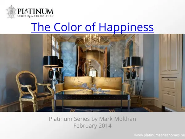
The Color of Happiness Platinum Series by Mark Molthan February 2014
The Psychology of Color People have known for a long time—at least intuitively—that colors affect our emotions. We usually try to plan our wardrobes and decorate our homes in the colors that make us happy. But what is the relationship between color and emotion? Artists and scientists have been trying to discover this relationship for hundreds of years. In the 1800’s, Goethe published a book called Theory of Colours that attempted to answer this very question. Today, psychologists have set out to understand the relationship between color and emotion, and their work has yielded surprising results. Knowing a little bit about the psychology of color can give insight into your color preferences and help you make design decisions that boost your happiness every day.
Color in Advertising & Marketing Advertisers are famous for their insightful use of color psychology. By now, we have probably all heard the explanation for frequent use of red in fast food restaurants: it has been shown to create a sense of urgency and stimulate the appetite. But brands go beyond this with more subtle and sophisticated uses of color. An article on color and branding in Business Insider gives several illustrations of these choices. One example is the famous teal blue color or Tiffany’s. Tiffany’s smartly uses a color which people “associate with logic and communication. It’s also serene, like the ocean, and calming to look at.” But the tone is equally important. “The wrong tone of blue,” explains the article, can “appear cold, aloof and unapproachable.”
Bring Color into the Home When choosing the colors of your home, take a closer look at ads online or in magazines. Instead of jumping to conclusions about the meaning of a particular color, pinpoint the ads that you like. How do they make you feel? What color combinations do they use? Don’t forget to take note of the shade and tone of the colors. Over time, colors have acquired symbolic meanings. These meanings often affect our emotional relationship with a particular color, but the relationship between color and emotion go much deeper than a conscious association. For example, purple has long been symbolic of royalty and wealth, and today, purple can give a sense of luxury and grandeur. Just as often, however, purple is interpreted as a whimsical color, perhaps because of its association with magic. Regardless of a color’s associations, we tend to have immediate emotional reactions to colors without ever analyzing their symbolic meaning. Because the cultural meaning of colors can impact us on an intuitive level, knowing the symbolism of different colors can help you skillfully manipulate the moods projected by the different parts of your home.
Custom Building is the Best Option Some color consultants recommend choosing colors based on the function in each of the rooms in your home. Warm colors (red, yellow, orange) and earth tones (brown, beige) are said to facilitate conversation and create a sense of warmth and connection. For this reason, these colors can work well in a foyer or living area. You may also consider decorating your home office in green, since the color has been shown to aid with concentration.