Download
1 / 18
180 likes | 294 Views
Top Expert Tell Banner Ads and Marketing Strategy and Strategy development. It's all in one in just one Presentation.<br>Here you can find How you increase your conversion and earn a lot of money.

E N D
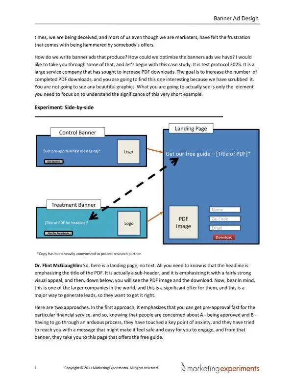
Banner AdDesign times, we are being deceived, and most of us even though we are marketers, have felt the frustration that comes with being hammered by somebody’soffers. How do we write banner ads that produce? How could we optimize the banners ads we have? I would like to take you through some of that, and let’s begin with this case study. It is test protocol 3025. It is a large service company that has sought to increase PDF downloads. The goal is to increase the number of completed PDF downloads, and you are going to find this one interesting because we have scrubbed it. You are not going to see any beautiful graphics. What you are going to actually see is only the element you need to focus on to understand the significance of this very shortexample. Experiment:Side-by-side Dr. Flint McGlaughlin: So, here is a landing page, no text. All you need to know is that the headline is emphasizing the title of the PDF. It is actually a sub-header, and it is emphasizing it with a fairly strong visual appeal, and then, down below, you will see the PDF image and the download. Now, bear in mind, this is one of the larger companies in the world, and this is a significant offer for them, and this is a major way to generate leads, so they want to get itright. Here are two approaches. In the first approach, it emphasizes that you can get pre-approval fast for the particular financial service, and so, knowing that people are concerned about A - being approved and B - having to go through an arduous process, they have touched a key point of anxiety, and they have tried to reach you with a message that might make it feel safe and easy for you to engage, and from that banner, they take you to this page that offers the freeguide. Copyright © 2011 MarketingExperiments. All rightsreserved.
Banner AdDesign Experiment #2:Control Dr. Flint McGlaughlin: So, we look at the page, analyze the metrics, and we see this. On your left, you should be seeing the actual page, and you will notice on the right-hand side of the page, and it has been blown up here very large, you will see the ad, “2007/2008 new car buying guide,” and it is right there, and I need to get to notice it because I am going to show you the new ad in just a moment.What you are looking at right now is the control, and notice thetreatment. Copyright © 2011 MarketingExperiments. All rightsreserved.
Banner AdDesign Experiment #2:Treatment Dr. Flint McGlaughlin: Now, there is a slight change, but it is not as slight as you might think. Look at it carefully and notice the first point. I will go back. You will see that we changed the position of the ad on the page. The ad went from the right to the left. Position is important. We will talk about that in just a bit. Now, there is clearly a color change, but the ad looks remarkablysimilar. Copyright © 2011 MarketingExperiments. All rightsreserved.
Banner AdDesign Experiment #2:Side-by-side Dr. Flint McGlaughlin: Let’s look at the two of them side by side with one critical difference, and that is, we move them right to the first step, so that it feels like the ad is doing more than scream for your attention. It is actually serving you by helping you self-identify and work through a process. We have changed it from an ad to a utility, very important, and later, I would like to talk about how ads could become more useful, in fact, by changing many ads and so that they felt like, look like, and function like forms. We have seen dramatic increases in theresponse. 10 Copyright © 2011 MarketingExperiments. All rightsreserved.
Banner AdDesign Experiment #2:Results What you need to understand: By making very slight changes to the banner (color, case, layout, and position) and by increasing the participation factor, we were able to generate a dramaticlift. Dr. Flint McGlaughlin: All I want you to notice is that with those changes, there was a 74% increase in visits. Look at that. Think of this as an advertiser from 45,000 visits to 79,000 visits, and there is almost no change in the ad except the little form-field box, a color, and the position on thepage. Copyright © 2011 MarketingExperiments. All rightsreserved.
Banner AdDesign Dr. Flint McGlaughlin: Size is one way to do that. Another way to do that is shape. In this case, changing this particular shape to a circle, an oval, there is a shape on the ad, the cloud shape, but even the shape of the ad itself can help achieveattention. Dr. Flint McGlaughlin: Color, on a page with a little bit of color, some color will grab attention. That is not always positive, but at least, it grabs attention. I mean, there are some ugly colors that will get everybody’s attention, but they won’t like your message because they will translate their distaste for the color to you. Remember something, people don’t buy from banner ads and people don’t buy from websites. People buy from people, and they are making a judgment about you when they make a judgment about your bannerad. Copyright © 2011 MarketingExperiments. All rightsreserved.
Banner AdDesign Dr. Flint McGlaughlin: Motion, oh you guys are all good at this. If ever there was a crime universally committed across the Internet, it is the infamous Flash panel at the top that allows you to start to read before it changes, before you have read the message, and somehow assumes that you start readingthe message right at the beginning of the multi-second time limit. It never allows for the fact that you first of all absorb the page, try to understand where you are at, then you flash up the re-boots at the top. Before you are done, it is changed on you. You can’t read it. Now you are trying to find a place to click, so you can see what you were seeing in, and it is moving ahead, and all you are doing is increasing frustration or anxiety or friction and damaging your conversion rate, but motion can work. I just want to say it has been abusedbadly. {Banner ad plays flashmovement} Dr. Flint McGlaughlin: And position, position on thepage Copyright © 2011 MarketingExperiments. All rightsreserved.
Banner AdDesign determines…the one reporting out right now is in a very poor position and will hardly be seen where it is at, but each of these are factors. Size, shape, color, motion, and position, but it is critical for you to understand that ‘if you emphasize everything, you emphasizenothing’. Dr. Flint McGlaughlin: I really like that statement, and I didn’t think of it. Dan, one of our editors said it to me the other day at a meeting, and I immediately wrote it down. This is the only time I will admit in public I didn’t think of it. From now on, I would like you to spread the word that was actually…Dan is in the room, and he is laughing in the back at me now. I would like to take credit for, but it is not mine, but it really well said. ‘If you emphasize everything, you emphasizenothing’. So, if everything is big, if everything has…if you have lots of different shapes, if you have lots of different colors, none of what I have said to you will work. It is the relative differential that controls this. Now, just take a moment, look at any web page you are producing with banner ads on it. It might be on somebody else’s site. It might be on yours. If you had to, if you could, I would love for you after this clinic to print the web page and ask yourself what gets my attention first, second, third, and fourth. We can take a heat map over here and look at somebody’s eye movement and determine immediately where the eye path is, but candidly, almost any senior optimizer in our group doesn’t need a heat map. We can look at a page and immediately tell you that the eyes either have a path, and here is what is it or the eyes don’t have a path because it becomes very easy to determine the eye path once you understand how to look at a page through these critical fivefeatures. So, the question is, how do we get more attention with our ad? And the answer is, you need to look at the competition for attention, and if this ad is ranked number one in your priorities, you need to use one of these five elements to emphasize it over the others. We can talk a lot more about that, and I would love to teach you to exercise this, work with you, but we do that in our training. Right now, I got to take you to the next piece,interest. Copyright © 2011 MarketingExperiments. All rightsreserved.
Banner AdDesign Poll: Measure theinterest On a scale of 1 to 5, how would you ratethe overall interest generated by thebanner? Appeal Exclusivity Credibility Clarity Dr. Flint McGlaughlin: Here is an ad, and I would like you to rank it. Overall, on its effectiveness, thinking about these four points on a scale of one to five. We are doing a poll right now, so vote, and we will share with you how the audience…now, this is an ad submitted by our audience, and so, weare trying to help somebody who is here on the call today, and we are also trying to communicate to you a transferable principle that will apply to everybody else who might not be having their adreviewed. Interesting. I think we will shut the poll now. Okay, so, if you can see, we have given it a three, overall it is a team of marketers out of afive. Copyright © 2011 MarketingExperiments. All rightsreserved.
Banner AdDesign Dr. Flint McGlaughlin: Now, let’s take some more analysts. I have got Spencer and Taylor with me, and we are going to show you a brief analysis of the ads and comments on it. So, I think I need to as soon as that poll is shut down. All right, the poll is closed, and I have control back. I would like you to see how we rank it with the caveat about the clarity and some quick thoughts. There is a simple diagram up that explains a lot of what Spencer is going to say. Go ahead,Spencer. Spencer Whiting: Yeah, the caveat around the clarity is that I actually know this company, so I know what they are selling. So, when we were talking about it shortly before Flint said, you know, clarity is…first question is, what are they selling? I think from the other parts, the appeal to me is that it is a nice-looking picture. It is a well laid out advertisement, but as far as exclusivity andcredibility, Copyright © 2011 MarketingExperiments. All rightsreserved.
Banner AdDesign exclusivity everybody is giving $20 off on orders over $100, and the credibility is there is really not much that supports it. So, that was kind of our…my assessment of thisad. Flint McGlaughlin: All right, so you can see that Spencer is generous. He is kind of like Paula Abdul on AmericanIdol. Spencer Whiting: Yeah, that’sit. Flint McGlaughlin: I think that it probably appears on their own page, which means there might be come clarity, but if it is appearing on their own page, what you have on a banner ad should have actually been in a headline and should be emphasized properly. I think the appeal is minimal. The exclusivity is debatable. I mean, you could say it is exclusive because it is to this product only, but if they have a strong competitor in any categories offering anything similar, then that is washedout. The credibility is reasonable because let’s assume you know the brand. Let’s assume, let’s be generous and say you know the brand. This is better than average, and it is still poor. Let’s keeplearning. On a scale of 1 to 5, howwould you rate the overall interest generated by thebanner? Appeal Exclusivity Credibility Clarity Dr. Flint McGlaughlin: All right, audience tell us about this one, one to five? One to five, rank this one. I am going to get your poll. We will let you see how you do. Let’s see how the audience is, and I think we are going to have Taylor talk to us. Taylor, are younext? Taylor Kennedy:Yeah. Dr. Flint McGlaughlin: All right, so standby. We will let the audience vote. Wow, we are getting validity. There is a strong winner. We will be posting that pretty soon. Whenever you guys think we have got enough validity, let’s go. This is a very large focus group by the way. The marketer who submitted this is on the clinic. It is pretty hard to get this many qualified marketers looking, and the only thing I would say is your demographic is skewed because you got a bunch of professionals looking,but Copyright © 2011 MarketingExperiments. All rightsreserved.
Banner AdDesign also many of them represent your target audience knowing the product. All right, good. Let’s close the poll. Dr. Flint McGlaughlin: You can see that 38% rank this as a two, with 23% being generous enough to give it a three. Let’s talk about it, and Taylor, talk tous. Taylor Kennedy: All right, great Flint. It looks like our audience is pretty keyed in on this ad. You know, we ranked it around between one and a two. We got a two for clarity here, but a one in appeal, exclusivity, and credibility. You know, we have got hundreds of enterprises trust Rackspace to solve complex IT challenges. Really, you want to ask yourself what sort of IT challenges, what sort of enterprises? You know, we don’t really have much credibility there in the…of the enterprises,and Copyright © 2011 MarketingExperiments. All rightsreserved.
Banner AdDesign On a scale of 1 to 5, how wouldyou rate the overall interest generated by thebanner? Appeal Exclusivity Credibility Clarity Dr. Flint McGlaughlin: Okay, so I am moving on to the genius project. We are measuring this ad across four criteria and give me your vote. Give me your vote. Here we go. Wow, it is interesting watching, right at the beginning, talk about validity. It is like an instant Bell curve. By far, the audience initially ranked it as four, and as time passes, it goes down and down and down. What does that tell me? The people who liked it were quick. The people who took time to reflect, I don’t know what thatmeans. Dr. Flint McGlaughlin: All right, but let’s close the poll out and tell you that 31% of you ranked it as a three, 27% is a four. On a scale of one to five, project management software tailored to your needs product tour. All right, that is the ad, and let’s get the comments. Is it Spencer? Go ahead,Spencer. Copyright © 2011 MarketingExperiments. All rightsreserved.
Banner AdDesign Spencer Whiting: Okay, so I really like this ad a lot when it came in because it had a lot of interesting, just the layout, and what is going on. I wanted to know what was is going on, and as far as the clarity, it talks about the project management software tailored to your needs, so that makes it a little more exclusive, and then, it gives me a product tour. So, that is going to give me everything that I need. Now the question from credibility is I have never heard of the genius project, but I think just the name of it, kind of, tells me in my thought that there is some validity to that credibility. So, I thought the ad was good, but then again, I’m Paula, so I’ll let Simon make somecomments. Dr. Flint McGlaughlin: Well, I want to say this. I would like you to keep this ad in mind when I teach the final part here. A very important part of designing an ad is understanding where people are in the buying process, and at what stage they are in. This ad is potentially powerful for people who have heard of genius project and are interested in learning more. It is very limited for someone who is earlier in the cycle, and let’s talk about that as we talk about anad. Objective #3: Ask for theclick Dr. Flint McGlaughlin: So, here we have 2at + i - as or I am sorry + as, and we are on the final piece, and that is the ask. We all know about a call to action, but I want to talk to you about the ask, and tell you some things that arecritical. Copyright © 2011 MarketingExperiments. All rightsreserved.
Banner AdDesign Dr. Flint McGlaughlin: All of that leads us to an example of Not this, and I think the ask here might be browse. Not real sure, it is…I suppose the whole ad is clickable, but without putting the button, we just didn’texperiment. Now, most of us know if it is a square banner, you click anywhere around the banner, and you are going forward, but we just saw a dramatic increase for a major financial institution by putting a button on the banner. That made it very apparent that this is what you do now, click here. But this, this is a little bit better. The ask is a little bitbetter. Copyright © 2011 MarketingExperiments. All rightsreserved.
Banner AdDesign Summary: Putting it alltogether KeyPrinciples • The goal of an effective banner ad is to get a qualifiedclick. • Therefore, following the online ad sequence, to get a qualified click a banner must powerfully accomplish 3 keyobjectives: • Attract Attention(at) • Generate Interest(i) • Ask for the click(as) Dr. Flint McGlaughlin: All right, so if that is helpful for you, please let me know because this is a summary of the key principles, and we are moving right into live optimization. We have been doing it throughout, but we are going to just go from case study to case study to case study or from submission tosubmission. Copyright © 2011 MarketingExperiments. All rightsreserved.
Banner AdDesign Live Optimization: Submission#1 Dr. Flint McGlaughlin: So, here is a page that has been submitted. This is SmartStream. See the banner up at the top? We are looking at that particular banner. There is no better time. You can see it right now, flexibility, efficiency control, pre-book a meeting, etc. Let me let you as the audience real quick go to your Q&A function and give me a critique of this. What do you think you do to make this adbetter? All right, I am listening. What do they do? What is the offering? Where is the button? Add a call to action. There isn’t enough clarity. Not sure what I am looking at. Increase the clarity, increase the clarity, add a button. Increase the clarity, add a button. Where is the CTA? That is simply the same thing. It is too busy. This is the audience telling us, and I think you are bang on, but let me shift over to…is it Spencer? Spencer, give us yourthoughts. Spencer Whiting: Well, this…their goal here is to drive visitors to an online demo, and they are looking for their primary audience as the operations managers of banks, which isn’t very apparent bythis. Obviously, the Flash spanner is attracting a lot of attention. The difficulty for me is that the clock has a lot of time in there, and it doesn’t add to the sales. SIBOS, obviously, this website is related to that. It was a part of the conference you are looking at, but what they are trying to do is get people to sign up for meetings at the SIBOS conference, and it is very, very quick. It doesn’t allow for thatbuilding Copyright © 2011 MarketingExperiments. All rightsreserved.
Banner AdDesign Live Optimization: Submission#2 Taylor Kennedy: All right, great, Flint. Well, I think the biggest difficulty of this ad right now is mainly more the site itself, it is difficult. There is noattention. Dr. Flint McGlaughlin: No eye path. Taylor Kennedy: No eye path there. Dr. Flint McGlaughlin:Yeah. Taylor Kennedy: There is no way to get the attention on to this ad and, you know, every icon on the sided square and so too is the ad. Really attracting attention here is very difficult. This might be one of the cases depending on the importance of the ad where you actually might use some sort of rich media or actual use of motion here. Maybe, drawing the mouse over the ad extends theadvertisement. Dr. Flint McGlaughlin: Well, can I just say Taylor is dead right, but the real solution is to tone down the rest of the site. The site has no eye path, and you got to figure out what you really want to sell here and what you really want to emphasize because the whole site is a verbal onslaught or I’m sorry, a visual onslaught. Go ahead,Taylor. Taylor Kennedy: Absolutely. Really, the importance overall, we have to determine your goals first of the site and determine the importance of each advertisement, and really, right now, it looks like this advertisement is a low priority. So, other things about the ad that we have got here, we have an emphasis on the price over the actual savings. You could mention the savings in larger font and then the price beneath that. View Item, you can do Shop Now instead of View Item really using more forceful CTA there. Also, really, what is the feature product? What makes it the feature product? Is it a kind of a limited time offer? Is it something that expires as in last year’s model that is going to be sold out?You Copyright © 2011 MarketingExperiments. All rightsreserved.