Download
1 / 4
40 likes | 56 Views
Consumers are more informed, more opinionated and more selective than ever before.<br><br>As a result, theyu2019re paying more attention to whatu2019s in (and around!) their food and holding food companies to a higher standard - expecting added benefits, better ingredients and smarter packaging solutions.

E N D
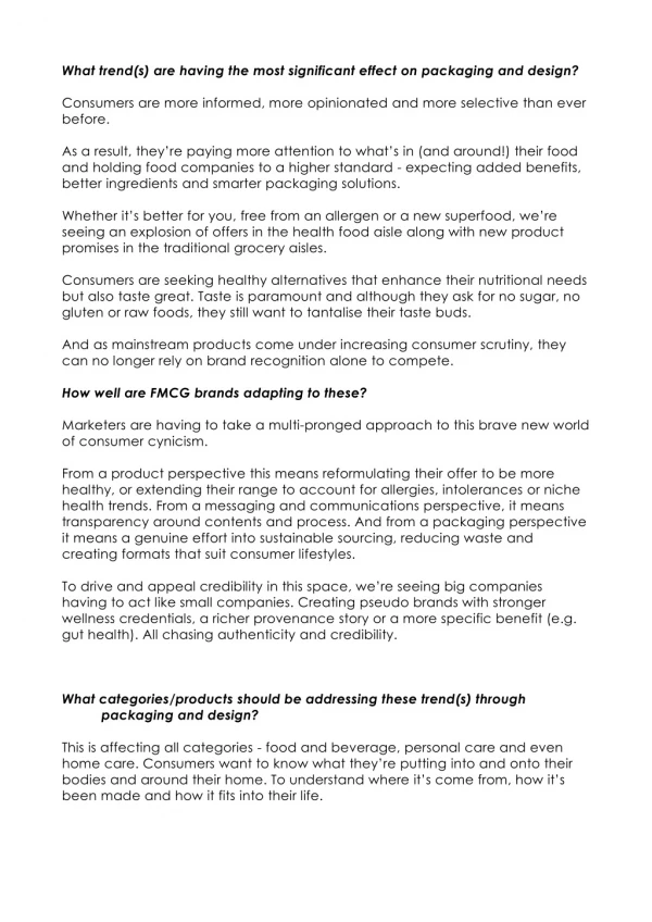
What trend(s) are having the most significant effect on packaging and design? Consumers are more informed, more opinionated and more selective than ever before. As a result, they’re paying more attention to what’s in (and around!) their food and holding food companies to a higher standard - expecting added benefits, better ingredients and smarter packaging solutions. Whether it’s better for you, free from an allergen or a new superfood, we’re seeing an explosion of offers in the health food aisle along with new product promises in the traditional grocery aisles. Consumers are seeking healthy alternatives that enhance their nutritional needs but also taste great. Taste is paramount and although they ask for no sugar, no gluten or raw foods, they still want to tantalise their taste buds. And as mainstream products come under increasing consumer scrutiny, they can no longer rely on brand recognition alone to compete. How well are FMCG brands adapting to these? Marketers are having to take a multi-pronged approach to this brave new world of consumer cynicism. From a product perspective this means reformulating their offer to be more healthy, or extending their range to account for allergies, intolerances or niche health trends. From a messaging and communications perspective, it means transparency around contents and process. And from a packaging perspective it means a genuine effort into sustainable sourcing, reducing waste and creating formats that suit consumer lifestyles. To drive and appeal credibility in this space, we’re seeing big companies having to act like small companies. Creating pseudo brands with stronger wellness credentials, a richer provenance story or a more specific benefit (e.g. gut health). All chasing authenticity and credibility. What categories/products should be addressing these trend(s) through packaging and design? This is affecting all categories - food and beverage, personal care and even home care. Consumers want to know what they’re putting into and onto their bodies and around their home. To understand where it’s come from, how it’s been made and how it fits into their life.
So brand owners and creators need to ensure they’re have a clear story to tell around: Ingredients provenance and sourcing Recipe and process Company ethos Sustainability How they benefit consumers But still reassuring on taste/experience, quality and convenience! It’s a big ask, but with consumers more informed, more opinionated and more selective than ever before, it’s what brands need to do to stay relevant, engaging and loved. How can your business help? It’s a core B Brand ethos that strategy and creativity share the stage. That we find the sweet spot between logic and magic deliver to great design outcomes that are also commercially effective. This approach perfectly positions us to help brands remain relevant in the face of increasing consumer interrogation - bringing appeal and reassurance through design. And balancing niche brand appeal with shelf standout and shoppability. Wallaby Porridge Bounce into your morning Challenge: Wallaby Foods has leveraged its unique combination of Byron Bay sunny optimism, innovative products and premium natural ingredients to establish itself as a wholesome snack brand. This created a perfect platform to extend into other categories, bringing the goodness of Byron Bay superfoods to the breakfast table through development of an oat-free porridge, the first of its kind in Australia.
Solution: Wallaby’s product is full of wholesome, tasty ingredients including almond meal and coconut. Meaning it’s a delicious gluten-free alternative to everyday porridge. This gave us license to maximise the taste appeal of our design, heroing the ingredients through beautiful food photography and cameos. A vibrant natural colour palette is lifted by the signature Wallaby illustration style. The brand hierarchy focuses on the unique benefit of the product (oat-free) to allow ease of location for consumers. A distinctive pack that stands out in the sea of mass produced cereals, carving out a new product category for a beloved Australian brand. Wholesome Food Company A whole lotta wholesome Challenge: Bring appetite appeal, modernity and provenance to the Wholesome Food Company’s unique range of snacks ensuring the range stands out in the sea of ‘brown paper’ prevalent in the natural snack food section. Solution: We served up vibrancy and stand-out through a palette of bright variant colours, balanced against the existing brown background so loyalists could still find their tasty snacks. Locking up the logo and layering it with an illustration tells the provenance story and when coupled with the large, punchy product descriptors - ensures clear differentiation at shelf. Real food cameos help build taste credentials. Vibrant and tasty, a new raft of aficionados have been drawn into the brand! New flavours launching soon… The Culture Co Loves Your guts Challenge: Capitalise on the increasing interest and growth of probiotic and fermented foods by uncovering a compelling offer that can expand this niche into the mainstream grocery sector.
Solution: With a blank canvas, B! created a visual identity, brand and packaging that was distinctive with a strong in-store presence, through the use of black - coupled with friendly approachable typography. The hand drawn shapes and water colour treatment support the dual meaning of The Culture Co. as they allude to science and molecules, yet feel artistic and abstract. Sales exceeded projections at launch and continues to grow. A brand is born and the future is bright.