0 likes | 2 Views
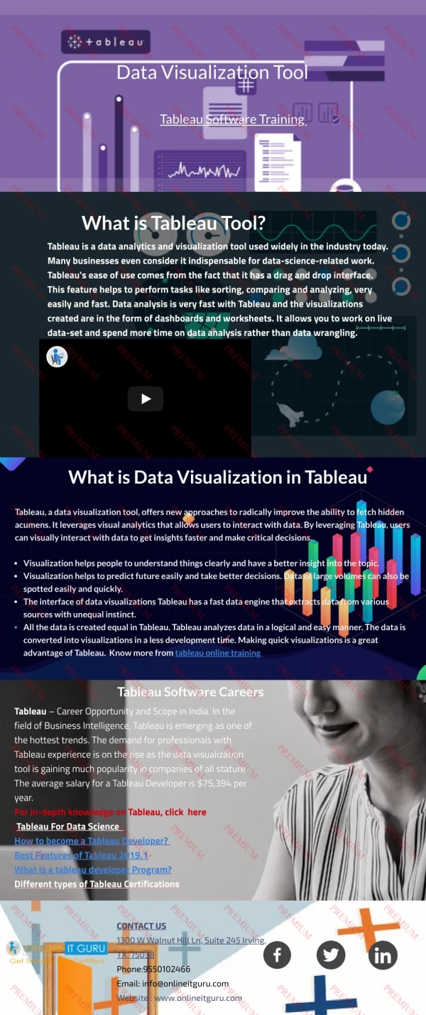
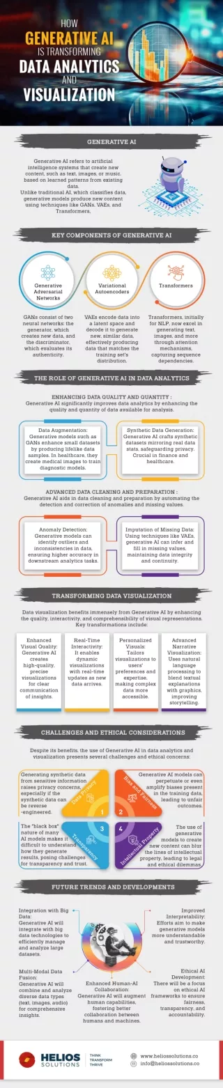
Check out our detailed infographic on data visualization to understand its importance in businesses, different data visualization techniques, and best practices. bit.ly/4j8WqQz
E N D
TRANSFORMING BUSINESS WITH DATA VISUALIZATION EFFECTIVELY THE GREATEST VALUE OF A PICTURE IS WHEN IT FORCES US TO NOTICE WHAT WE NEVER EXPECTED TO SEE. This quote by John Tukey (renowned American Mathematician) states all on why Data Visualization can transform presentation and reveal insights that could possibly change the world © Copyright 2025. United States Data Science Institute (USDSI®). All Rights Reserved. DATA VISUALIZATION Data Visualization is an important process in the data science lifecycle that transforms data into easy-to-understand visuals like charts and graphs for easier Understanding and Communication. WHY IS DATA VISUALIZATION IMPORTANT? Data visualization has a huge role to play in the data-driven decision-making process, and it is very important because- Supports Data-driven Decisions with clear visual insights It simplifies Complex Data and makes it easier to understand Clear visuals can reveal Trends and Outliers that might go unnoticed in raw data Makes communication easier and concise with even non-technical stakeholders © Copyright 2025. United States Data Science Institute (USDSI®). All Rights Reserved. BENEFITS OF EFFECTIVE DATA VISUALIZATION An effective visualization can benefit organizations in several ways, such as: Enhances Retention Improves Engagement Helps understand how differ ent data points relate to each other Assists with Faster Analysis © Copyright 2025. United States Data Science Institute (USDSI®). All Rights Reserved. WIDELY-USED DATA VISUALIZATION TECHNIQUES Scatter Plots Pie Charts Bar Charts Heat Maps Histograms Bubble Charts Line Graphs Tree Maps Dashboards © Copyright 2025. United States Data Science Institute (USDSI®). All Rights Reserved. Some common and widely-used data visualization techniques include: LINE GRAPHS It is used to show the relationships between two numerical variables and is best suited to depict correlations and patterns. Example Relation between advertising spending and sales SCATTER PLOTS BAR CHARTS It is used to compare categorical data and is best for showing differences in quantities between groups. Example Comparing sales figures of different products Best for depicting trends over time that show changes and patterns in continuous data. Example Used for tracking stock prices over time HEAT MAPS PIE CHARTS Pie charts represent a portion of a whole in slices of a circle. They show a share or percentage of the whole. Example Market share in different industries Heatmap uses a color gradient to represent data values in a matrix. It is a great way to visualize patterns in large datasets. Example Performance of a portfolio of stocks © Copyright 2025. United States Data Science Institute (USDSI®). All Rights Reserved. STEPS FOR EFFECTIVE DATA VISUALIZATION Identify what your data set tells Consider your audience and data points Craft a compelling and engaging storyline Choose the right charts and graphs to present insights When insights are presented with effective data visualization and a storyline, they can transform decision-making and business. LEARN HOW TO CREATE A VISUALLY APPEALING AND ENGAGING DATA VISUALIZATION WITH THE BEST DATA SCIENCE CERTIFICATIONS FROM USDSI® REGISTER TODAY © Copyright 2025. United States Data Science Institute (USDSI ). All Rights Reserved.