Download

1 / 14
140 likes | 156 Views
Several important steps Can Boost mobile conversion For Your Woocommerce store. Here a quick guide which can quickly maximize mobile conversions.

E N D
Quick Guide to Maximize Mobile Conversions on WooCommerce Store
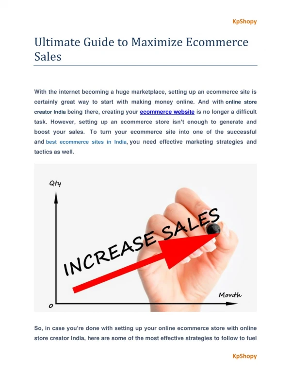
Whether you’re an online or offline store owner, both urge for more and more conversion. And if you are a WooCommerce store owner, expecting more is only fair. If you say, you already tried for a full bag of conversion hacks, and still not getting it 100%. Then you might miss the fact that 50% of users are searching from mobile devices. Yes! WooCommerce Mobile conversion is what you’re missing out. In this unstable world of transformation, the use of the same technical steps can’t make you sustain. In this article, we will guide you on how you can quickly maximize mobile conversion for WooCommerce stores. After all, you don’t want to miss mobile users that are increasing daily.
But foremost, before guiding you for optimization, let’s know mobile conversion a little more. Definition of Mobile Conversion- When your website visitor takes a desirable action, while he/she drops-in via mobile devices, known as mobile conversion. On the other side, the mobile conversion rate is the percentage of mobile device users from the total number of users who saw your site. The higher the percentage goes, the successful is your mobile marketing strategy. If you have a robust mobile marketing strategy, you have more people to convert in profit.
Now when you might know that mobile conversion is a big part, so do WooCommerce. Now just imagine, what would you call a combination of both. That is what we are guiding you for. Guide to maximize mobile conversion rate Rapids mobile site- It’s no more a secret that more than 30% of users won’t wait more than three seconds for loading a site. It would be better to focus on the Start Render Time (time that something takes to appear first visual change) for fast mobile conversion.
How to do that? • Consider the theme and mobile design • Support the best Google method to enhance website speed • Enter URL in Google’s mobile page speed checker • Set up caching plugin and system • Image optimization • Consider the content delivery network Use mobile responsive WordPress theme- Use a custom WordPress theme, to optimize your site speed. Remember that always choose the theme that fits best to your screen size.
How to do that? • Analyze the theme demo on any mobile device, as obviously for every user you can’t analyze with your device. When you check your website for each device only then you examine whether it is cutting for any drive or not. • Find out the mobile responsive features of your site. It mostly depends on responsive design. • Execute the theme-demo through Google mobile-friendly testing tool. • While selecting the theme check for rating, reviews, and comments. • Look for if the theme is perfectly compatible with WooCommerce and how it works for mobile devices.
Improved website design for mobile devices- The first impression is always important. And if you believe that too, enrich your site design today. A recent survey on website design states that 94% of users’ first impression relates to your website design. How to do that? • Check for how your site design processes on mobile devices. • Compute the user’s flow to check if the users are getting appropriate information from your site design.
Ease to use for mobile devices- If your website is difficult to handle, then you might cost it with your sale and drawing conversion rate. Follow the number of tips that can help you to make your site easy to go. The number of tips: • Improve on-site search via adding live search, filters, and indexing. • Easy product comparison. We suggest you use the “Product Compare Plugin” of Woocommerce. • Improve site navigation so customers can filter by attributes such as size selector, swathes
Use video content- Visuals are more strong to memory than any other thing. Especially if you are using videos, then profit is on your way. In the case of mobile conversion, videos are the best way to show your products, as 90% of customers link to view videos on mobile devices. Why use video? • 79% of buyers prefer videos instead of reading the information when it comes to products. • 84% of buyers buy a product after seeing videos.
How to do it? • Decrease the check out process, try one step checkout • Include progress bar and visual signal to display the process • Add guest check for both purchase without register and save the specification Focus on push notification and SMS- From 75% of received mobile text messages, almost 45% of the theme highers the response rate. So it can be said both push notification and SMS are proven to increase conversion.
And if you want to gain mobile conversion, don’t forget to blent in this major aspect. Sms(s) is easy to glimpse rather than emails, moreover. you can encourage them to opt into emails. Simplify the mobile menu- Small screens with giant menus can create complications. So you don’t want to confuse your customers, add some symbols such as arrows, and following bars. Menus to use: Hamburger menu- The vertical three lines (head of each other) that hide the entire menu into it. This is the best option for those websites that have several pages to show.
Tab menu- Looks the same as common desktop navigation and general list menu items and is used for websites with fewer links. With this menu, visitors don’t have to scroll up-down or left-right. • Floating action menu- FAB performs both primary and most common action on site. It appears in front of the screen content. Typically, the shape of this menu is circular. • Dropdown menu- The menu stays at the top of the page and drops down only when it is clicked. As compared to the hamburger menu, it takes more space but can easily be seen by the users.
Over to you! We are sure, with this quick and to-the-point guide, now you can maximize mobile conversions for your WooCommerce store. However, for more, having an experienced WordPress development service on your project is the same as having experts on your side.