Download
1 / 128
1.28k likes | 1.44k Views
Progressive enhancement sounds practical, but not for your current project, right? Good news: you’re wrong! <br><br>In this session, Aaron will debunk the myths that often preclude individuals and organizations from embracing progressive enhancement and demonstrate solid techniques for applying progressive enhancement in your work. <br><br>By the end of this session, you’ll walk away with <br><br>* a better sense of the devices people are using to access the Web, <br>* a framework for envisioning experience as a continuum, and <br>* a solid understanding of how to improve the accessibility and reach of your Web projects. <br><br>Come find out why progressive enhancement isn’t just for “content” sites (whatever those are).

E N D
Hi! I’m @AaronGustafson
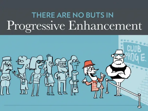
What is PROGRESSIVE ENHANCEMENT?
TECHNOLOGICAL RESTRICTIONS
USER EXPERIENCE BASIC ADVANCED BROWSER CAPABILITIES
Interactivity Design Semantics Content
Make your mobile site strategy simply your website strategy
“We have developed a new version of the News website which implements a responsive design so that we can offer all our users the best experience possible no matter what device they are using.” NIKO VIJAYARATNAM SENIOR PROJECT MANAGER - BBC
EFFORT 4 years 50 contributors 5000 pull requests RESULTS 1 code base 30 different languages
BEFORE AFTER
“Looking back, using Mobile First was genius. We were able to strip everything back to the core content, the stuff that mattered to users. No JavaScript. No cruft. Just the good stuff. Journalism at its best.” JOHN CLEVELY @JCLEVELEY
Assuming JAVASCRIPT is always available
How many people are missing out on JavaScript-based enhancement?
1.1% according to the UK’s GDS
0.2% JavaScript disabled or unavailable 0.9% JavaScript enabled but never received +
LOGIN IS AN EASY FIX Include the Login Form in your markup and give it a unique id: <form id="login"> 1. Hide it by default: form#login { display: none; } 2. Make the activation link target it: <a href="#login">Login…</a> 3. Show the form when someone clicks the link: form#login:target { display: block; } 4. Use CSS to transition the opacity to make it look friggin’ sweet! 5.
OR EVEN EASIER… Make the link point to a login page 1.
NAVIGATION Large screen Small screen Touch devices Mouse users Mouse and touch enabled devices Keyboard users Color blind users Screen readers Users without JavaScript thebostoncalendar.com/system/events/photos/000/023/300/original/tumblr_n9wbg5xUuK1qbycdbo1_1280.jpg?1421977741
SCENARIOS IF NO JS; SMALL SCREEN WIDTH Hamburger menu acts as jump link to navigation at bottom of the page; main and sub nav are shown IF JS; SMALL SCREEN WIDTH Hamburger menu toggles off-screen navigation pattern; two levels of nested navigation - expand/collapse functionality for sub-nav IF NO JS or JS; LARGE SCREEN WIDTH Show main navigation; hide sub nav on default under drop down menus nested within main; use CSS to show sub navigation on hover FOR TOUCH DEVICES; LARGE SCREEN WIDTH Make top level navigation items link to landing pages with sub-nav accessible
Would you believe you CAN DO THAT without JavaScript?