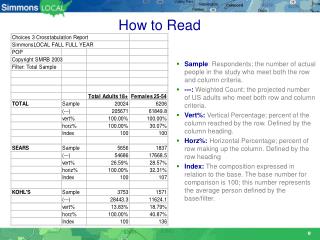
Download
1 / 6
60 likes | 80 Views
In laymanu2019s terms, a stock chart is a graphical representation of how the trading volumes or the stock price has changed over the course of time. This relationship can be digitally displayed in a lot of different ways with the help of charts. As a technical analysis, it is the job of the person to identify something that is right there on the screen and it just has to be identified. What it will bring out are the confirmations of a new trend in stock market.

E N D
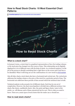
How to Read Stock Charts: 10 Most EssentialChart Patterns investhub.agency/blog/10-most-essential-stock-chart-patterns What is a stockchart? In layman’s terms, a stock chart is a graphical representation of how the trading volumes or the stock price has changed over the course of time. This relationship can be digitally displayed in a lot of different ways with the help of charts. As a technical analysis, it isthe job of the person to identify something that is right there on the screen and it just has to be identified. What it will bring out are the confirmations of a new trend in stockmarket. Like all other charts, stock charts also have a horizontal and vertical axis. The verticalaxis addresses the trading volume or the price of the stock for a particular period of time. The horizontal axis addresses those periods of time around which the technical chart isbuilt. Technical analysis works around a lot of different charts. Each has its own setof complexities. However, the chart encyclopedia0 is divided into 4 different sections.Line charts, Bar charts, candlestick charts. Also, the point and figure charts. Later in this article, we. will discuss each of them extensively but for now, This is what you needto know: There are 4 main types of stock charts that the trader can or shoulduse. How to read stockcharts?
Learning how to read stock charts can be a hard task if you think of it as “nonessential”. In the end, you will see them everyday if you are in the realms oftrading. You just can’t ignore the fact that there are no cars in the world because you don’t know how to drive one. Out on the road, there is going to be a vehicle and most of them willbe cars. Of course, you could use a bike but you will still have to ride your way aroundcars. Similarly, a lot of traders think that reading charts is not something they have to necessarily do, which is true to a point. But it would be better if they knew how toread stockcharts. Learn how to Identify the nature of thechart: To identify the charts, look for the ticker symbol which is an alphabetical identifier of a firm. The correct ticker symbol is the only piece of information that can take trader tothe stock charts of the desired company so be attentive when you look for them.Look whether the chart is a line or a bar chart. Most of the trading platforms will give youan option to change the visual representation of the samechart. Set a time windowcarefully: Setting up a time window is a subjective opinion. Different traders do itdifferently. If you want, you can do that weekly, monthly, or even a daily basis. Lookingat different timelines of the same chart can help the traders gain a better view ofthe consolidation and trends that areshort-lived. Daily charts can help the traders find a common breakout point that happensalmost daily. Also, they can tell the traders how the index is behaving and let them calculate their earnings by keeping that index as a referencepoint. Remember and note the price on any given day and look for consolidations inthe days that follow and check whether they form above or below theprice. Look for thesummary: Looking for the summary key is crucial as it provides the traders with the informationin terms of numbers. Numbers, of course are easier to grasp than analphabetical representation of something that has happened. The summary should at least havethe information regarding the latest price, the trading volumes and the movingaverages. Keep an eye on theprices: The chart is divided into two different sections the upper and the lower. Thesetwo sections guide the prices. The upper part of the chart will track the changes in thestock price The prices are generally shown in the form of differentcolours. Note the volumetraded:
At the bottom of the chart, you will find all the volume that is traded on the market. This helps the traders in determining when the stock is at a momentum, whether that stock is on the positive or the negative. All of these things are marked in colours and those colours are set. to specific values. There has to be a comprehensive study of the colours and also,a careful one. The volume of the stock traded and the two day difference is colour specified so there is a lot of attention that has to be paid to thecolours. Track the movingaverages: Moving average is the calculation of the average price of the stock for a period of timethat gets regularly adjusted as time moves on. One of the key tools in technical analysisand charting, the Moving average generally is indicated by lines that cut across the stock charts. It can also help the traders to figure out a trend pattern but there can besome possible lagstoo. How important is thevolume? Volume can be seen on every stock chart that you will ever come across. This isbecause the trading volume is considered one of the most crucial technical indicators by almostall the investors. In a chart, blue bars indicate the times when the buying volumes are high. The times when the selling volume is high are indicated with redbars. The reason behind volume being one of the best technical indicators is that most ofthe big selling and buying in the stock market is done by the institutionalinvestors, investment banks and fund managers. When these people or organisations sell or buy particular stocks, a high trading volume is created around those stocks. It is this kindof major selling or buying that gives the definition to a stock in profitterms. Hence, institutional or individual investors are always on a lookout for volumefigures because only they can indicate whether the stock is being heavily traded. Thisinformation can be used for prediction or also to find out the chief support and resistancelevels. as a matter of fact, a lot of individual investors will decide whether to buy or sell almost majorly based on following the steps taken by bigger investors. they will buy when thereis an indication of the institutional investors buying and sell when there are signswhere there are signs that major institutions areselling. This kind of strategy will mainly work on the blue chip stocks that are traded heavily ona daily basis. This will mostly be less effective when it is applied on smaller stocks that are not yet on the watchlist of big institutional investors. These stocks will have less trading volumes also on days when the stocks are traded heavily thanusual. What kind of patterns does the volume follow for each stocktraded? The chart patterns also follow a pattern of volume. It is a well known fact that the nature of the trading day will set the pattern of the chart. for example. On an up day, there willbe a high volume of trading. This indicator is bullish that the stock price will continue torise.
These stock chart patterns are not that hard to identify and once the trader is usedto looking at stock charts, he or she will also be comfortable with the patterns made withthe combination of the stock price movement and the closingprice. When the day is about trading low, this will be a bullish indicator saying that the price movements indicate that there are less people interested in buying. Such events duringa trading day are known as corrections or a retracement. The investors don’t pay heed to them as the beginning of new trends but rather smaller setbacks that happen during the course of a tradingday. When the stock is displaying huge volumes in terms of selling, then this is a strongbear indicator and shows that the stock’s price is down now more than ever and a lotof investors are aggressivelyselling. Low trading volume on up days: This is another serious bear indicator. Although not as strong as the previous one. The lower volume of trading around. a stock despite thefact that the index is tracing an uptrend is an indication of a bigger picture beartrend. What are some of the most important charttypes? 1. Ascendingtriangle: This is a continuation chart pattern that reveals that the trend is bullish. Theascending triangle chart pattern suggests that a breakout is about to happen at the point where the lines of the triangle converge. To draw this pattern, the traders need to place ahorizontal line over the resistance points and along the support lines, an ascending line needs to be drawn. 2. Descendingtriangle:
This pattern indicates that the market is bearish. The support line looks horizontal,the resistance line is descending. These two things possibly signify the possibility ofa downwardbreakout. 3. Symmetricaltriangle: For symmetrical triangles to be identified, there has to be two trend lines that tendto meet which will later indicate a breakout in one of the directions. The support line is drawn with the help of an upward trend and the resistance line is drawn at par witha downward trend. There is a possibility that the breakout happens in any one of these directions but generally, it follows the trivia of themarket. 4.Pennant
This pattern can be seen when two lines meet at a set point. These are often formed aftera strong uptrend has just happened and the traders have just paused. The brief amountof time for which the train stops and then follows the direction it wasfollowing. 5.Flag: the flag stock chart patterns look like sloping rectangles. Here, the resistanceand support lines run parallel to each other till the time a breakout happens. The breakoutis generally a trend that opposes the trendlines. This indicates that it is a reversalpattern.