Download
1 / 11
130 likes | 328 Views
Good design and layout. The Ten commandments. 1. Research your subject. Find out the key information and make notes Select pictures that tell the story Draft a “mock” layout of your publication. 2. Use pictures or graphic images to add visual interest. Be creative!

E N D
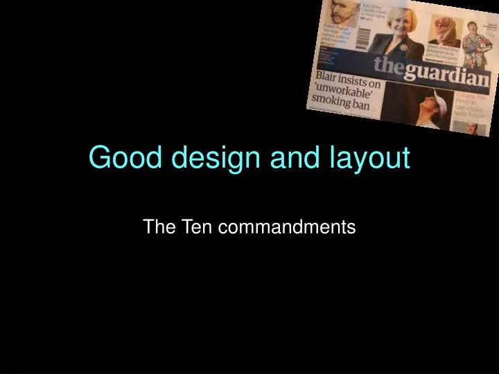
Good design and layout The Ten commandments
1. Research your subject • Find out the key information and make notes • Select pictures that tell the story • Draft a “mock” layout of your publication
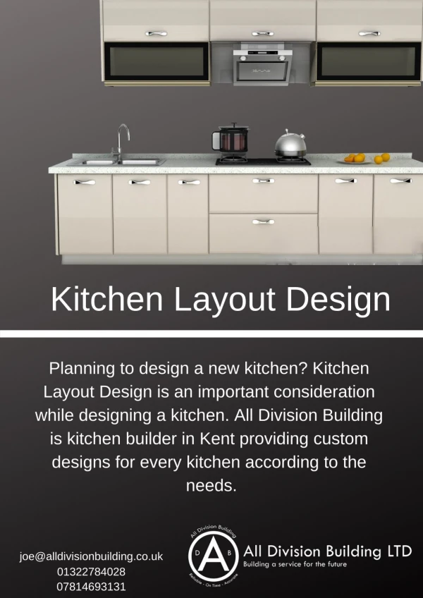
2. Use pictures or graphic images to add visual interest • Be creative! • Use unusual proportions • Turn tables into charts • Make a feature of “pull out” quotes, sidebars or text boxes • Let a detail or image jut into the text area, with the text “wrapping” around it
3. Make it easy to see what your publication is about • Can the reader scan the product quickly… and know what it is about? • Make sure visual images have visible captions • Make sure headlines draw readers in…
4. Make it easy for readers to find their way about • Create signposts for the content • Use a contents list where possible • Make sure headlines are bigger than text • Ensure page numbers are visible • Group items that belong together
5. Choose appropriate fonts • Serif font adds authority and “classicism” • Sans serif is more modern • Start any job with only two fonts • Choose your combination carefully Headline This combination is a heavy sans serif (above Franklin Gothic Heavy) for headlines, with text in an old style serif (here Book Antiqua)
6. Combine colours carefully • Colour is a powerful design tool • Colours can be complementary or contrasting • Think about colour associations e.g. red = danger orange/yellow = warning light blues/greens = restful
7. Formatting rules • Use only a single space after punctuation • Do not use underlining in text • Use bold or italic for emphasis in a text setting
8. Pay attention to space • White space is good • Readers need to be able to “see” what’s on the page • Don’t make your page design too “fussy”
9. Be consistent with details • Agree a “style” for your publication and stick to it (e.g. all headlines in Times New Roman) • Use a master page where possible; this reduces the risk of design error • Your publication can be read more quickly if the style is the same throughout
10. Make sure you check your work!! • Do the headlines say what you want? • Are those images cropped creatively? • Arrange text boxes and pictures in the right order • Proof read your text • Get some feedback