Download
1 / 8
80 likes | 85 Views
A design project using font faces, color, layout, and icons to create a cohesive poster with initials. Includes webpages, print media, and icons.

E N D
Webpage Print Media Icons Color Type I Type II Layout Similar to Simon, I decided to do my initials. For a long time, I have been drawing them in one fell swoop, starting at the base of the J, using it to come into the M, and then ending the M with a final cut to the right, making an L. To make my image, I looked at all the font faces and tried to find one where the letters would easily merge together, without losing too much of their individual character. I could have used the sanserif faces, but they seemed painfully businesslike. The DWT logo above, for example, looks downright industrial to me. After looking at many of the faces, I ended up using the Bodoni italics set, since the serifs in the set were almost identical from one letter to the next.
Webpage Print Media Icons Icons Color Color Layout Type II Type II Type I For this poster, I was challenged getting things to fit correctly while giving meaning where I wanted to. Since I wanted to constrain myself to the same text and picture for all the posters, I had a hard time. In the end, I’m pretty happy with the result, but I think the reader is tempted to read the paragraphs first, which was not my intention. For font faces, I was originally planning on doing a project on some kind of government transparency, so I grabbed the ones from whitehouse.gov, Georgia for titles, and Lucida Sans Unicode for text. The Lucida worked out pretty well, but the kerning for the Georgia had to be adjusted manually in every word. Otherwise, some letters were overlapping, and others were miles away from its neighbor. I think the end result worked out pretty well though.
Webpage Webpage Print Media Print Media Icons Icons Color Color Type II Layout Layout Type I For this poster, I drew upon a number of my other projects to create a cohesive whole. I pulled color and style from the web project, the background image from the icon project, and the idea of a poster from the Type project. For this poster, I have used lines and grid layout to draw the viewer’s attention. The eye naturally begins at the title, and then is funneled down by the tree to the middle of the text. Once there, most readers should begin with the left paragraph, however contextually the right paragraph should work as well.
Webpage Webpage Print Media Print Media Icons Icons Color Type II Type II Layout Layout Type I For this assignment, I simply played around with the arrangement of the colors from a pallet I had chosen. I played a bit with the alpha channel, and with frames, but everything I did seemed to detract from the feeling I was trying to evoke with the poster. In the end, this version is a simple iteration on the last, but an effective application of the colors I had chosen.
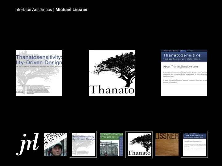
Webpage Webpage Icons Print Media Print Media Color Color Type II Type II Layout Layout Type I For this assignment, I made a logo for a project that I am doing for a different class. I had a real hard time finding the inspiration for what the logo should be, but once I had the idea in mind, creating the logo itself was fairly easy. I had a set of emotions I wanted to evoke with this logo. It’s planned to be part of a site that will help people manage digital assets of deceased friends and relatives, so creating a logo that was a neutral as possible was a must. I also wanted to evoke feelings of the cycle of life, and peace, and harmony. The site also has some major security and trust issues, so the logo has to look reassuring, and professional. It has to tell the viewer that they can trust the site.
Webpage Webpage Print Media Icons Icons Color Color Type II Type II Layout Layout Type I For this project, I wanted to make a business card for a small custom furniture building company I may eventually start. The idea was to take a quarter inch thick 3″ square piece of red oak, and to somehow put my name and contact information onto it. In the past I’ve had success using a laser printer to print a template, and then to use a hot iron to transfer the toner from the paper to the oak. In the end, a fair amount of the toner transferred over, but the deep grain of the oak prevented it from being a complete success. I like the tangible quality of the card, and the idea of using a chunk of wood as a business card for a company.
Webpage Print Media Print Media Icons Icons Color Color Type II Type II Layout Layout Type I For this project, I created a website to go along with the poster I completed for the Color Exercise. Using the feedback from class, I created a site with static width content, a minimum of clutter, and clear hierarchy. In addition, I made an effort to reduce the number of links in a given page to the bare minimum, thus ensuring that the user visits all of the important pages. Finally, I did some color reworking on this version from the more drab colors I had originally used to more exciting and vivid ones.