Download
1 / 35
370 likes | 607 Views
...in a nutshell. What is Human-Computer Interaction?. Interaction!. Why bother?. Practitioner survey (2000) about 75 topics taught to computer science students HCI was second in terms of “knowledge gap” (where importance most exceeds current knowledge)

E N D
What is Human-Computer Interaction? Interaction!
Why bother? • Practitioner survey (2000) about 75 topics taught to computer science students • HCI was second in terms of “knowledge gap” (where importance most exceeds current knowledge) • User interfaces (UIs) are a major component of many computer systems • Up to 50% of all code is UI code • Some members of US Congress blamed bad UIs for failing to detect 9/11 terrorists
HCI people vs Computer Scientists Comp Sci people worry about making programs with functionality But don’t worry enough about whether the programs are awful to use HCI people want people to enjoy using computers, but don’t care much if they can actually perform tasks (exaggeration...) We need functionality + usability!
Interface design: 8 golden rules Strive for consistency Cater to universal usability Offer informative feedback Design dialogs to yield closure Prevent errors Permit easy reversal of actions Support internal locus of control Reduce short term memory load
1. Strive for consistency Most ignored, but most important Helps the user to acquire a consistent world model E.g., identical file dialogs in different parts of a program E.g., same terminology used throughout the program Exceptions should be understandable and limited in number E.g., don’t require confirmation for most operations, but should do for delete operation
When consistency breaks down • What happens when you click this symbol on the top-right of a window? • Shut down the program? • E.g. most programs • Or minimise? • E.g. Skype, Spotify, ...
2. Cater to universal usability Make sure users can configure your program to their needs / experience Working with text readers (Web) Configuring text size Configuringcolours Customising buttons/menu choices Defining shortcuts/macros for experts Linking to other tools
…or you may be sued! • RNIB (UK)threatened two large corporations with legal action concerning their websites • Both altered websites in exchange for anonymity • Disability Rights Commission (UK) investigated 1000 sites, 80% weren't accessible • Wrote to all threatening action if not remedied • Man successfully sued Olympics in Australia for inaccessible site (2000)
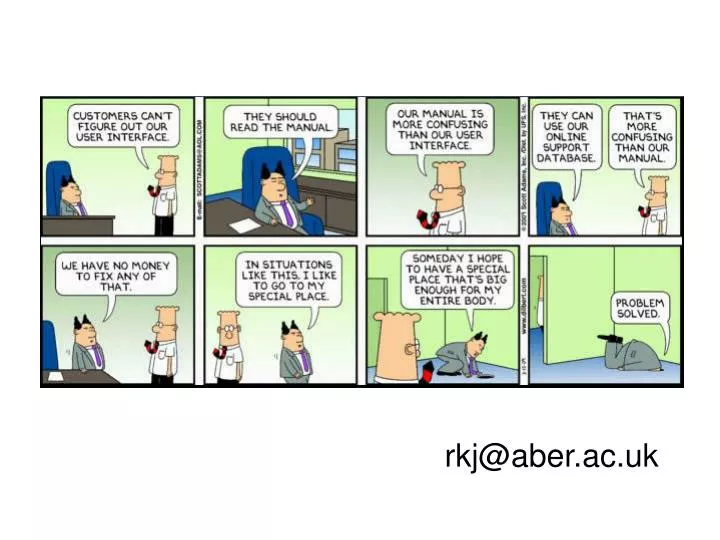
3. Offer informative feedback For every operator action, there should be some user feedback If it happens often and is minor, then feedback can be modest E.g. typing characters - make them appear, and how disconcerting it is when they don’t... If it is less frequent and is major, then response should be more substantial (e.g. rm *) Error messages...
Error messages cc:Mail
Error messages We are all too familiar with the use of terms such as "Fatal Error", "Critical Error", and "Severe Error"
4. Design dialogs to yield closure It’s no fun feeling lost/disorientated! Sequences of actions should be organised into groups with a beginning, a middle and an end For example, printing in Word on a PC: You get up a window, and there are a group of related items there, and you can flick from dialog to dialog, but you know that when you finally click Print or Cancel, you can forget about it For example, purchasing items via the internet has a clearly defined step-by-step process
5. Prevent errors Make error messages specific, positive in tone, and constructive Encourage correct actions Grey out inappropriate actions Selection rather than freestyle typing Automatic completion
6. Permit easy reversal of actions Where it is possible, this reduces user anxiety Where would be without the undo facility? Also, not deleting files at once, but sticking them in a waste basket
7. Support internal locus of control Experienced users like to think that they are in control Build systems that give the user the sense of being in charge and that the system responds to their commands The following build anxiety and dissatisfaction: Surprising interface actions Tedious actions Difficulty in producing action Good rules: Avoid a-causality, make users initiators rather than responders…
8. Reduce short-term memory load Look for places where people have to remember a lot of things Recognition vsrecall 7 chunks of information When designing: see how you can change the system so that users don’t have to rely on their memory E.g. if you can give people a choice rather than expect them to remember things, then their use of the system will be improved Use of menus, lists of choices... even just telling them what you are expecting - date format...
Which golden rules have been broken? Strive for consistency Cater to universal usability Offer informative feedback Design dialogs to yield closure Prevent errors Permit easy reversal of actions Support internal locus of control Reduce short term memory load
Designing for the Web • “Unless you're abnormally gifted, the best way to learn a craft thoroughly is to learn not only its central tenets but also its pitfalls” • http://www.webpagesthatsuck.com/ • E.g. Havenworks.com (2008) • http://webpagesthatsuck.smugmug.com/keyword/havenworks#!i=440032429&k=6bJAm&lb=1&s=O • http://www.webpagesthatsuck.com/worst-business-web-sites-of-2009-but-you-can-learn-something-from-them.html#axzz0f7dE3403 • So how do we avoid this??
Web use What’s the most important thing I should do if I want to make sure my Web site is easy to use?... “Don’t make me think!” Krug, p.11 Don’t make me think: A Common Sense Approach to Web Usability, Steve Krug, 2006
Web design vs reality “In the past ten years, I’ve spent a lot of time watching people use the Web, and the thing that has struck me most is the difference between how we think people use Web sites and how they actually use them.” Krug, p.21
Web design: conclusions Design for scanning, not reading Visual hierarchy Visual contrast - size, bold, colour Important things = visually prominent Related things = spatially close, nested Avoid “noise" Use conventions Make clear what's clickable Use underline and/or colour coding Less is more Cut half the number of words, then cut half again!
Summary Importance of HCI Make sure your interfaces are usable! Use the principles to guide your design Use the eight golden rules When designing for the Web, design for scanning Don’t make me think!