Download
1 / 6
60 likes | 72 Views
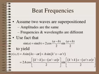
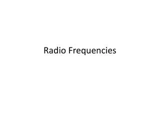
Frequencies. Y axis, X axis. Y Axis—typically shows frequencies. Hint: think “Y on the left, X on the bottom…” OR Remember this? Y = f(X). X Axis—typically shows values/value categories. Bar Graph—Nominal Level Measure. Frequency. Frequency Polygon—Interval or Ratio Level of Measures.

E N D
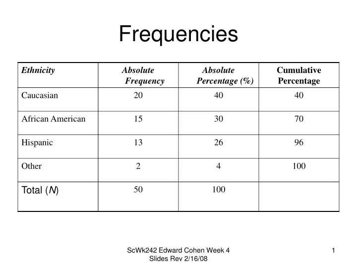
Frequencies ScWk242 Edward Cohen Week 4 Slides Rev 2/16/08
Y axis, X axis Y Axis—typically shows frequencies Hint: think “Y on the left, X on the bottom…” OR Remember this? Y = f(X) X Axis—typically shows values/value categories ScWk242 Edward Cohen Week 4 Slides
Bar Graph—Nominal Level Measure Frequency ScWk242 Edward Cohen Week 4 Slides
Frequency Polygon—Interval or Ratio Level of Measures 120 100 Number of clients 80 60 40 3 6 9 12 15 18 21 Annual income (in thousands of dollars) ScWk242 Edward Cohen Week 4 Slides
Histogram—Ordinal, Interval or Ratio Level of Measures 10 8 Number of children 6 4 2 >8 0 1-2 3-4 5-6 7-8 Number of serious behavioral incidents ScWk242 Edward Cohen Week 4 Slides
Plus Frequency Polygon 10 8 Number of children 6 4 2 >8 0 1-2 3-4 5-6 7-8 Number of serious behavioral incidents ScWk242 Edward Cohen Week 4 Slides