Download
1 / 35
350 likes | 356 Views
This guide explains how to calculate the mean and standard deviation, sample size, minimum and maximum values, and create a range of data for house-fly wing measurements. It also demonstrates how to create a frequency distribution and a normal distribution graph in Microsoft Excel.

E N D
Frequencies and the normal distribution CSC 152 (Blum)
Calculate the mean (average) and standard deviation of the House –fly wing data CSC 152 (Blum)
Calculate the sample size (count) of the data CSC 152 (Blum)
Calculate the minimum and maximum of the data CSC 152 (Blum)
Make a range of data starting at the Min plus 0.00001 and going to the Max by 0.1’s CSC 152 (Blum)
Warning: Array formula • Array formulas have results that span several cells instead of just one. • They require: • Highlighting enough cells for the complete answer • Clicking Ctrl-Shift-Enter instead of just Enter. • If you attempt to edit part of an array formula result, problems occur. Use the Esc key to get out of it. CSC 152 (Blum)
Highlight cells D2:D21 (for the answer) and insert the formula =FREQUENCY(A2:A101,C2:C21) and then hit Ctrl-Shift-Enter CSC 152 (Blum)
A frequency is the number of times something occurs – in this case the values up to and including 3.6, then the values between 3.6 (exclusive) and 3.7 (inclusive), etc. CSC 152 (Blum)
Make a quick (unformatted, un-designed) XY Scatter graph CSC 152 (Blum)
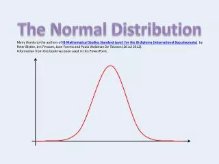
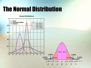
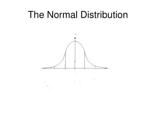
Normal distribution CSC 152 (Blum)
Use Excel’s formula for the normal distribution Notice that we have used absolute addressing for the mean B$2 and standard deviation B$4. That means when the formula is copied elsewhere the 2 and 4 are held fixed. The 4th argument is whether or not we want to sum the distribution everything from negative infinity up to and including a value – we said no. CSC 152 (Blum)
Before comparing we need two more steps. The first is to divide the frequencies by the sample size turning them effectively into probabilities Instead of saying the value 4.2 occurred 7 times in a sample size of 100, we say 4.2 occurred 0.07 or 7% of the time. Note the count requires absolute addressing. CSC 152 (Blum)
The normal distribution has to be multiplied by the Δx – the separation between our values We had gone up by 0.2’s instead of by 0.1’s there would be roughly half as many Frequencies with roughly twice the value they have now. CSC 152 (Blum)
Highlight columns C, F & G (only where there’s data) and Insert an XY-Scatter chart. To highlight non-consecutive columns: highlight the first column then hold down the Ctrl key while highlighting the second (and third) column. Then let go of Ctrl. CSC 152 (Blum)
Apply a Chart Layout (e.g. 1) under Design. CSC 152 (Blum)
Change the title and axis labels CSC 152 (Blum)
Format the axis to have a Minimum of 3 CSC 152 (Blum)
Right click on a data point and choose Select Data CSC 152 (Blum)
Select a data set, click Edit and give the series a name. CSC 152 (Blum)
Result – see legend CSC 152 (Blum)
Right click on the second (normal dist.) series and choose Change Format Data Series. Choose the Paint bucket (Fill & Line). Choose Line, Solid Line and pick a color CSC 152 (Blum)
And on Marker choose None CSC 152 (Blum)
Result CSC 152 (Blum)
Histogram: highlight columns C & D and choose Insert Column Chart CSC 152 (Blum)
Right click and choose Select Data CSC 152 (Blum)
Highlight Series 1 and click Remove CSC 152 (Blum)
Highlight Series 2 and click Edit under Horizontal Axis Labels CSC 152 (Blum)
Then highlight the C column and click OK CSC 152 (Blum)
Right click on the x axis, Choose Format, choose Number, change the category to Number and set the Decimal place to 1 CSC 152 (Blum)
Result so far CSC 152 (Blum)
Choose a Layout (e.g. 7) and label axes CSC 152 (Blum)
Add a title (if you haven’t got one already). Design tab, Add Chart Element, … CSC 152 (Blum)
Right click on the columns and choose Format Data Series. Choose the gap width to be 0%. CSC 152 (Blum)
Choose a Solid Line and a Border Color. CSC 152 (Blum)
Result CSC 152 (Blum)