Download
1 / 15
190 likes | 235 Views
PRINCIPLES OF ART. Joseph Stella 1913 Battle of lights / Coney Island Oil. PRINCIPLES OF ART. Elizabeth Murray Things to Come Oil 1988. Balance Emphasis Harmony Variety Gradation Movement Rhythm Proportion Unity.

E N D
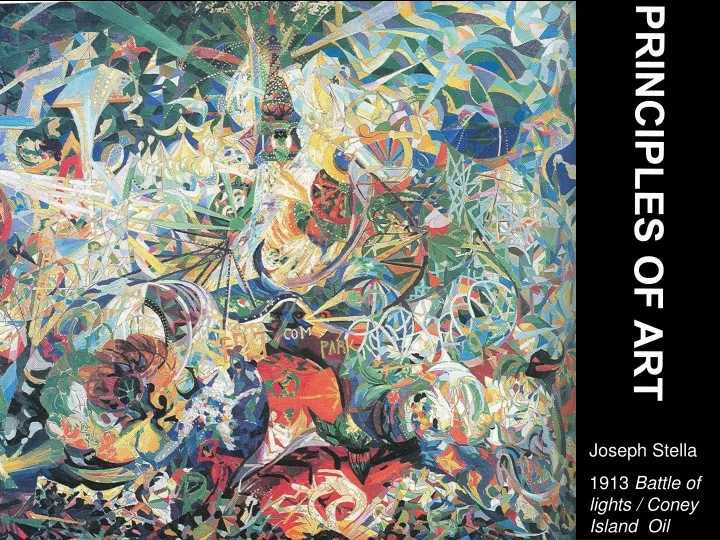
PRINCIPLES OF ART Joseph Stella 1913 Battle of lights / Coney Island Oil
PRINCIPLES OF ART Elizabeth Murray Things to Come Oil 1988 Balance Emphasis Harmony Variety Gradation Movement Rhythm Proportion Unity
Artists “design” their works by controlling and ordering the elements of art in some way. When trying to combine these different elements into an organized whole, they use certain principles or guidelines. A unified piece of art is a skillful blend of elements and principles to produce the best possible effect. The principles or art then describe the different ways artists can use each element. Learning the principles will help you understand the art work and the way, or style an artist chooses to work, and most importantly, how the art work is put together. Julio Larraz Papiamento 1987 Oil
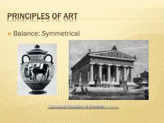
Balance Balance refers to a way of combining elements to add a feeling of equilibrium, or stability to a work of art. Of course, sometimes an artist will use a lack of balance on purpose to create a feeling of uneasiness. There are four types of balance, also known as composition. These four are Classical or Renaissance, Symmetrical Asymmetrical, and Radial. Balance is the principle of art concerned with equalizing visual forces or elements in a work of art. Radial Balance occurs when objects are positioned around a central point. Stained Glass Rose Window, Chartres Cathedral 1153
Symmetrical balance means a formal balance in which two halves of a work are perfectly balanced. Georgia O’Keefe. Black Cross with Stars and Blue, oil, 1929
Asymmetrical balance is more informal and takes into account such qualities such as hue, intensity, and value in addition to shape and size. All these qualities have an effect on the apparent weight of objects shown in a work of art . The Great Wave, by Katsushika Hokusai, 1829-32, woodcut print
Classical or Renaissance During the Renaissance…most compositions were based on a triangular design, or a combination of triangles. Leonardo Da Vinci Virgin of the Rocks.
Emphasis Emphasis, or contrast is a way of combining elements to stress the differences between those elements . Contrasting elements are often used to direct and focus the viewers attention on the most important part of a design. Artists try to avoid making art in which the same colors, values, lines shapes, forms, textures, and space relationships are used over and over again, They know that such art works are monotonous and boring. To avoid this artists introduce contrasts that create interest in their work. Emphasis is the principle of are that makes one part dominant over the other parts Cecila Beuax. Ethel Page. 1884 Oil Notice how the artist has used color and value to create emphasis.
Harmony Harmony is the principle of art that creates unity by stressing the similarities of separate, but related parts. In musical harmony, related tones are combined into blended sounds. Harmony is pleasing because the tones compliment each other. In visual harmony, related art elements are combined. The result is pleasing because the elements compliment each other. Used in certain ways, color can produce harmony in a work of art. Wassily Kandinsky Improvisation 28 1912 oil
Variety Variety is a way of combining elements to create interesting relationships. Artists use this principle when they want to increase the visual interests of their works. Variety is the principle of art concerned with difference or contrast. Note the different contrast of patterns, and textures in the painting by Max Weber. Max Weber ChineseRestaurant 1915 oil
Gradation Gradation refers to a way of combining elements by using a series of gradual changes in those elements…for example a gradual change from a large to a small shape, or a gradual change of a light to a dark color. Antonio Ruiz School Children 1936 oil
Movement Movement is the principle or art used to create the look and feel of action, and to guide the viewer’s eye throughout the work of art. Of course, in a two dimensional artwork, any look of motion is only an illusion. A horse shown galloping gives only the impression of movement. There are some three dimensional artworks, or sculptures that actually do move. Marcel Duchamp, Nude descending aStaircase. 1912 Oil
Rhythm Artists use rhythm in a work of art to convey visual movement. In this print, Escher creates a progressive rhythm of reptiles climbing out of a flat drawing and evolving into fully formed creatures, the reptiles the re-enter the two dimensional drawing. M.C. Escher Reptiles 1943 Lithograph
Proportion Proportion is the principle of art concerned with the size relationships of one part to another. Proportion can direct the viewers eye to a specific area or object in an artwork. For example, proportion is used to show the importance of a king. Diego Rivera Building of a City 1931Fresco Nigeria King with Servants 16th century Bronze
Unity In art, unity is the successful combination of the elements of art to create a wholeness and visual completion. Unity is like an invisible glue, it joins all the separate parts so that they look as if they belong together. JasperJohn’s map of the UnitedStates could be pulled apart, but it is unified by the harmonious limited color palette, or color choice. Jasper Johns, Map, 1961