Download
1 / 43
430 likes | 519 Views
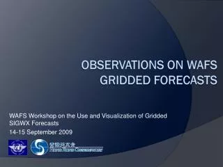
WAFS Workshop on the Use and Visualization of Gridded SIGWX Forecasts 14-15 September 2009. Visualization of WAFS Gridded Forecasts. Overview. Introduction Why interpolation? Horizontal strip chart Vertical cross-sectional chart Monochrome presentation Flight documentation

E N D
WAFS Workshop on the Use and Visualization of Gridded SIGWX Forecasts 14-15 September 2009 Visualization of WAFS Gridded Forecasts
Overview • Introduction • Why interpolation? • Horizontal strip chart • Vertical cross-sectional chart • Monochrome presentation • Flight documentation • Great circle / “dog-leg” flight routes • User survey • Way forward
Introduction • WAFSOPSG/4meeting agreed • spatial and temporal linear interpolation could be used for generating a route-specific wind/temp chart for long-haul flights. • study the applicability of interpolation on concatenated visualization of WAFS gridded forecasts of CB clouds, icing and turbulence.
Why interpolation? • Provide the MET information most relevant to the flight segment • Address problem with the large no. of gridded forecasts for each model run: • Icing: 6 layers, max/mean • CAT: 6 layers, max/mean • In-cloud turbulence: 5 layers, max/mean • CB cloud: horizontal extent, top and base heights • Above forecasts for 11 time steps (T+6h, T+9h, …, T+36h)
Simple joining T+12h, T+18h and T+24h (from W to E) • Discontinuities are still observed at the grid points where two charts join (green lines), but such discontinuities are less obvious as compared to concatenated SIGWX chart considered previously. T+12 h T+18 h T+24 h
Temporal linear interpolation • Consider temporal linear interpolation for a hypothetical flight route (on a Great Circle): Route: 0o N 20o E to 0o N 132.5o E Flight time: 15 hr
Horizontal strip chart • Linear interpolation for every consecutive hour • Using T+6h, T+12h, T+18h, T+24h forecast data • Route specific Strip Charts can be produced(width is configurable) flying from west to east flying from east to west Quality after interpolation: - main SIGWX features could be reproduced - smaller scale features smoothed out - intensity of features time-averaged
Vertical cross-sectional chart (JMA Chart) (Model Chart in 1976) • Similar concept • Adopted by WMO CAeM-VI in 1976 • Vertical forecast chart issued by JMA for airlines
Simple joining T+12h, T+18h, T+24h (from W to E) CAT CB top + Horiz. Extent Icing In-cloud Turb Discontinuities could be present at chart boundaries (red lines)
Temporal interpolation Manages to capture SIGWX features and smooth out discontinuities Back
Vertical cross-sectional chart • Welcomed by IFALPA pilot • Suggest to use median/max value of surrounding grid points to reflect probable weather condition on the flight route • 3×3 grid points of the same flight level are considered
Using median value within 3x3 grids: smooth out SIGWX features (c.f. previous) Using max value within 3x3 grids:tend to retain SIGWX features
Monochrome presentation • For operational use and suitable for ICAO Annex 3, monochrome charts are produced • Colour schemes are replaced by dotted / continuous / thick lines, grey shades or hatched areas • Simplified by presenting only two SIGWX “intensity” levels
Monochrome for flight document Two “intensity” levels
Further simplification by removing in-cloud turbulence and icing within CB Since CB implies in-cloud turband icing, they may be seen as redundant & could be removed
Issues with CB top/base heights Large CB base height? ? ? Zero/small CB top height?
Monochrome strip chart • Other strip charts could be handled similarly
Route-specific flight doc (horizontal) • Width of strip is configurable • Can be fitted into one page
Other High “at-a-glance” high/medium level horizontal SIGWX charts proposed by WAFCs • Issues: • SIGWX features like TC, VA, etc are not depicted • Extensive CB area causes concerns to pilots • Jetstream and icing info is limited (only for one FL) • CAT info is limited (only for three FLs) • Need users’ acceptance
Safety-related information needed Safety-related info (e.g. TC and VA) could be inserted when it is within certain distance from the flight route 110.2E 110.2E 2.8S 2.8S FELICIA 3.1N 42.3E FELICIA 3.1N 42.3E FELICIA 3.1N 42.3E
Great circle / dog-leg routes Example: flight route from Hong Kong to Vancouver with turning point at Anchorage - Hong Kong-Anchorage and Anchorage-Vancouver both lie on great circles
Great circle / dog-leg routes • The curved strip could be cut at the turning point - the duplicated area is indicated by the red dots. • Further straightening the strips requires different map projections, e.g. oblique Mercator / Stereographic projection and thus computer programming effort. Anchorage TP1 ( See also route-specific chart presented in WAFSOPSG/4-WP/16 )
Great circle / dog-leg routes Turning point Vertical cross-section forecast chart for “dog-leg” flight route Anchorage TP1
User survey • HKO conducted a user survey on the WAFS trial gridded forecasts (15 returns) • The survey results and our feedback regarding visualization issues are summarized below
Comments from users Existing SIGWX chart
Way forward • Visualization models should be user-oriented and subject to user acceptance • Support inclusion of all SIGWX features required by users (esp safety-related) • Time to consider high “at-a-glance” route-specific charts for flight doc • Proposed models need refinement (e.g. address CB top/base height issues, no. of SIGWX levels, width of strips etc)
Consecutive gridded forecasts of max icing potential at FL180 T+12h T+6h T+24h T+18h Back
Concatenated SIGWX chart ( Extracted from WAFSOPSG/4-WP/16 ) Back
Time-interpolation Back
Time-interpolation of forecasts T+6 h forecast T+12 h forecast T+18 h forecast T+24 h forecast flying from west to east (interpolated) flying from east to west (interpolated) Back
Vertical cross-sections for T+6h, T+12h, T+18h, T+24h T+12h T+6h T+24h T+18h Back
Concatenated route-specific wind/temp chart Route-specific concatenated WAFC London wind forecast chart at FL390 based on 20071010 00 UTC generated for the hypothetical flight route from VHHH to LIRF Back
Oblique map projection Oblique stereographic - Great circle which passing through the projection center become straight line Oblique Mercator - Great circle could be projected as an equator and thus a straight line (Figure courtesy of Swisstopo) (Figure courtesy of Wikipedia) Back