Download
1 / 7
70 likes | 78 Views
Scatterplots on the Nspire. I. . Using the Nspire to Graph Data Points. A) Press “Lists & Spreadsheet” icon (greenish excel icon) B) Go to the top of the first column and name it (x). C) Scroll to box “1” and enter your “x” values. 1) Press enter or arrow down after each entry.

E N D
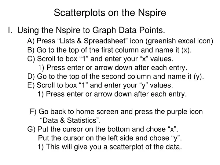
Scatterplots on the Nspire I.. Using the Nspire to Graph Data Points. A) Press “Lists & Spreadsheet” icon (greenish excel icon) B) Go to the top of the first column and name it (x). C) Scroll to box “1” and enter your “x” values. 1) Press enter or arrow down after each entry. D) Go to the top of the second column and name it (y). E) Scroll to box “1” and enter your “y” values. 1) Press enter or arrow down after each entry. F) Go back to home screen and press the purple icon “Data & Statistics”. G) Put the cursor on the bottom and chose “x”. Put the cursor on the left side and chose “y”. 1) This will give you a scatterplot of the data.
Scatterplots on the Nspire II.. Getting the Best Fit Line for the Scatterplot. A) With the scatterplot on your screen… 1) Press MENU, 4: Analyze, 6: Regression (Menu, 4, 6) B) Look at the shape and determine which regression you should use. 1) Straight line: 1: Show Linear (mx + b) 2) Parabola: 4: Show Quadratic 3) Cubic: 5: Show Cubic
Scatterplots on the Nspire III.. Using the best-fit line equation to make predictions. A) Round off any decimal values to appoximate #s. B) Go to the graph icon and type in the equation. C) Press Ctrl T to toggle the table on/off. C) Use the table to see the (x , y) pairs. 1) To look up a particular value for x … a) Scroll up/down until you find it -- or -- 2) With the table on the screen, a) Press Menu, 2:Table, 5: Edit Table Settings b) In the pop up window “Table Start” box, type in the x value you want to use. Menu, 2, 5, #
CW: Scatterplots 2) TUITION: The data pairs (x , y) give U.S. average annual public college tuition y (in dollars) x years after 1997. Approximate the best-fitting line for the data. ( 0 , 2271 ), (1 , 2360),(2 , 2430),(3 , 2506),(4 , 2562),(5 , 2727),(6 , 2928)
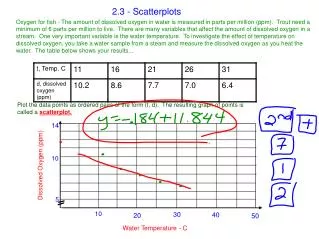
3) PHYSICAL SCIENCE: The diagram shows the boiling point of water at various elevations. Approximate the best-fitting line for the data pairs (x , y) where x represents the elevation (in ft) and y represents the boiling point (in degrees Fahrenheit). Then use this line to estimate the boiling point at an elevation of 14,000 feet. 14,000 ft ----------------------------------------------------- ?? ----- 12,000 ft ---------------------------------------------- 189.8° F ---- 10,000 ft ----------------------------------------- 193.6° F --------- 8,000 ft ------------------------------------ 197.4° F ---------------- 6,000 ft ----------------------------- 201.1° F ----------------------- 4,000 ft ----------------------- 204.8° F ----------------------------- 2,000 ft ------------------ 208.4° F ----------------------------------
4) MULTIPLE REPRESENTATIONS: The table shows the numbers of countries that participated in the Winter Olympics form 1980 to 2002. X 1980 1984 1988 1992 1994 1998 2002 Y 37 49 57 64 67 72 77 A: Making a list: Use the table to make a list of data pairs (x,y) where x represents years since 1980 and y represents the number of countries. B: Drawing a Graph: Draw a scatterplot of the data pairs from part (A). C: Writing an Equation: Write an equation that approximates the best-fitting line, and use it to predict the number of participating countries in 2014.
5) TAKS REASONING: The table shows manufacturers’ shipments (in millions) of cassettes and CDs in the U.S. from 1988 to 2002. Year 1988 1990 1992 1994 1996 1998 2000 2002 Cass 450.1 442.2 336.4 345.4 225.3 158.5 76.0 31.1 CD 149.7 286.5 407.5 662.1 778.9 847.0 942.5 803.3 A: Draw a scatter plot of the data pairs (year, shipments of cassettes). Describe the correlation shown by the scatterplot. B: Draw a scatter plot of the data pairs (year, shipments of CDs). Describe the correlation shown by the scatterplot. C: Describe the correlation between cassette shipments and CD shipments. What real-world factors might account for this?