Download
1 / 32
320 likes | 411 Views
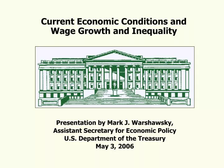
Current Economic Conditions and Wage Growth and Inequality. Presentation by Mark J. Warshawsky, Assistant Secretary for Economic Policy U.S. Department of the Treasury May 3, 2006. Treasury Department is the Financial Arm of the U.S. Government.

E N D
Current Economic Conditions and Wage Growth and Inequality Presentation by Mark J. Warshawsky, Assistant Secretary for Economic Policy U.S. Department of the Treasury May 3, 2006
Treasury Department is the Financial Arm of the U.S. Government • Treasury is a key contributor on all aspects of domestic and international economic policy. For example, most economic developments either influence tax receipts or are influenced by tax policy. • I head the Office of Economic Policy and am the chief adviser to the Treasury Secretary on domestic economic policy and developments. • Our office handles a wide range of issues. On the Micro side, we have assisted in the formulation of Treasury’s policy on pensions, terror risk insurance, flood insurance, Social Security, airlines, etc., and shepherd the Trustees’ Reports process. • On the Macro side, we monitor economic data in real time, respond to specific questions posed by Treasury policymakers and participate in setting the economic assumptions used in the President’s budget.
How is the Economy Doing? Real GDP is Strong and Forecast is for Continued Solid Growth Sources: Bureau of Economic Analysis and Blue Chip Consensus
Real GDP Growth is Strong and Forecast is for Continued Solid Growth • U.S. real GDP grew by 4.8 percent at an annual rate in 2006Q1, the strongest quarterly growth since 2003Q3. This was a bounce-back from slow growth of just 1.7 percent in 2005Q4 when personal spending on motor vehicles dropped and Federal spending fell. Over the two quarters growth averaged about 3.3 percent. • In Q1, personal consumption expenditures rose by a strong 5.5 percent at an annual rate and contributed 3.8 percentage points to the gain in GDP. In addition, investment in equipment and software posted a solid increase and federal spending turned up, chiefly for defense. • The current Blue Chip consensus sees quarterly GDP growth slowing somewhat over the course of 2006. For 2006, the panel sees 3.5 percent growth (4th/4th basis). For 2007, the panel sees 3.0 percent growth (4th/4th basis).
We’ve had Solid Job Growth Source: Bureau of Labor Statistics
We’ve had Solid Job Growth • The economy has generated more than 2.1 million jobs since March 2005, and nearly 5.2 million jobs since August 2003 (when the jobs total reached its post-recession trough). • So far this year (Jan, Feb, and Mar), non-farm payrolls have risen by an average of 197,000 per month. That is nearly 2.4 million jobs at an annual rate. • The unemployment rate was 4.7 percent in March, one of the lowest readings since mid-2001. Many economists think that an unemployment rate between 4.5 percent and 5.0 percent is consistent with low inflation.
Inflation Is Moderate, Though Energy Prices are Raising the Headline Number Sources: Bureau of Labor Statistics, Federal Reserve Board and Haver Analytics
Inflation Is Moderate, Though Energy Prices are Raising the Headline Number • Consumer price inflation was 3.4 percent during 2005, about the same as 2004, but up slightly from the previous two years. • The surge in energy prices is the main contributor to higher headline inflation. • Core inflation (which excludes volatile food and energy prices) in the U.S. has been relatively low, hovering around 2 percent. That suggests underlying inflation pressures are contained. • Inflation expectations -- reflected in the spread between the nominal 10-year Treasury note and the inflation-protected Treasury note (TIPS) -- are running just over 2-1/2 percent. • Low actual inflation helps to keep expected inflation low, which in turn helps to keep longer term interest rates from rising coincidentally with short rates.
Inflation Is Moderate, Though Energy Prices are Raising the Headline Number Source: Energy Information Administration and Haver Analytics
Inflation Is Moderate, Though Energy Prices are Raising the Headline Number • Average retail gasoline prices rose more than $0.40 per gallon in April and now stand at $2.92 per gallon. Higher crude oil prices are a key reason for the surge. • Oil prices rose above the $70 per barrel mark in late April on supply problems in Nigeria and Iraq along with concern over Iran. Global demand remains brisk and excess oil production capacity is low. • The phase-out of the gasoline additive MTBE and the transition to ethanol could create local supply disruptions, and is pushing gasoline prices higher. • The President has directed the EPA to allow waivers of local fuel requirements on a temporary basis. That could avert local supply shortages and may help to ease gasoline prices.
After Remaining Surprisingly Low For an Extended Period, Long Rates Have Risen Past 5 Percent Source: Federal Reserve Board and Haver Analytics
After Remaining Surprisingly Low For an Extended Period, Long Rates Have Risen Past 5 Percent • The Fed has raised the target funds rate 15 times over the past two years (375 basis points), after rates were at 40 year lows. • Long rates have been slower to react. Part of the answer is that expectations of future inflation remained low as short rates were rising. • Since early January long-term rates have risen about 70 basis points and are now above the 5 percent mark, but are still only back to the levels seen in the spring of 2002. • Low long-term rates have helped to stimulate the market for homes and have allowed consumers to accumulate and manage higher levels of debt.
The Discussion About Income Measures • The previous discussion focused on the traditional, broad macroeconomic indicators. But recently many observers have become more concerned about household or family income and, more specifically, the distribution of income. • There are many statistical measures of income, and they differ not only in what kinds of income they include but also in what demographic groups they represent. • Aspects of the discussion surrounding the growth in income and the income distribution are made more difficult because some income figures are mean measures, while others focus on the median.
The Discussion About Income Measures • Mean measures show more rapid growth very recently than during the same period in the previous business cycle. The national accounts’ real per-capita disposable income figure is an example. • But measures like the national accounts income figures may not reflect changes in the well-being of the “typical” household. • A popular measure of median income – which may more closely measure the typical household income – is the Census measure of median household money income. The Federal Reserve, through its Survey of Consumer Finances, has another measure of median income.
The National Accounts Measure of Real Per-Capita Income Shows a Consistent Rising Trend and Favorable Cyclical Comparisons
A Popular Alternative Measure is Real Median Household Money Income (Census)
The Federal Reserve’s Survey of Consumer Finances Also Has a Median Income Measure (but only for selected years)
The Distribution of Income is Also Important • The movement of the average or median income is often highlighted, but changes in the distribution of income are also important. • Understanding the broad movements in the distribution of income is difficult, partly because there are so many potential income measures. • The most popular income distribution measures come from the Census Bureau, the Federal Reserve, and the Internal Revenue Service. • The following measures all tell a similar story: the distribution is skewed, but has changed very little since 2001.
Distribution of Household Income (Census) • Census data show the top 20 percent of households receive more than 50 percent of the income as defined by this survey. • The long-term trend -- dating back to the early 1980s -- shows generally increasing income inequality in this Census survey. • But more recent data show that the income distribution shares have changed very little since 1990.
Distribution of Real Family Income (Federal Reserve) • Data are from the Federal Reserve’s triennial Survey of Consumer Finances, which provide us with information on the distribution of income, linked directly to “household” financial data. • Median income of households in the top income decile rose 2.3 percent from the 2001 to 2004 survey. • Gains were also recorded for the bottom quintile (+1.6 percent) and the 40 to 59.9 percent quintile. All other categories declined slightly.
Distribution of Real Adjusted Gross Income (IRS) • Data are from the IRS’s Statistics of Income report. • Pre-tax income shares for the top 1 percent of returns filed rose slightly more than 7 percentage points from 1990 to 2000, then fell about 4 percentage points from 2000 to 2003 (latest data available). • The share of income accounted for by the top 20 percent of returns (highest quintile) rose from 56 percent in 1990 to 62 percent in 2000, then declined to 60 percent in 2003. • The share of income accounted for by the second highest quintile (20-40%) rose from 19 percent to 20 percent, and the share of income accounted for by the third highest quintile (40-60%) rose from 11 percent to nearly 12 percent. • After-tax income shares moved similarly to pre-tax shares. The share of after-tax income accounted for by the top 20 percent of returns rose from 54 percent in 1990 to 62 percent in 2000, then declined to about 57 percent in 2003. • Comparing the two tables underscores a basic fact: the post-tax distribution is more equal than the pre-tax distribution.
Narrow The Focus to Wage Income • Each form of income (i.e. wages, capital gains, rental income) has its own distribution. To make an attempt to understand the movements in the most broadly defined measure of income, we need to narrow the focus to individual pieces of the income puzzle. • I want to focus on the distribution of wages. • Median usual weekly earnings is a wage measure that has a fairly long, consistent history, and also has information available on the distribution of wages (source is BLS). • Real median usual weekly earnings include earnings before taxes and other deductions and include any overtime pay, commissions or tips usually received. The measure excludes all self-employed persons and “fringe” benefits like employer pension and health contributions. We restrict ourselves to looking at full-time workers age 25 and over.
Description of Wage Income Movements • Data show that real median usual weekly earnings were largely flat from 1979 through about 1997. Earnings rose sharply through 2001, and have since continued to trend up, but more slowly. Earnings slipped in 2005. • Slowing inflation in late 1990s – aided by a sharp drop in energy prices -- helped raise the real weekly earnings figure. Energy price increases contributed to the 2005 slip. • Real median usual weekly earnings of full-time wage and salary workers are essentially unchanged from the business cycle peak in 2001Q1. • In the previous business cycle, this indicator was still about 1.5 percent below the 1990Q3 peak.
Male and Female Trends are Different • Wage growth has been better and more “even” than the last business cycle. Distribution of earnings is different for men and women. • In the previous cycle (89-94), male workers in the lowest earnings group saw their earnings contract by 4.3 percent. Male workers in the 25th and 50th percentile saw equally sharp declines in real earnings. • The current cycle (00-05) also shows a fall in real earnings for males in the lowest 10th percentile but it is smaller than the 89-94 period. In addition, real weekly earnings in the 25th and 50th percentiles were roughly unchanged in 2000-05, compared to sharp contractions in 89-94. • In the current cycle, the contraction in real earnings for females in the lowest 10th percentile has been smaller than the last cycle and gains in the 50th percentile have been slightly higher, while gains in the 90th percentile have been lower.
Health Care Costs Could Contribute to Observed Wage Inequality • Wages reflect just one part of the labor compensation contract. Rising health care costs have driven up employer health insurance contributions. • Economists recognize that increasing fringe benefits does not necessarily raise total labor compensation. It simply alters the distribution of compensation between wages and fringes. • There is less disparity between lower wage and higher wage workers in their employer contributions for health insurance. • The combination of health insurance and wage income shows less disparity – workers at the lower end of the wage distribution are getting a larger proportion of their labor compensation in health care insurance contributions. This could be especially important going forward, because health care compensation costs are about 10 percent of median wages, and health care costs are rising rapidly.
Some Observations about Income Inequality • There are many data sets from different sources and each is useful in its own way. But each has its own limitations. • Wage data help to highlight another analytical difficulty: trends are different across changing demographic groups, in this case, men and women. • Household incomes – roughly the Census, Fed, and IRS definitions – are changing mixtures of not only different income types, but different types of earners. • Understanding the changing distribution of income means understanding the dynamics of each of these factors.