Download

1 / 17
190 likes | 295 Views
2.4 Trends, Interpolation and Extrapolation. Line of Best Fit. a line that approximates a trend for the data in a scatter plot shows pattern and direction. Line of Best Fit. a line that approximates a trend for the data in a scatter plot shows pattern and direction.

E N D
Line of Best Fit • a line that approximates a trend for the data in a scatter plot • shows pattern and direction
Line of Best Fit • a line that approximates a trend for the data in a scatter plot • shows pattern and direction
How to Find the Line of Best Fit • The line of best fit should: • pass through as many points as possible • allow remaining points to be grouped equally above and below the line
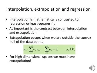
Why make a Line of Best Fit? • Helps us to make predictions by • INTERPOLATING • EXTRAPOLATING
Interpolating: Estimating a value BETWEEN two measurements in a set of data • Extrapolating: Estimating a value BEYOND the range of a set of data
Interpolating – what would the wife’s age be of a husband who is 57? Extrapolating - what would the wife’s age be of a husband who is 84?
The table below shows the sales of bottled water at a refreshment booth at the Canadian National Exhibition in Toronto for different days during a heat wave one summer. Dependent variable: Bottles sold Independent Variable: Temperature
500 450 400 350 300 250 200 150 100 50 20 24 28 32 36 40 44
500 450 400 350 300 250 200 150 100 50 20 24 28 32 36 40 44
Describe the relationship between the variables. • The warmer it is outside the more bottles of water you sell. • d) Identify any outliers. Should they be included in the data set? • (let’s discuss) • e) What does the ordered pair (29, 147) mean? • remember (x,y)!!!!
500 450 400 350 300 250 200 150 100 50 “Outlier” Order pair (29,147) 20 24 28 32 36 40 44
Predict how many bottles of water will be sold on a day when the temperature reaches 25°C. • This is an example of ___________________. • g) Predict how many bottles of water will be sold on a day when the temperature reaches 42°C. • This is an example of ___________________. • HW. p. 73 #2, 4, 6-8