Download
1 / 11
150 likes | 327 Views
In this informative presentation we go over responsive web design for beginners. <br>You will learn what responsive web design is and why your website should be responsive. You will also learn how to make your website responsive.<br><br>Topics include CSS3 media queries, Responsive Images and Fluid Layouts.

E N D
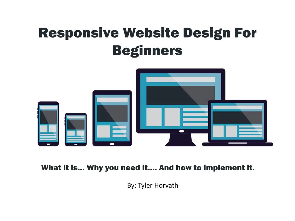
Responsive Website Design For Beginners What it is… Why you need it…. And how to implement it. By: Tyler Horvath
Introductions Who we are and what we do
Tyler Horvath CEO tytonmedia.com
What is Responsive Web Design? • Web Design approach to allow website to work on any device (mobile, tablet, TV, desktop, etc) • Uses HTML, fluid layouts and CSS3 media queries to change the layout based on the users device.
Why Do You Need Responsive Design? • Good for SEO • Visitors from Mobile • More conversions • Better Engagement 62% of companies that designed a website specifically for mobile had increased sales. (Source: Econsultancy)
Making Your Website Responsive Fluid Layouts Media Queries Responsive Images 2 1 3
Fluid Layouts • From fixed to fluid • Widths are percentages • Fluid layouts are the base • Work with CSS media queries
Responsive Images Adaptive Images • Most widely used • Gives images a 100% width to adapt to container • Not 100% full proof HISRC • Newer method • Uses JavaScript (jQuery) • Shows based on users internet speed
Media Queries CSS based rules for device-specific user experiences • Each device has specific rules for hiding and showing specific content • Min and Max device width with custom rules
Putting It All Together Fluid Layouts + Responsive Images + Media Queries =
Wrapping Up tytonmedia.com


![Intro to Adaptive Web Design [ChaDev Lunch]](https://cdn4.slideserve.com/7566148/intro-to-adaptive-web-design-dt.jpg)