Download
1 / 11
110 likes | 185 Views
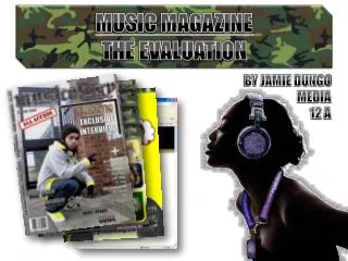
Music Magazine Evaluation. Brief Introduction.

E N D
Music Magazine Evaluation
Brief Introduction For this section of the course we were required to make a music magazine that had appealed to a genre specific target audience. Before actually producing my magazine I had to consider certain factors that may impact of the production of my magazine such as: the genre of the magazine, my target audience, what I will be producing and if I would fully conform to the conventions of ma genre specific magazine. My magazine bases itself around R&B and Hip-Hop; two common genres to my preferred target audience. My target audience is an audience around areas in east London. The title of my magazine is “BEATS”, I used this because it not only attracts the audience but has deep connotations that different readers will distinguish between different meanings. I initially began my magazine by drawing sketches and planning it through processes of experimenting on certain programmes such as Photoshop and paint.net.
Forms and Conventions The initial aim of my magazine was to challenge the forms and conventions that magazines had bounded to. I considered magazines that situated around R&B and Hip-Hop. As I had progressed by producing my magazine I usually noticed a conforming pattern amongst other magazine such as “XXL” and “VIBE”. My magazine “BEATS” includes profound connotations to it, its merges with the idea of a prime and bold magazine that is essentially widely-known to readers. My magazine as you can see is the final production of my magazine, it conforms well to substantially the sell lines, the bold masthead and the feature articles amongst the page. In contrast the boundaries challenging the forms and conventions of my magazine are exemplified by the bold masthead, insinuating a colossal yet appealing title that represents the theme of the magazine. My picture of my artist also conforms to the general image of an R&B magazine.
Forms and Conventions The barcode in both ways conforms and subverts to an R&B and Hip-Hop magazine. It contains the common barcode any magazine will have but with an R&B and Hip-Hop magazine there will also be the publisher logo, the issue of the magazine and the price. It also conforms to the broad R&B and Hip-Hop magazine by including a bold, sophisticated masthead placed on the top of the front cover and includes feature articles along the side of the cover. There is also a frequent play on words with the feature articles which again like most magazines appeals to the reader and draws their attention. The image of my magazine conforms well with RnB magazines. The image is placed centre of the page which is common for magazines to do. Also as I designed my front cover I considered the subtle and subliminal elements that conforms to the conventions of real life music magazines.
Forms and Conventions My contents page generally conforms to the common contents page of a RnB magazine. My contents page believably has high levels of professionalism and a good clear precision in conventions a RnB magazine. The stylistic features I tried to incorporate was the separation of the word ‘contents’. In addition to that, the colour scheme of the text doesn’t stray too far from the background photo. The font almost blends in with the image and the background. There is also detailed effects on the background of the “bricks”, the image creates a sense of street and yet still professionalism. The image was taken at an alley during mid-day to emphasise the lighting. As you can see the image consists of bright lighting that illuminates the whole contents page itself. The image of the artist shows a very stylistic yet apathetic look.
Forms and Conventions The double page spread of my magazine involved the most writing. However it was the most interesting the thing I had done in part of the whole task. You see the artist standing in a contemplative and casual position. The background of the main image here enforces the idea of the artists own environments connoting his urban nature. His devious and mysterious smirk insinuates that his perceptions of music as a whole is a colossal merge between his life and his rap culture. Again, I didn’t deviate too far from the conventions already established by existing magazines, instead trying to add my own stylistic image. Conventions incorporated into my double page spread include: a quote by the artist which connotes his life and a general biography if the artist. However there are subversive features in the double page spread such as the extra image, this had been used to show to different sides of the artist. Promoting both his life and rap culture.
Representational Issues As my magazine is essentially a instrument used to portray the culture of hip-hop and RnB, my magazine represents the listeners of these genre’s. Stereotypically, these listeners are people from destitute environments and are more often than not of an Afro-Caribbean race. Sex, drugs, dance, food, clothing, violence and racial affairs are all factors that make hip hop what it is today. The use of profanity and colloquial slang depicts the audience of my magazine it connotes people that have a limited language bank and the only way in which they can emotionally express as themselves is through swearing. Also the use of the colloquial language describes the audience through a dire image, that intimates their social status.
Target Audience The broad audience of my magazine will be males aged around 13 – 26. This demographic is not entirely representative of the whole hip-hop and RnB generation but a reflection of today’s most consecutive artists that have a key prime influence towards young audiences. However my magazine is not gender specific but is presented to both the male and female viewers. I want to reinforce the encouragement of key female artists prime in ma genre such as Nicki Minaj and Lil Kim. Also ironically my magazine consists of features and elements that could estrange a large portion of my targeted population. I believe the mature yet very street tone of the magazine appeals to the youth not for the way it is read, but rather all the factors that have gone in to creating this overall conflicting ambience. The mature and formal writing in addition to the ambient yet gritty, urban images used really represents the culture of hip-hop and RnB.
Institutions With my magazine, I decided that my magazine will be sold in well thought retailers. This is to emphasise and magnify that my magazine is not only for a single demographic but to all hip-hop and RnB enthusiasts. I also chose to promote the release of my magazine through websites and TV. I chose to do advertise my magazine through this way because, both TV and internet are popular with initializing the endorsement of music, this would also be good exposure for the artists published in my magazine.
Technical & Construction issues Through the use of many of technological software's through the creation of my magazine, I had to experiment on and constantly redraft that I achieved the best results I can. Also when stumbling upon the creation of my magazine I found that conforming to the traditional styles of the general magazines is to not deviate away from being creative and conceptive, even though the most original magazines are the most ingenious it is also that you should be careful when deviating away form these conventions. Additionally I found that Photoshop had been an inventive software that allowed my images to be more artistic, also with the unique tools in the programme it allowed me to augment my images that would appeal to my target audience.
Comparisons Looking back at the preliminary task and the main task, I can say that the use of the preliminary task helped my enhancing skills making the main task more appealing and attractive. Also the use of the preliminary helped me improve my skills of creating a magazine that will be more professional. With both tasks I used publisher and Photoshop, I gradually became more improved at designing my tasks. I also noticed that my magazine in the preliminary task, was much harder and a practice for the production of my main task, the skills I gained from producing it made it much easier for me to use Photoshop and make my pictures more professional.