Download
1 / 23
230 likes | 233 Views
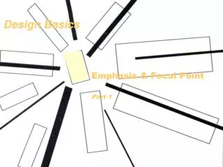
5.1 | Design Basics. The Principles. C ontrast. H armony. A lignment. P roximity. S implicity. They are important to remember. Always. The Principles. Contrast

E N D
The Principles Contrast Harmony Alignment Proximity Simplicity They are important to remember. Always.
The Principles • Contrast • One photo or area must be at least two times larger than the next largest shape. Headlines should be obviously larger than other text. • Harmony • Alignment • Proximity • Simplicity • .
contrast Pantone Project, Paul Octaviours [IL]
The Principles • Contrast • Harmony • Every shape, color and font should be repeated at least once, usually more, on a design. • Alignment • Proximity • Simplicity
HARMONY Les Miserables Movie
harmony Lake & Sumpter Magazine Design by Jaime Ezra Mark
The Principles • Contrast • Harmony • Alignment • Think grids. Think even spacing. Photos and text boxes should align even when on separate facing pages, otherwise known as a Double Page Spread. • Proximity • Simplicty
alignment Lululemon
alignment Lake & Sumpter Magazine Design by Jaime Ezra Mark
The Principles • Contrast • Harmony • Alignment • Proximity • Similar ideas, concepts or topics should be closer to one another than unrelated ones. • Simplicity
proximity Projectforawesome.com Design by Karen Kavett
proximity Design by Liz Rankin, Graphic Designer
The Principles • Contrast • Harmony • Alignment • Proximity • Simplicity • Unnecessary visuals and text are eliminated, no matter how much you love them.
simplicity Starbucks Corp.
simplicity Heinz Ketchup
TYPOGRAPHY • Watch the video “An Intro to Typography” by Karen Kavett on YouTube. • Review the following slides, taking notes so you can complete the scavenger hunt later.
Type styles SERIF fonts have little feet on them. In general, serif fonts are easier to read in long text blocks. “SANS SERIF”literally means “without serifs.” Sans Serif type does not have feet on the letters. Full of personality, DECORATIVE fonts should be reserved for headlines and should be used in moderation. Traditional and classic, SCRIPT fonts are often difficult to read, so they should be reserved for headlines and used in moderation.
Combining fonTs Add energy with contrast
Type sizes Type is measured in points. It is measured from the bottom of a descender to the top of an ascender. These are all 36 point type.
Text alignment ALIGN LEFT JUSTIFIED With his head in his hands and the sweat coming down his face, sophomore Brandon Gonzales knew it was all worth it when he placed third in the district race. He finished with a time of 20:06 to lead the junior varsity team. With his head in his hands and the sweat coming down his face, sophomore Brandon Gonzales knew it was all worth it when he placed third in the district race. He finished with a time of 20:06 to lead the junior varsity team. ALIGN RIGHT CENTERED With his head in his hands and the sweat coming down his face, sophomore Brandon Gonzales knew it was all worth it when he placed third in the district race. He finished with a time of 20:06 to lead the junior varsity team. With his head in his hands and the sweat coming down his face, sophomore Brandon Gonzales knew it was all worth it when he placed third in the district race. He finished with a time of 20:06 to lead the junior varsity team.
Assignment • You will find examples from the handout on-line. You will not be taking pictures. Find examples, copy and paste them into a Word document. When you are finished, email the assignment to me with your name on it. Please label each example.