Download
1 / 68
700 likes | 881 Views
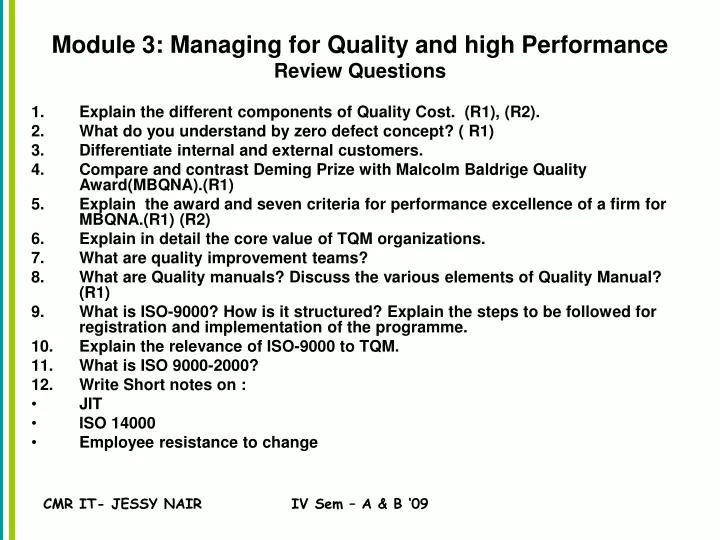
Module 3: Managing for Quality and high Performance Review Questions. Explain the different components of Quality Cost. (R1), (R2). What do you understand by zero defect concept? ( R1) Differentiate internal and external customers.

E N D
Module 3: Managing for Quality and high PerformanceReview Questions • Explain the different components of Quality Cost. (R1), (R2). • What do you understand by zero defect concept? ( R1) • Differentiate internal and external customers. • Compare and contrast Deming Prize with Malcolm Baldrige Quality Award(MBQNA).(R1) • Explain the award and seven criteria for performance excellence of a firm for MBQNA.(R1) (R2) • Explain in detail the core value of TQM organizations. • What are quality improvement teams? • What are Quality manuals? Discuss the various elements of Quality Manual? (R1) • What is ISO-9000? How is it structured? Explain the steps to be followed for registration and implementation of the programme. • Explain the relevance of ISO-9000 to TQM. • What is ISO 9000-2000? • Write Short notes on : • JIT • ISO 14000 • Employee resistance to change IV Sem – A & B ‘09
Module 4 :Process Management and Quality Control Tools IV Sem – A & B ‘09
Tools and Techniques for Quality Management Strategic Statistical (7) Tools Radical aids • Histograms • Pareto Charts • Cause and Effect Diagrams • Run Charts • Scatter Diagrams • Flow Charts • Control Charts • Planning • Improvement Benchmarking Business Process Reengineering (BPR) Six Sigma QFD Concurrent Engineering Tools for Quality Planning Continuous Improvement Market Research QFD Concurrent Engineering New Tools / Managerial Tools Demings PDCA Benchmarking Kaizen JIT Poka Yoke Zero Defect IV Sem – A & B ‘09
Seven Quality Tools The Seven Tools • Histograms • Pareto Charts • Cause and Effect Diagrams • Run Charts • Scatter Diagrams • Flow Charts • Control Charts IV Sem – A & B ‘09
Ishikawa’s Basic Tools of Quality • Kaoru Ishikawa developed seven basic visual tools of quality so that the average person could analyze and interpret data. • These tools have been used worldwide by companies, managers of all levels and employees. Kaoru Ishikawa (Ishikawa Kaoru) (1915-1989) was a Japanese University professor and influential quality management innovator. Best known for the Ishikawa or Cause and Effect (CE) diagram (also known as Fishbone Diagram) that are used in the analysis of industrial process. He is considered one of the Quality Gurus. IV Sem – A & B ‘09
Three SQC Categories Statistical quality control (SQC) is the term used to describe the set of statistical tools used by quality professionals SQC encompasses three broad categories of; Descriptive statistics e.g. the mean, standard deviation, and range Statistical process control(SPC) Involves inspecting the output from a process Quality characteristics are measured and charted Helpful in identifying in-process variations Acceptance sampling used to randomly inspect a batch of goods to determine acceptance/rejection Does not help to catch in-process problems IV Sem – A & B ‘09
Sources of Variation Variation exists in all processes. Variation can be categorized as either; Common or Random causes of variation, or Random causes that we cannot identify Unavoidable e.g. slight differences in process variables like diameter, weight, service time, temperature Assignable causes of variation Causes can be identified and eliminated e.g. poor employee training, worn tool, machine needing repair IV Sem – A & B ‘09
Histograms • Histogram Defined • A histogram is a bar graph that shows frequency data. • Histograms provide the easiest way to evaluate the distribution of data. IV Sem – A & B ‘09
Histograms • Creating a Histogram • Collect data and sort it into categories. • Then label the data as the independent set or the dependent set. • The characteristic you grouped the data by would be the independent variable. • The frequency of that set would be the dependent variable. • Each mark on either axis should be in equal increments. • For each category, find the related frequency and make the horizontal marks to show that frequency. IV Sem – A & B ‘09
Histograms • Examples of How Histograms Can Be Used • Histograms can be used to determine distribution of sales. • Say for instance a company wanted to measure the revenues of other companies and wanted to compare numbers. IV Sem – A & B ‘09
Pareto Charts • Pareto Chart Defined • Pareto charts are used to identify and prioritize problems to be solved. • They are actually histograms aided by the 80/20 rule adapted by Joseph Juran. • Remember the 80/20 rule states that approximately 80% of the problems are created by approximately 20% of the causes. IV Sem – A & B ‘09
Pareto Charts • Constructing a Pareto Chart • First, information must be selected based on types or classifications of defects that occur as a result of a process. • The data must be collected and classified into categories. • Then a histogram or frequency chart is constructed showing the number of occurrences. IV Sem – A & B ‘09
Pareto Charts • An Example of How a Pareto Chart Can Be Used • Pareto Charts are used when products are suffering from different defects but the defects are occurring at a different frequency, or only a few account for most of the defects present, or different defects incur different costs. • What we see from that is a product line may experience a range of defects. The manufacturer could concentrate on reducing the defects which make up a bigger percentage of all the defects or focus on eliminating the defect that causes monetary loss. • Actual chart is on the next slide • Example and chart were obtained from: <www.yourmba.co.uk/pareto_diagram.htm> IV Sem – A & B ‘09
Pareto Charts IV Sem – A & B ‘09
Cause and Effect Diagrams • Cause and Effect Diagram Defined • The cause and effect diagram is also called the Ishikawa diagram or the fishbone diagram. • It is a tool for discovering all the possible causes for a particular effect. • The major purpose of this diagram is to act as a first step in problem solving by creating a list of possible causes. IV Sem – A & B ‘09
Cause and Effect Diagrams • Constructing a Cause and Effect Diagram • First, clearly identify and define the problem or effect for which the causes must be identified. Place the problem or effect at the right or the head of the diagram. • Identify all the broad areas of the problem. • Write in all the detailed possible causes in each of the broad areas. • Each cause identified should be looked upon for further more specific causes. • View the diagram and evaluate the main causes. • Set goals and take action on the main causes. IV Sem – A & B ‘09
Cause and Effect Diagrams • An Example of When a Cause and Effect Diagram Can Be Used • This diagram can be used to detect the problem of incorrect deliveries. • Diagram on next slide • Diagram obtained from: <http://www.hci.com.au/hcisite/toolkit/causeand.htm> • When a production team is about to launch a new product, the factors that will affect the final product must be recognized. The fishbone diagram can depict problems before they have a chance to begin. IV Sem – A & B ‘09
Cause and Effect Diagrams Diagram of the Incorrect Deliveries Example: IV Sem – A & B ‘09
Scatter Diagrams • Scatter Diagrams Defined • Scatter Diagrams are used to study and identify the possible relationship between the changes observed in two different sets of variables. IV Sem – A & B ‘09
Scatter Diagrams • Constructing a Scatter Diagram • First, collect two pieces of data and create a summary table of the data. • Draw a diagram labeling the horizontal and vertical axes. • It is common that the “cause” variable be labeled on the X axis and the “effect” variable be labeled on the Y axis. • Plot the data pairs on the diagram. • Interpret the scatter diagram for direction and strength. IV Sem – A & B ‘09
Scatter Diagrams • An Example of When a Scatter Diagram Can Be Used • A scatter diagram can be used to identify the relationship between the production speed of an operation and the number of defective parts made. IV Sem – A & B ‘09
Scatter Diagrams • An Example of When a Scatter Diagram Can Be Used (cont.) • Displaying the direction of the relationship will determine whether increasing the assembly line speed will increase or decrease the number of defective parts made. • Also, the strength of the relationship between the assembly line speed and the number of defective parts produced is determined. • Example obtained from: <http://www.sytsma.com/tqmtools/Scat.html> IV Sem – A & B ‘09
Flow Charts • Flow Charts Defined • A flow chart is a pictorial representation showing all of the steps of a process. IV Sem – A & B ‘09
Flow Charts • Creating a Flow Chart • First, familiarize the participants with the flow chart symbols. • Draw the process flow chart and fill it out in detail about each element. • Analyze the flow chart. Determine which steps add value and which don’t in the process of simplifying the work. IV Sem – A & B ‘09
Flow Charts • Examples of When to Use a Flow Chart • Two separate stages of a process flow chart should be considered: • The making of the product • The finished product IV Sem – A & B ‘09
Run Charts • Run Charts Defined • Run charts are used to analyze processes according to time or order. IV Sem – A & B ‘09
Run Charts • Creating a Run Chart • Gathering Data • Some type of process or operation must be available to take measurements for analysis. • Organizing Data • Data must be divided into two sets of values X and Y. X values represent time and values of Y represent the measurements taken from the manufacturing process or operation. • Charting Data • Plot the Y values versus the X values. • Interpreting Data • Interpret the data and draw any conclusions that will be beneficial to the process or operation. IV Sem – A & B ‘09
Run Charts • An Example of Using a Run Chart • An organization’s desire is to have their product arrive to their customers on time, but they have noticed that it doesn’t take the same amount of time each day of the week. They decided to monitor the amount of time it takes to deliver their product over the next few weeks. IV Sem – A & B ‘09
Control Charts • Control Charts Defined • Control charts are used to determine whether a process will produce a product or service with consistent measurable properties. IV Sem – A & B ‘09
Control Charts • Steps Used in Developing Process Control Charts • Identify critical operations in the process where inspection might be needed. • Identify critical product characteristics. • Determine whether the critical product characteristic is a variable or an attribute. • Select the appropriate process control chart. • Establish the control limits and use the chart to monitor and improve. • Update the limits. IV Sem – A & B ‘09
Control Charts • An Example of When to Use a Control Chart • Counting the number of defective products or services • Do you count the number of defects in a given product or service? • Is the number of units checked or tested constant? IV Sem – A & B ‘09
Class Activity Consider you are the student coordinator incharge of conference being conducted by MBA dept on 7th and 8th May. Chart your plan of action in a Flow Chart to make a presentation to the conference committee which includes : Prez, CMRIT, Principal CMRIT, Coordinator MBA Dept. IV Sem – A & B ‘09
Summary This presentation provided learning material for each of Ishikawa’s seven basic tools of quality. Each tool was clearly defined with definitions, a step-by-step process and an example of how the tool can be used. As seen through the presentation, these tools are rather simple and effective. IV Sem – A & B ‘09
Works - Cited • Histograms and Bar Graphs. <http://www.shodor.org/interactivate/lessons/sm3.html> • Your MBA: The Business Study Reference Site. http://yourmba.co.uk/pareto_diagram.htm • Hci Home Services. Cause and Effect Diagram. http://hci.com.au/hcisite/toolkit/causeand.htm • Scatter Diagram. http://sytsma.com/tqmtools/Scat.html • Flowchart. <http://http://deming.eng.clemson.edu/pub/tutorials/qctools/flowm.htm> • Run Charts/Time Plot/ Trend Chart. <http://www.deming.edu.clemson.edu/pub/tutorials/qctools/runm.htm> • Foster Thomas S. Managing Quality An Integrative Approach. New Jersey: Prentice Hall, 2001 IV Sem – A & B ‘09
Question: • What are costs of quality? • Task: Create your list of quality costs and share with the class. • What is the relationship between quality and productivity? IV Sem – A & B ‘09
Why Metrics! • A strategy without metrics is just a wish. And metrics that are not aligned with strategic objectives are a waste of time. • Emery Powell • Be careful what you measure -- you might just get it. • If you don’t keep score, you’re only practicing. • Tom Malone • You get what you inspect, not what you expect. IV Sem – A & B ‘09
The Real Bottom Line: Mission and Measures • One of the most powerful management disciplines, the one that more than any other keeps people focused and pulling in the same direction, is to make an organization’s purposes tangible. Managers do this by translating the organization’s mission – what it, particularly, exists to do – into a set of goals and performance measures that make success concrete for everyone. This is the real bottom line for every organization – whether it’s a business or a school or a hospital. Its executives must answer the question, “Given our mission, how is our performance going to be defined?” • Magretta & Stone, Management. 2002, p. 129 IV Sem – A & B ‘09
Why Metrics Now! • The “never satisfied” customer. • Managing the “total” supply chain. • Shrinking product life cycles. • More (not necessarily better) data. • Profit margin squeezes. • Presence of an increasing number of alternatives. IV Sem – A & B ‘09
So What • Surviving in this new environment means working with: • Less lead time • Less inventory • Less cost • More reliance on the supply chain • Surviving means having “better” metrics. IV Sem – A & B ‘09
What are Metrics? • A verifiable measure stated in either quantitative (e.g., 95% inventory accuracy) or qualitative (e.g., as evaluated by our customer,we are providing above average service) terms. A metric is intended to close the gap between value, strategy, and specific activities. • Metrics • Measure, direct, teach. IV Sem – A & B ‘09
Cost of Quality IV Sem – A & B ‘09
Quality cost A quality cost is considered to be any cost that the company would not have incurred if the quality of the product or service were perfect. Quality costs: Total quality costs are the sum of : prevention costs, appraisal costs, and internal and external failure costs IV Sem – A & B ‘09
Classifying Quality Costs IV Sem – A & B ‘09
Quality costs increase over time Liability costs Failure found by customer Field repair costs Failure Costs Failure found at installation Failure found at final inspection Failure found at onset of manufacture Failure found during design phase Prevention Costs Time when failure found IV Sem – A & B ‘09
Hidden Costs of Poor Quality Reprocessing Customer returns Rejects Warranty expenses Lost sales Loss of goodwill Overtime to correct errors Process downtime Extra inventory Delays Extra process capacity Premium freight costs Extra inventory IV Sem – A & B ‘09
IMPLICATIONS OF THESE COSTS NEXT LET US LOOK AT: FINANCIAL AND NON-FINANCIAL MEASURES OF MEASURING CUSTOMER SATISFACTION AND INTERNAL PERFORMANCE Dr Robert Kaplan and Dr David Norton developed that takes into account Financial and non-financial measures in internal performance, customer satisfaction, etc. IV Sem – A & B ‘09
BALANCED SCORE CARDGaining widespread popularity now, as many companies are turning to the balanced score card approach. BSA takes into account measures from accounting, operations, human resources, customers and other stake holders in order to arrive into a more integrative and broader measure of performance. IV Sem – A & B ‘09
Balanced Score Card TQM Element Financial Measure Non-financial Measure Customer satisfaction External failure cost. Field service expense. Results of customer satisfaction survey. On-time delivery. Number of customer complaints. Internal performance Appraisal cost. Internal failure cost. Prevention cost. Defect rates Yields Lead times Idle capacity Unscheduled machine downtime IV Sem – A & B ‘09
Cost of Quality: COQ as motivator Companies under TQM do not focus on quality cost minimization. Quality improvement projects tend to focus on zero defects or defect reduction to the six-sigma level. Costs of Conformance: prevention & appraisal Costs of Non-Conformance: Internal Failure & External IV Sem – A & B ‘09