Download
1 / 26
260 likes | 269 Views
Histograms and Charts. FSE 200. Why Illustrate Data?. When describing a set of scores, you will want to use two things… One score for describing the group of data Measure of Central Tendency Measure of how diverse or different the scores are from one another Measure of Variability

E N D
Histograms and Charts FSE 200
Why Illustrate Data? • When describing a set of scores, you will want to use two things… • One score for describing the group of data • Measure of Central Tendency • Measure of how diverse or different the scores are from one another • Measure of Variability • However, a visual representation of these measures is much more effective when examining distributions
Ten Ways to a Great Figure • Minimize the “junk” • Plan before you start creating • Say what you mean…mean what you say • Label everything • Communicate one idea • Keep things balanced • Maintain the scale in the graph • Remember…simple is best • Limit the number of words • The chart should convey what you want to say
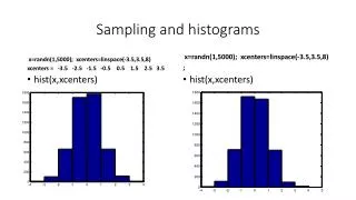
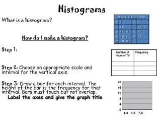
Frequency Distributions • Method of tallying and representing the number of times a certain score occurs • Group scores into interval classes/ranges • Creating class intervals • Range of 2, 5, 10, or 20 data points • 10-20 data points cover entire range of data • List class interval with a multiple of the interval • Largest interval goes at the top
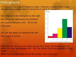
Histograms Class intervals along the x axis
Histograms A hand drawn histogram
Histograms Tallying scores
Excel’s Histogram Tool Histogram data
Excel’s Histogram Tool Creating bins
Excel’s Histogram Tool The data analysis dialog box
Completed Histogram The completed histogram dialog box
Completed Histogram The finished ToolPak histogram
Frequency Polygon • “a continuous line that represents the frequencies of scores within a class interval”
Frequency Polygon A hand drawn frequency polygon
Fat and Skinny of Frequency Distributions • Distributions can be different in four ways… • Average value • Variability • Skewness • Kurtosis
Average Value How distributions can differ in their average score
Variability How distributions can differ in variability
Skewness • Positive and negative skewness Degree of skewness in different distributions
Kurtosis Degrees of kurtosis in different distributions
Excellent Charts • Column chart Creating a simple column chart
How to Create Charts in Excel The All Chart Types dialog box
How to Create Charts in Excel • Click Chart Type • Click Finish A simple column chart
Other Cool Charts A line chart showing trend over time
Other Cool Charts A pie chart of voters by party
Acknowledgement The majority of the content of these slides were from the Sage Instructor Resources Website