Download

1 / 10
110 likes | 383 Views
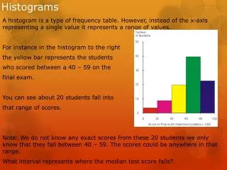
Histograms. NOT Instagrams. Histograms, what are they?. Histograms are all about groups of numerical data. Histograms show intervals of data (it kind of looks like a bar graph).

E N D
Histograms NOT Instagrams
Histograms, what are they? • Histograms are all about groups of numerical data. • Histograms show intervals of data (it kind of looks like a bar graph). • For example, a histogram may show how many people at a Justin Bieber concert were in their teens, twenties, thirties, forties, and fifties.
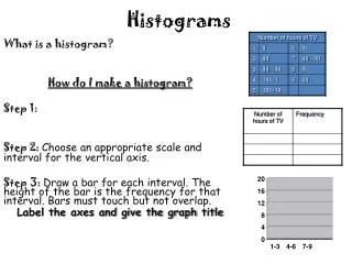
Let’s Make a Histogram • Example The boys in Mr. Robinson’s Math class earned the following scores on their last exam: 71, 82, 89, 63, 81, 92, 64, 85, 72, 87. • Here are the steps to creating a histogram: • 1. First, we need to figure out what size intervals (or groups) would be appropriate for this data. • We should put our data into groups of: _________________________________________
Let’s Make a Histogram • Make a frequency table that shows how many test scores were in each group. 71, 82, 89, 63, 81, 92, 64, 85, 72, 87
Let’s Make a Histogram • Next, we will make a graph from our table. Begin by drawing two intersecting lines which create the X and Y axis. • Remember, we will have to label both of these axes with units in a second.
Let’s Make a Histogram 4. Use the left side of your paper to set the range to match your table. Ours is from 1-5. Include units. 5. Then label the bottom of your graph with the test score intervals. Give your graph a title! 6. When you graph your data, the bars must touch!
Solve this question: • What is the number of persons below the age of 60 in the histogram below?
One More Question: • If 70 and above is considered a passing grade, how many students passed the math test?
Now, see if you can create a histogram of your data! Don’t forget, your histogram must also come with the frequency table!