Download
1 / 35
370 likes | 596 Views
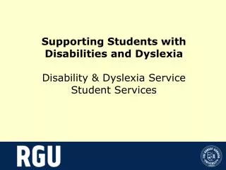
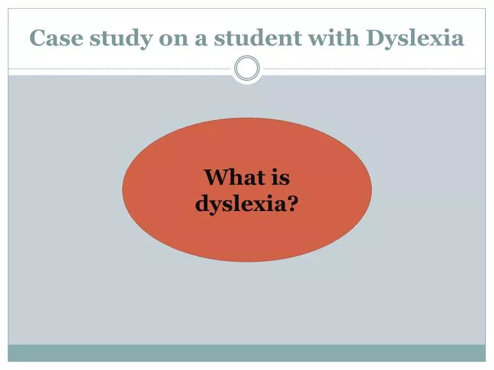
Case study on a student with Dyslexia. What is dyslexia?. Definition of Dyslexia.

E N D
Case study on a student with Dyslexia What is dyslexia?
Definition of Dyslexia Dyslexiais a complex neurological condition which may be described as a specific difficulty in reading, spelling and written language. One or more of these areas can be affected. Numeracy, notation skills, motor function and organisational skills may also be involved.
Recommended strategies Pre task discussion Visual cues Keywords Pen friend XP Repetition Short list of steps Seating Use PowerPoint and bullet points. Promotion of self-esteem Time management Clear, natural voice
Additional Strategies suitable for Art and design teaching. Use coloured markers on board and hand-out. Use primary colours Step by step instructions Multisensory approach (visual, Kinaesthetic, Auditory). Check written homework Encourage Visualisation Use pictures often Use cream coloured paper Use of colour transparencies
Rationale To help maximise the pupils capacity to access the scheme. “ensuring that what a student learns, how he/she learns it, and how the student demonstrates what he/she has learned is a match for that student’s readiness level, interests, and preferred mode of learning”.
Screen Printing Scheme Create a ‘Pop art’ self-portrait in the style of Roy Lichtenstein. Creating a ‘Pop art’ self-portrait
Student Profile • Learning strengths: • Highly motivated. • Focused and productive approach to completing short tasks. • Neat and tidy worker. • Likes Art, Music and Home Ec. • Works well using colour, specifically painting and print media.
Student Profile • Learning Needs: • Social skills: Self confidence and teacher-pupil communication. • Visualisation of Screen Printing process including stylisation, stencil creation and printing procedure. • Management of multiple tasks. • Organisational skills with regard to remembering homework. • Understanding of new Key words. • Sensitivity to lighting and difficulty with reading black print on white paper.
Specific Learning Outcomes for the Print scheme To help the student to: Visualise their self-portrait in a Pop art style, considering the reduction of their photograph into block coloursand colour selection. Comprehend stencil creation and organise stencils in printing order (visualising the shapes to be cut out and the layering of colours). Create a proportionately correct print through accurate stencil cutting. Follow multiple step by step procedures and learn the process of screen printing by putting the steps into action. Set up the equipment and use tools and materials correctly. Become confident with asking questions and talking about their work. To be organised and prepared for class, creating stencils for homework.
Differentiating the Content To help the student access the content of the scheme, I used multiple visuals on a PowerPoint presentation in conjunction with brief information to examine and describe the work of artists.
Roy Lichtenstein UsedComic Strips as his main inspiration. He produced hard-edged, precise compositions that Parodied traditional comic book art of the 1950s, often in a tongue in cheek, humorous manner.
Differentiating the content To help the student to visualise their image in a Pop art style, the class were shown an artwork by Roy Lichtenstein in contrastwith a realist painting by Chuck close. This exercise allowed the student to identify the stylistic featuresof Pop artby observing the difference in appearance.
What are the differences between these two paintings? Block coloursvs. multiple shades, Sharp outlines vs. soft shadows.Vibrantcoloursvs. natural tones. Cartoon-likevs. Realism, Primary colours vs. multiple shades. Stylization vs. Direct observation
I used PowerPoint Presentation and a hand-out to present a clear outline of the project, listing the initial tasks for the next two classes and what the students should consider. I used bullet points, different colours and bold font for visual clarity.
Class Project Design your own Pop art self portrait in the style of these two artists. 1. Select your photograph. Consider: • An imaginative design, looking at composition, colour choice and facial expression. 2. Trace from the photograph and produce a drawing design of yourself in colouring pencil in bold block colours with stark outlines. Consider: • The reduction of the photograph into block colours and bold outlines (simple design). • Paired colour selection to limit number of stencils (Aim for 5 colours).
Differentiating the Process To check that the student has successfully visualised their self-portrait in a Pop art style, they received 1:1 pre task discussion and the student selected primary colours for her self-portrait design.
Differentiating the Process To further aid stylisation and stencil creation, the student was shown an example of a black colour stencil (for the stark outlines) before finishing the drawing. She was shown how to stylise by leaving spaces at the corners of the eyes, lips, face and neck to avoid creating ‘islands’ (sections that will fall out during stencil creation).
To enable the student to visualise the breakdown of their self- portrait design into separate colour stencils, the student was shownexamplesof a self-portrait drawing design, colour stencils and a second colour print. Demonstrating that you isolate a particular colour from your design and cut away the shape to turn that colour, also demonstrating the concept of layering and overprinting. Self-portrait Drawing Stencil (pre and post cutting) Second colour print
To aid with stencil creation and organisation of stencils in printing order. The student was presented with a colour co-ordinated sheet of General rules and Guidelines on cream paper. General rules for stencil creation: • Separate stencil for each colour. • Stencils will be cut in the exact shape of each colour traced from your colouring pencil drawing. • To make a stencil: Trace the shape of the colour from your drawing onto stencil paper using carbon paper.Then, using the blade cut away the shape. You are cutting away what you want to turn that colour! The rest of the stencil acts as a barrier to the ink. • Accuracy is important, trace precisely to avoid gaps in the stencils. To help prevent this in certain areas you can trace slightly beyond the lines to aid registration. Eg. Extending the line wherethe top meets the background ensuring that the lines meet. • Work from light to dark, so printlightest colours first (with the exception of white teeth over lips, the red of the lips would come first then white). • Find ways to limit number of colours to about 5, 6 max. E.g. Red lips and background in the same stencil. • Be VERY careful with the blades, do not cut with your opposite hand in front of the other. Rotate the page when cutting don’t try to move around it.
Guidelines for stencil order: • Arrange the stencils as they would be in printing order, think of the colours in layers, which would come first? What would be printed on top? • Skin stencil – Unless there is a way to retain the white of the page for the eyes, the skin is usually first. The stencil should be in one simple block in the shape of your face and neck. Bare in mind other colours may be printed on top. This is called ‘over printing’ you will get extra marks for this in the Leaving Cert. • Red /pink stencil (lips) - This will come before the white layer if teeth are shown (in which case the white will be printed on top). Consists of the shape of the lips and possibly another area. • White stencil-one simple block for eyes as eye colour will be printed on top. May include teeth. • Blue/green stencil (eyes) – may combine eyes and background or eyes and top. Consists of two circles. • Hair stencil-This should be one solid block of colour in the shape of your hair, use the black layer to show individual strands. When tracing, trace slightly beyond the line along the hairline, this ensures the hair layer meets the skin when printing. • Background colour-make sure this colour appear s on the same stencil as another to limit number of stencils. • Black stencil – This stencil will consist of the black outlines in your drawing. Be careful to avoid islands (islands are parts that will fall out of the stencil). Don’t link any lines together in a circle, leave spaces. Areas to check: corners of the eyes, corners of the mouth, contour of face and neck, hair outline. Also, watch out for a black outline around the iris, this will create an island so leave it out.
As the student has a sensitivity to light and difficulty seeing black on white paper, the student was provided with semi-transparent cream coloured paper to work out her colour stencils. This helped her to trace more accurately hence, creating better stencils with accurate proportions. Furthermore, the transparency enabled the student to visualise the layering of her colours and organise them in printing order, labelling each stencil. Differentiating the Process
Differentiating the Process Whole class demonstration on Screen printing procedure including a sample first colour print. • Differentiation: • Spoken language was clear, and natural. • New keywords were identified. • A visual breakdown of the process with numbered steps, coloured writing and images remained on the board during class using the overhead projector. The demonstration and visual breakdown of each step, assisted the student to understand and visualise the screen printing process, carry out multiple tasks during the one lesson and remember how to correctly use tools and equipment.
Step by step instructions of screen Printing Procedure: 9. Hold the squeegee at a 45 degree angle and pull towards you firmly. Do this a second time to ensure the ink has come through. 10. Lift up your screen and inspect your print.
Structure and organisation to the lesson was important to ensure that the student could manage their time effectively. The student was seated near to the teacher, to allow for discrete assistance. The students were reminded of the time left before clean up at various intervals throughout lesson, helping them to manage their time effectively. The lesson tasks were structured and achievable. The desks were paired together in fours, providing more space so the students could move freely and maintain an organised working area.
Organisation of homework and understanding key words. Homework was always written on the board ten minutes before class ended, ensuring the student remembers . Keywords were repeated and written on the board on a daily basis. Stencil making was to be completed for homework, ensuring the student was organised and prepared for class.
To initiate confidence with asking questions and talking about their work. Frequent encouragement and supportive comments. Communicate Supportiveness and friendliness through tone of voice, facial expressions and body language. Pre task discussion Ask questions Encourage self evaluation of work through class discussion on multiple examples of student work. 1:1 instruction
Objectives achieved Differentiating the product • Student successfully: • Visualised their self-portrait in a Pop art style. • Understood stencil creation and organised stencils in printing order. • Created a proportionately correct print through accurate stencil cutting. • Followed multiple step by step procedures and learned the process of screen printing. • Managed her time effectively in class. • Student was confident in the making of the project and became more open with talking about their work. • Organised and prepared stencils at home for class.
Future Alterations Continue to check each stencil is accurate prior to set up for printing. Encourage more communication in class to initiate confidence. Perhaps through class discussion. Be wary of overly literal interpretation of guidelines. Maintain class management.
Art history SchemeEarly Christian Ireland- examining early monastic settlements and the development of the High cross
Specific Learning Outcomes for the scheme • To develop an understanding of monastic settlements and the development of the High Cross. • Notation skills: The student should be able to give an account of the development of the high cross in their own words using the notes provided. • Visual analysis: The student should be able to visually assess and illustrate the crosses, identifying key features and their significance. • Drawing skills: student should be able to create a detailed drawing of the Cross of Moone, understanding the importance of correct proportions, layout, correct shapes, clarity and indication of relief.
Differentiating the Process • Visual cues were used including a PowerPoint presentation with photographs and illustrations, handouts with illustrated diagrams and illustrations on the wall of the classroom. These were used to identify and examine significant features of the high crosses. Straight forward, simple language was used both verbally and within the written notes. Notes were kept brief avoiding lengthy copying and dictation. I made sure this student understood key words by explaining new terms, repetition, asking questions during presentation and writing them on the board. The students notes were printed on cream paper and the student was provided with coloured overlays to provide clarity when reading and looking at illustrations.
Differentiating the Process Notes printed on cream paper and choice of overlay Image displayed in classroom
Differentiating the Product Objectives achieved • Notation skills: The Student was able to outline the development of the high cross in her own words, demonstrating understanding. • Visual analysis: The student s’ illustration was accurately drawn and correctly labeled indicating an ability to visually assess and identify key features. • Drawing skills: Students’ drawing of the Cross of Moone indicated understanding of the importance of correct proportions, layout, correct shapes, clarity and indication of relief.
Future Alterations Introduce the student to software that helps with creative writing e.g. Penfriend XP Include a test on the written information as well as the diagram. Continue to explain and repeat new key words. A blue overlay makes the writing easer to see than a red overlay.