Download
1 / 53
610 likes | 1.89k Views
Chapter 2 Descriptive Statistics: Tabular and Graphical Methods. Summarizing Qualitative Data Summarizing Quantitative Data Exploratory Data Analysis Crosstabulations and Scatter Diagrams. Summarizing Qualitative Data. Frequency Distribution Relative Frequency

E N D
Chapter 2Descriptive Statistics:Tabular and Graphical Methods • Summarizing Qualitative Data • Summarizing Quantitative Data • Exploratory Data Analysis • Crosstabulations and Scatter Diagrams
Summarizing Qualitative Data • Frequency Distribution • Relative Frequency • Percent Frequency Distribution • Bar Graph • Pie Chart
Frequency Distribution • A frequency distribution is a tabular summary of data showing the frequency (or number) of items in each of several nonoverlapping classes. • The objective is to provide insights about the data that cannot be quickly obtained by looking only at the original data.
Example: Marada Inn Guests staying at Marada Inn were asked to rate the quality of their accommodations as being excellent, above average, average, below average, or poor. The ratings provided by a sample of 20 quests are shown below. Below Average Average Above Average Above Average Above Average Above Average Above Average Below Average Below Average Average Poor Poor Above Average Excellent Above Average Average Above Average Average Above Average Average
Example: Marada Inn • Frequency Distribution RatingFrequency Poor 2 Below Average 3 Average 5 Above Average 9 Excellent 1 Total 20
Relative Frequency Distribution • The relative frequency of a class is the fraction or proportion of the total number of data items belonging to the class. • A relative frequency distribution is a tabular summary of a set of data showing the relative frequency for each class.
Percent Frequency Distribution • The percent frequency of a class is the relative frequency multiplied by 100. • Apercent frequency distribution is a tabular summary of a set of data showing the percent frequency for each class.
Example: Marada Inn • Relative Frequency and Percent Frequency Distributions RelativePercent RatingFrequencyFrequency Poor .10 10 Below Average .15 15 Average .25 25 Above Average .45 45 Excellent .05 5 Total 1.00 100
Bar Graph • A bar graph is a graphical device for depicting qualitative data. • On the horizontal axis we specify the labels that are used for each of the classes. • A frequency, relative frequency, or percent frequency scale can be used for the vertical axis. • Using a bar of fixed width drawn above each class label, we extend the height appropriately. • The bars are separated to emphasize the fact that each class is a separate category.
9 8 7 6 Frequency 5 4 3 2 1 Rating Above Average Excellent Poor Below Average Average Example: Marada Inn • Bar Graph
Pie Chart • The pie chart is a commonly used graphical device for presenting relative frequency distributions for qualitative data. • First draw a circle; then use the relative frequencies to subdivide the circle into sectors that correspond to the relative frequency for each class. • Since there are 360 degrees in a circle, a class with a relative frequency of .25 would consume .25(360) = 90 degrees of the circle.
Exc. 5% Poor 10% Below Average 15% Above Average 45% Average 25% Quality Ratings Example: Marada Inn • Pie Chart
Example: Marada Inn • Insights Gained from the Preceding Pie Chart • One-half of the customers surveyed gave Marada a quality rating of “above average” or “excellent” (looking at the left side of the pie). This might please the manager. • For each customer who gave an “excellent” rating, there were two customers who gave a “poor” rating (looking at the top of the pie). This should displease the manager.
Summarizing Quantitative Data • Frequency Distribution • Relative Frequency and Percent Frequency Distributions • Dot Plot • Histogram • Cumulative Distributions • Ogive
Example: Hudson Auto Repair The manager of Hudson Auto would like to get a better picture of the distribution of costs for engine tune-up parts. A sample of 50 customer invoices has been taken and the costs of parts, rounded to the nearest dollar, are listed below.
Frequency Distribution • Guidelines for Selecting Number of Classes • Use between 5 and 20 classes. • Data sets with a larger number of elements usually require a larger number of classes. • Smaller data sets usually require fewer classes.
Frequency Distribution • Guidelines for Selecting Width of Classes • Use classes of equal width. • Approximate Class Width =
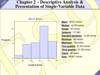
Example: Hudson Auto Repair • Frequency Distribution If we choose six classes: Approximate Class Width = (109 - 52)/6 = 9.5 10 Cost ($)Frequency 50-59 2 60-69 13 70-79 16 80-89 7 90-99 7 100-109 5 Total 50
Example: Hudson Auto Repair • Relative Frequency and Percent Frequency Distributions Relative Percent Cost ($)FrequencyFrequency 50-59 .04 4 60-69 .26 26 70-79 .32 32 80-89 .14 14 90-99 .14 14 100-109 .1010 Total 1.00 100
Example: Hudson Auto Repair • Insights Gained from the Percent Frequency Distribution • Only 4% of the parts costs are in the $50-59 class. • 30% of the parts costs are under $70. • The greatest percentage (32% or almost one-third) of the parts costs are in the $70-79 class. • 10% of the parts costs are $100 or more.
Dot Plot • One of the simplest graphical summaries of data is a dot plot. • A horizontal axis shows the range of data values. • Then each data value is represented by a dot placed above the axis.
. . .. . . . . .. .. .. .. . . . . . ..... .......... .. . .. . . ... . .. . 5060708090100110 Cost ($) Example: Hudson Auto Repair • Dot Plot
Histogram • Another common graphical presentation of quantitative data is a histogram. • The variable of interest is placed on the horizontal axis. • A rectangle is drawn above each class interval with its height corresponding to the interval’s frequency, relative frequency, or percent frequency. • Unlike a bar graph, a histogram has no natural separation between rectangles of adjacent classes.
Example: Hudson Auto Repair • Histogram 18 16 14 12 Frequency 10 8 6 4 2 Parts Cost ($) 50 60 70 80 90 100 110
Cumulative Distributions • Cumulative frequency distribution -- shows the number of items with values less than or equal to the upper limit of each class. • Cumulative relative frequency distribution -- shows the proportion of items with values less than or equal to the upper limit of each class. • Cumulative percent frequency distribution -- shows the percentage of items with values less than or equal to the upper limit of each class.
Example: Hudson Auto Repair • Cumulative Distributions Cumulative Cumulative Cumulative Relative Percent Cost ($)FrequencyFrequencyFrequency < 59 2 .04 4 < 69 15 .30 30 < 79 31 .62 62 < 89 38 .76 76 < 99 45 .90 90 < 109 50 1.00 100
Ogive • An ogive is a graph of a cumulative distribution. • The data values are shown on the horizontal axis. • Shown on the vertical axis are the: • cumulative frequencies, or • cumulative relative frequencies, or • cumulative percent frequencies • The frequency (one of the above) of each class is plotted as a point. • The plotted points are connected by straight lines.
Example: Hudson Auto Repair • Ogive • Because the class limits for the parts-cost data are 50-59, 60-69, and so on, there appear to be one-unit gaps from 59 to 60, 69 to 70, and so on. • These gaps are eliminated by plotting points halfway between the class limits. • Thus, 59.5 is used for the 50-59 class, 69.5 is used for the 60-69 class, and so on.
Example: Hudson Auto Repair • Ogive with Cumulative Percent Frequencies 100 80 60 Cumulative Percent Frequency 40 20 Parts Cost ($) 50 60 70 80 90 100 110
Exploratory Data Analysis • The techniques of exploratory data analysis consist of simple arithmetic and easy-to-draw pictures that can be used to summarize data quickly. • One such technique is the stem-and-leaf display.
Stem-and-Leaf Display • A stem-and-leaf display shows both the rank order and shape of the distribution of the data. • It is similar to a histogram on its side, but it has the advantage of showing the actual data values. • The first digits of each data item are arranged to the left of a vertical line. • To the right of the vertical line we record the last digit for each item in rank order. • Each line in the display is referred to as a stem. • Each digit on a stem is a leaf. 8 5 7 9 3 6 7 8
Stem-and-Leaf Display • Leaf Units • A single digit is used to define each leaf. • In the preceding example, the leaf unit was 1. • Leaf units may be 100, 10, 1, 0.1, and so on. • Where the leaf unit is not shown, it is assumed to equal 1.
Example: Leaf Unit = 0.1 If we have data with values such as 8.6 11.7 9.4 9.1 10.2 11.0 8.8 a stem-and-leaf display of these data will be Leaf Unit = 0.1 8 6 8 9 1 4 10 2 11 0 7
Example: Leaf Unit = 10 If we have data with values such as 1806 1717 1974 1791 1682 1910 1838 a stem-and-leaf display of these data will be Leaf Unit = 10 16 8 17 1 9 18 0 3 19 1 7
Example: Hudson Auto Repair • Stem-and-Leaf Display 5 2 7 6 2 2 2 2 5 6 7 8 8 8 9 9 9 7 1 1 2 2 3 4 4 5 5 5 6 7 8 9 9 9 8 0 0 2 3 5 8 9 9 1 3 7 7 7 8 9 10 1 4 5 5 9
Stretched Stem-and-Leaf Display • If we believe the original stem-and-leaf display has condensed the data too much, we can stretch the display by using two more stems for each leading digit(s). • Whenever a stem value is stated twice, the first value corresponds to leaf values of 0-4, and the second values corresponds to values of 5-9.
Example: Hudson Auto Repair • Stretched Stem-and-Leaf Display 5 2 5 7 6 2 2 2 2 6 5 6 7 8 8 8 9 9 9 7 1 1 2 2 3 4 4 7 5 5 5 6 7 8 9 9 9 8 0 0 2 3 8 5 8 9 9 1 3 9 7 7 7 8 9 10 1 4 10 5 5 9
Crosstabulations and Scatter Diagrams • Thus far we have focused on methods that are used to summarize the data for one variable at a time. • Often a manager is interested in tabular and graphical methods that will help understand the relationship between two variables. • Crosstabulation and a scatter diagram are two methods for summarizing the data for two (or more) variables simultaneously.
Crosstabulation • Crosstabulation is a tabular method for summarizing the data for two variables simultaneously. • Crosstabulation can be used when: • One variable is qualitative and the other is quantitative • Both variables are qualitative • Both variables are quantitative • The left and top margin labels define the classes for the two variables.
Example: Finger Lakes Homes • Crosstabulation The number of Finger Lakes homes sold for each style and price for the past two years is shown below. PriceHome Style RangeColonial Ranch Split A-Frame Total < $99,000 18 6 19 12 55 > $99,000 12 14 16 3 45 Total30 20 35 15 100
Example: Finger Lakes Homes • Insights Gained from the Preceding Crosstabulation • The greatest number of homes in the sample (19) are a split-level style and priced at less than or equal to $99,000. • Only three homes in the sample are an A-Frame style and priced at more than $99,000.
Crosstabulation: Row or Column Percentages • Converting the entries in the table into row percentages or column percentages can provide additional insight about the relationship between the two variables.
Example: Finger Lakes Homes • Row Percentages PriceHome Style RangeColonial Ranch Split A-Frame Total < $99,000 32.73 10.91 34.55 21.82 100 > $99,000 26.67 31.11 35.56 6.67 100 Note: row totals are actually 100.01 due to rounding.
Example: Finger Lakes Homes • Column Percentages PriceHome Style RangeColonial Ranch Split A-Frame < $99,000 60.00 30.00 54.29 80.00 > $99,000 40.00 70.00 45.71 20.00 Total 100 100 100 100
Scatter Diagram • A scatter diagram is a graphical presentation of the relationship between two quantitative variables. • One variable is shown on the horizontal axis and the other variable is shown on the vertical axis. • The general pattern of the plotted points suggests the overall relationship between the variables.
Example: Panthers Football Team • Scatter Diagram The Panthers football team is interested in investigating the relationship, if any, between interceptions made and points scored. x = Number of y = Number of InterceptionsPoints Scored 1 14 3 24 2 18 1 17 3 27
Example: Panthers Football Team • Scatter Diagram y 30 25 20 Number of Points Scored 15 10 5 x 0 1 0 2 3 Number of Interceptions
Example: Panthers Football Team • The preceding scatter diagram indicates a positive relationship between the number of interceptions and the number of points scored. • Higher points scored are associated with a higher number of interceptions. • The relationship is not perfect; all plotted points in the scatter diagram are not on a straight line.
y x Scatter Diagram • A Positive Relationship
y x Scatter Diagram • A Negative Relationship