Download
1 / 83
940 likes | 1.38k Views
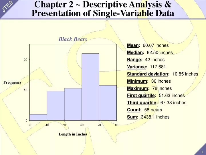
Chapter 2 ~ Descriptive Analysis & Presentation of Single-Variable Data. Black Bears. Mean : 60.07 inches Median : 62.50 inches Range : 42 inches Variance : 117.681 Standard deviation : 10.85 inches Minimum : 36 inches Maximum : 78 inches First quartile : 51.63 inches

E N D
Chapter 2 ~ Descriptive Analysis &Presentation of Single-Variable Data Black Bears Mean: 60.07 inches Median: 62.50 inches Range: 42 inches Variance: 117.681 Standard deviation: 10.85 inches Minimum: 36 inches Maximum: 78 inches First quartile: 51.63 inches Third quartile: 67.38 inches Count: 58 bears Sum: 3438.1 inches 20 Frequency 10 0 30 40 50 60 70 80 Length in Inches
Chapter Goals • Learn how to present and describe sets of data • Learn measures of central tendency, measures of dispersion (spread), measures of position, and types of distributions • Learn how to interpret findings so that we know what the data is telling us about the sampled population
2.1 ~ Graphic Presentation of Data • Use initial exploratory data-analysis techniques to produce a pictorial representation of the data • Resulting displays reveal patterns of behavior of the variable being studied • The method used is determined by the type of data and the idea to be presented • No single correct answer when constructing a graphic display
Circle Graphs & Bar Graphs Circle Graphs and Bar Graphs: Graphs that are used to summarize attribute data • Circle graphs (pie diagrams) show the amount of data that belongs to each category as a proportional part of a circle • Bar graphsshow the amount of data that belongs to each category as proportionally sized rectangular areas
Example Day Number Sold Monday 15 Tuesday 23 Wednesday 35 Thursday 11 Friday 12 Saturday 42 • Example: The table below lists the number of automobiles sold last week by day for a local dealership. Describe the data using a circle graph and a bar graph:
Circle Graph Solution Automobiles Sold Last Week
Bar Graph Solution Automobiles Sold Last Week Frequency
Pareto Diagram Notes: • Used to identify the number and type of defects that happen within a product or service • Separates the “vital few” from the “trivial many” • The Pareto diagram is often used in quality control applications • Pareto Diagram: A bar graph with the bars arranged from the most numerous category to the least numerous category. It includes a line graph displaying the cumulative percentages and counts for the bars.
Example Defect Number Dent 5 Stain 12 Blemish 43 Chip 25 Scratch 40 Others 10 • Example: The final daily inspection defect report for a cabinet manufacturer is given in the table below: 1) Construct a Pareto diagram for this defect report. Management has given the cabinet production line the goal of reducing their defects by 50%. 2) What two defects should they give special attention to in working toward this goal?
Solutions Daily Defect Inspection Report 1) 1 4 0 1 0 0 1 2 0 8 0 1 0 0 6 0 8 0 Count Percent 6 0 4 0 4 0 2 0 2 0 0 0 Defect: Blemish Scratch Chip Stain Others Dent Count 43 40 25 12 10 5 Percent 31.9 29.6 18.5 8.9 7.4 3.7 Cum% 31.9 61.5 80.0 88.9 96.3 100.0 2) The production line should try to eliminate blemishes and scratches. This would cut defects by more than 50%.
Key Definitions Quantitative Data: One reason for constructing a graph of quantitative data is to examine the distribution - is the data compact, spread out, skewed, symmetric, etc. Distribution: The pattern of variability displayed by the data of a variable. The distribution displays the frequency of each value of the variable. Dotplot Display: Displays the data of a sample by representing each piece of data with a dot positioned along a scale. This scale can be either horizontal or vertical. The frequency of the values is represented along the other scale.
Example 2.5 8.9 12.2 4.1 18.1 1.6 12.2 16.9 2.5 3.5 0.4 2.6 2.2 4.0 4.5 6.4 2.9 3.3 4.4 9.2 4.1 0.9 14.5 4.0 0.9 7.2 5.2 1.8 1.5 0.7 3.7 4.2 6.9 15.3 21.8 17.8 7.3 6.8 3.3 7.0 4.0 18.3 8.5 1.4 7.4 4.7 0.7 10.4 3.6 • Example: A random sample of the lifetime (in years) of 50 home washing machines is given below: . : . . .:. . ..: :.::::::.. .::. ... . : . . . :. . +---------+---------+---------+---------+---------+------- 0.0 4.0 8.0 12.0 16.0 20.0 The figure below is a dotplot for the 50 lifetimes: Note: Notice how the data is “bunched” near the lower extreme and more“spread out” near the higher extreme
Stem & Leaf Display • Background: • The stem-and-leaf display has become very popular for summarizing numerical data • It is a combination of graphing and sorting • The actual data is part of the graph • Well-suited for computers Stem-and-Leaf Display: Pictures the data of a sample using the actual digits that make up the data values. Each numerical data is divided into two parts: The leading digit(s) becomes the stem, and the trailing digit(s) becomes the leaf. The stems are located along the main axis, and a leaf for each piece of data is located so as to display the distribution of the data.
Example • Example: A city police officer, using radar, checked the speed of cars as they were traveling down the main street in town. Construct a stem-and-leaf plot for this data: 41 31 33 35 36 37 39 49 33 19 26 27 24 32 40 39 16 55 38 36 Solution: All the speeds are in the 10s, 20s, 30s, 40s, and 50s. Use the first digit of each speed as the stem and the second digit as the leaf. Draw a vertical line and list the stems, in order to the left of the line. Place each leaf on its stem: place the trailing digit on the right side of the vertical line opposite its corresponding leading digit.
Example 20 Speeds --------------------------------------- 1 | 6 9 2 | 4 6 7 3 | 1 2 3 3 5 6 6 7 8 9 9 4 | 0 1 9 5 | 5 ---------------------------------------- • The speeds are centered around the 30s Note: The display could be constructed so that only five possible values (instead of ten) could fall in each stem. What would the stems look like? Would there be a difference in appearance?
Remember! 1. It is fairly typical of many variables to display a distribution that is concentrated (mounded) about a central value and then in some manner be dispersed in both directions. (Why?) 2. A display that indicates two “mounds” may really be two overlapping distributions 3. A back-to-back stem-and-leaf display makes it possible to compare two distributions graphically 4. A side-by-side dotplot is also useful for comparing two distributions
2.2 ~ Frequency Distributions & Histograms • Stem-and-leaf plots often present adequate summaries, but they can get very big, very fast • Need other techniques for summarizing data • Frequency distributions and histograms are used to summarize large data sets
Frequency Distributions Frequency Distribution: A listing, often expressed in chart form, that pairs each value of a variable with its frequency Ungrouped Frequency Distribution: Each value of x in the distribution stands alone Grouped Frequency Distribution: Group the values into a set of classes 1. A table that summarizes data by classes, or class intervals 2. In a typical grouped frequency distribution, there are usually 5-12 classes of equal width 3. The table may contain columns for class number, class interval, tally (if constructing by hand), frequency, relative frequency, cumulative relative frequency, and class midpoint 4. In an ungrouped frequency distribution each class consists of a single value
Frequency Distribution Guidelines for constructing a frequency distribution: 1. All classes should be of the same width 2. Classes should be set up so that they do not overlap and so that each piece of data belongs to exactly one class 3. For problems in the text, 5-12 classes are most desirable. The square root of n is a reasonable guideline for the number of classes if n is less than 150. 4. Use a system that takes advantage of a number pattern, to guarantee accuracy 5. If possible, an even class width is often advantageous
Frequency Distributions Procedure for constructing a frequency distribution: 1. Identify the high (H) and low (L) scores. Find the range.Range = H - L 2. Select a number of classes and a class width so that the product is a bit larger than the range 3. Pick a starting point a little smaller than L. Count from L by the width to obtain the class boundaries. Observations that fall on class boundaries are placed into the class interval to the right.
Example 1) Construct a grouped frequency distribution using the classes 3.7 - <4.7, 4.7 - <5.7, 5.7 - <6.7, etc. 2) Which class has the highest frequency? 6.5 5.0 5.6 7.6 4.8 8.0 7.5 7.9 8.0 9.2 6.4 6.0 5.6 6.0 5.7 9.2 8.1 8.0 6.5 6.6 5.0 8.0 6.5 6.1 6.4 6.6 7.2 5.9 4.0 5.7 7.9 6.0 5.6 6.0 6.2 7.7 6.7 7.7 8.2 9.0 • Example: The hemoglobin test, a blood test given to diabetics during their periodic checkups, indicates the level of control of blood sugar during the past two to three months. The data in the table below was obtained for 40 different diabetics at a university clinic that treats diabetic patients:
Solutions Class Frequency Relative Cumulative Class Boundaries f Frequency Rel. Frequency Midpoint, x --------------------------------------------------------------------------------------- 3.7 - <4.7 1 0.025 0.025 4.2 4.7 - <5.7 6 0.150 0.175 5.2 5.7 - <6.7 16 0.400 0.575 6.2 6.7 - <7.7 4 0.100 0.675 7.2 7.7 - <8.7 10 0.250 0.925 8.2 8.7 - <9.7 3 0.075 1.000 9.2 1) 2) The class 5.7 - <6.7 has the highest frequency. The frequency is 16 and the relative frequency is 0.40
Histogram Histogram: A bar graph representing a frequency distribution of a quantitative variable. A histogram is made up of the following components: 1. A title, which identifies the population of interest 2. A vertical scale, which identifies the frequencies in the various classes 3. A horizontal scale, which identifies the variable x. Values for the class boundaries or class midpoints may be labeled along the x-axis. Use whichever method of labeling the axis best presents the variable. Notes: • The relative frequency is sometimes used on the vertical scale • It is possible to create a histogram based on class midpoints
Example The Hemoglobin Test Solution: 1 5 1 0 Frequency 5 0 4 . 2 5 . 2 6 . 2 7 . 2 8 . 2 9 . 2 Blood Test • Example: Construct a histogram for the blood test results given in the previous example
Example • Example: A recent survey of Roman Catholic nuns summarized their ages in the table below. Construct a histogram for this age data: Age Frequency Class Midpoint ------------------------------------------------------------ 20 up to 30 34 25 30 up to 40 58 35 40 up to 50 76 45 50 up to 60 187 55 60 up to 70 254 65 70 up to 80 241 75 80 up to 90 147 85
Solution Roman Catholic Nuns 2 0 0 Frequency 1 0 0 0 2 5 3 5 4 5 5 5 6 5 7 5 8 5 Age
Terms Used to Describe Histograms Symmetrical: Both sides of the distribution are identical mirror images. There is a line of symmetry. Uniform (Rectangular): Every value appears with equal frequency Skewed: One tail is stretched out longer than the other. The direction of skewness is on the side of the longer tail. (Positively skewed vs. negatively skewed) J-Shaped: There is no tail on the side of the class with the highest frequency Bimodal: The two largest classes are separated by one or more classes. Often implies two populations are sampled. Normal: A symmetrical distribution is mounded about the mean and becomes sparse at the extremes
Important Reminders • The mode is the value that occurs with greatest frequency (discussed in Section 2.3) • Themodal class is the class with the greatest frequency • A bimodal distribution has two high-frequency classes separated by classes with lower frequencies • Graphical representations of data should include a descriptive, meaningful title and proper identification of the vertical and horizontal scales
Cumulative Frequency Distribution Cumulative Frequency Distribution: A frequency distribution that pairs cumulative frequencies with values of the variable • The cumulative frequency for any given class is the sum of the frequency for that class and the frequencies of all classes of smaller values • The cumulative relative frequency for any given class is the sum of the relative frequency for that class and the relative frequencies of all classes of smaller values
Example • Example: A computer science aptitude test was given to 50 students. The table below summarizes the data: Class Relative Cumulative Cumulative Boundaries Frequency Frequency Frequency Rel. Frequency ------------------------------------------------------------------------------------- 0 up to 4 4 0.08 4 0.08 4 up to 8 8 0.16 12 0.24 8 up to 12 8 0.16 20 0.40 12 up to 16 20 0.40 40 0.80 16 up to 20 6 0.12 46 0.92 20 up to 24 3 0.06 49 0.98 24 up to 28 1 0.02 50 1.00
Ogive Ogive: A line graph of a cumulative frequency or cumulative relative frequency distribution. An ogive has the following components: 1. A title, which identifies the population or sample 2. A vertical scale, which identifies either the cumulative frequencies or the cumulative relative frequencies 3. A horizontal scale, which identifies the upper class boundaries. Until the upper boundary of a class has been reached, you cannot be sure you have accumulated all the data in the class. Therefore, the horizontal scale for an ogive is always based on the upper class boundaries. Note: Every ogive starts on the left with a relative frequency of zero at the lower class boundary of the first class and ends on the right with a relative frequency of 100% at the upper class boundary of the last class.
Example Computer Science Aptitude Test 1.0 0.9 0.8 0.7 0.6 Cumulative Relative Frequency 0.5 0.4 0.3 0.2 0.1 0.0 0 4 8 12 16 20 24 28 Test Score • Example: The graph below is an ogive using cumulative relative frequencies for the computer science aptitude data:
2.3 ~ Measures of Central Tendency • Numerical values used to locate the middle of a set of data, or where the data is clustered • The term average is often associated with all measures of central tendency
Mean 1 1 å = = + + . . . + x x ( x x x ) i 1 2 n n n • The population mean, , (lowercase mu, Greek alphabet), is the mean of all x values for the entire population Notes: • We usually cannot measure but would like to estimate its value • A physical representation: the mean is the value that balances the weights on the number line Mean: The type of average with which you are probably most familiar. The mean is the sum of all the values divided by the total number of values, n:
Example 1 Solution: = + + + + + + + = x ( 8 9 3 5 2 6 4 5 ) 5 . 25 8 1 Solution: = + + + + + + + = x ( 8 9 3 5 2 26 4 5 ) 7 . 75 8 • Example: The following data represents the number of accidents in each of the last 8 years at a dangerous intersection. Find the mean number of accidents: 8, 9, 3, 5, 2, 6, 4, 5: • In the data above, change 6 to 26: Note: The mean can be greatly influenced by outliers
Median • Denoted by “x tilde”: • The population median, (uppercase mu, Greek alphabet), is the data value in the middle position of the entire population Notes: To find the median: 1. Rank the data 2. Determine the depth of the median: 3. Determine the value of the median Median: The value of the data that occupies the middle position when the data are ranked in order according to size
Example Solution: 1. Rank the data: 2, 2, 3, 3, 4, 8, 8, 9, 11 2. Find the depth: 3. The median is the fifth number from either end in the rankeddata: Suppose the data set is {4, 8, 3, 8, 2, 9, 2, 11, 3, 15}: 1. Rank the data: 2, 2, 3, 3, 4, 8, 8, 9, 11, 15 2. Find the depth: 3. The median is halfway between the fifth and sixth observations: • Example: Find the median for the set of data: {4, 8, 3, 8, 2, 9, 2, 11, 3}
Mode & Midrange Mode: The mode is the value of x that occurs most frequently Note: If two or more values in a sample are tied for the highest frequency (number of occurrences), there is no mode Midrange: The number exactly midway between a lowest value data L and a highest value data H. It is found by averaging the low and the high values:
Example + + L H 12 . 7 44 . 2 = = = Midrange 28 . 45 2 2 • When rounding off an answer, a common rule-of-thumb is to keep one more decimal place in the answer than was present in the original data • To avoid round-off buildup, round off only the final answer, not intermediate steps Notes: • Example: Consider the data set {12.7, 27.1, 35.6, 44.2, 18.0}
2.4 ~ Measures of Dispersion • Measures of central tendency alone cannot completely characterize a set of data. Two very different data sets may have similar measures of central tendency. • Measures of dispersion are used to describe the spread, or variability, of a distribution • Common measures of dispersion: range, variance, and standard deviation
Range Deviation from the Mean: A deviation from the mean, ,is the difference between the value of x and the mean Range: The difference in value between the highest-valued (H) and the lowest-valued (L) pieces of data: • Other measures of dispersion are based on the following quantity
Example Solutions: 2) 1) Data Deviation from Mean _________________________ 12 23 17 15 18 • Example: Consider the sample {12, 23, 17, 15, 18}. Find 1) the range and 2) each deviation from the mean. -5 6 0 -2 1
Mean Absolute Deviation å - = ( x x ) 0 1 å - Mean absolute deviation | x x | = n For the previous example: 1 1 14 å - = + + + + = = | x x | ( 5 6 0 2 1 ) 2 . 8 n 5 5 Note: (Always!) Mean Absolute Deviation: The mean of the absolute values of the deviations from the mean:
Sample Variance & Standard Deviation 1 å 2 2 = - where n is the sample size s ( x x ) - n 1 Note: The numerator for the sample variance is called the sum of squares for x, denoted SS(x): 1 ( ) å å å 2 where 2 2 = - = - SS ( x ) ( x x ) x x n Sample Variance: The sample variance, s2, is the mean of the squared deviations, calculated using n - 1 as the divisor: Standard Deviation: The standard deviation of a sample, s, is the positive square root of the variance:
Example Solutions: 1 First: = + + + + = x ( 5 7 1 3 8 ) 4 . 8 5 - - ( x x ) 2 x x x 5 0.2 0.04 7 2.2 4.84 1 -3.8 14.44 3 -1.8 3.24 8 3.2 10.24 Sum: 24 0 32.08 1 2 = = 1) s ( 32 . 8 ) 8 . 2 2) 4 = = s 8 . 2 2 . 86 • Example: Find the 1) variance and 2) standard deviation for the data {5, 7, 1, 3, 8}:
Notes • The shortcut formula for the sample variance: • The unit of measure for the standard deviation is the same as the unit of measure for the data
2.5 ~ Mean & StandardDeviation of Frequency Distribution • If the data is given in the form of a frequency distribution, we need to make a few changes to the formulas for the mean, variance, and standard deviation • Complete the extension table in order to find these summary statistics
To Calculate • In order to calculate the mean, variance, and standard deviation for data: 1. In an ungrouped frequency distribution, use the frequency of occurrence, f, of each observation 2. In a grouped frequency distribution, we use the frequency of occurrence associated with each class midpoint:
Example Solutions: 0 15 0 0 First: 1 17 17 17 2 23 46 92 4 5 20 80 5 2 10 50 Sum: 62 93 239 1) 2) 3) • Example: A survey of students in the first grade at a local school asked for the number of brothers and/or sisters for each child. The results are summarized in the table below. Find 1) the mean, 2) the variance, and 3) the standard deviation:
TI-83 Calculations • When dealing with a grouped frequency distribution, use the following technique: Input the class midpoints or data values into L1 and the frequencies into L2; then continue with Highlight: L3 Enter: L3 = L1*L2 Highlight: L4 Enter: L4 = L1*L3 Highlight: L5(1) (first position in L5 column)