Download
1 / 20
200 likes | 292 Views
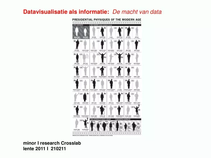
Datavisualisatie als informatie: De macht van data minor I research Crosslab lente 2011 I 210211. datavisualisatie als informatie: de macht van datavisualisatie research blok 1 : definities, betekenis, context > onderzoeksvraag kernvraag:

E N D
Datavisualisatie als informatie: De macht van data minor I research Crosslab lente 2011 I 210211
datavisualisatie als informatie: de macht van datavisualisatie • research blok 1: definities, betekenis, context > onderzoeksvraag • kernvraag: • Hoe geef je betekenis aan een dataset dmv een datavisualisatie? • vorige les: • datavisualisatie als informatie • welke mogelijkheden en vragen roept dit op? • welke relatie informatie – vormgeving / kwantitatief - kwalitatief? • welke kennis leveren datavisualisaties? • data als ‘beautiful evidence’ (Tufte) of subjectieve bewijsvoering?
criteria [David Case, How to Design with Numbers] • visualisatie: kleur, vorm, relaties, metaforen • - patronen en herkenning • gemiddelden: hoe nauwkeurig? • relatie tussen data • Hans Rosling, The Joy of Stats • http://www.open.ac.uk/openlearn/whats-on/the-joy-stats
Case: Selftracking vs Datamining • opdracht 2: • definities: > Onderzoek en definieer de begrippen Selftracking en Datamining > Baseer je zelfgeformuleerde definities op tenminste 6 bronnen (literatuurlijst). > Beschrijf de relatie tussen Selftracking en Datamining, wat zijn de voor- en / of nadelen?
> analyse: zijn data ‘beautiful evidence’? 3 voorbeelden van Selftracking en 3 van Datamining • doel / doelgroep? • - welke datasets worden gevisualiseerd? • - hoe? • - welke patronen en gemiddelden zie je? • - wat kan je concluderen?
> lezen: Gary Wolf, The Data Driven Life, New York Times, April 28, 2010 http://www.nytimes.com/2010/05/02/magazine/02self-measurement-t.html?_r=1&ref=magazine Lev Manovich, Social Data Browsing, 12 February 2006 http://www.tate.org.uk/intermediaart/entry15484.shtm kerngedachten?
3. De macht van data: data als ‘subjectieve bewijsvoering’ • - zijn data ‘beautiful evidence’? • - wie is de auteur van de datavisualisatie? • - voor welk doel gemaakt? • - data als ‘subjectieve bewijsvoering’ / storytelling • hoe beinvloeden datavisualisaties de publieke opinie? • voorbeeld: Obama verkiezingen • http://www.nytimes.com/interactive/2008/10/06/opinion/06opchart.html
actueel debat: Wat betekent de toenemende rol van allerlei verschillende databases in het dagelijkse leven voor onze samenleving? Wat voor kennis leveren al die verzamelde en verknoopte gegevens en analyses op? Doen we er wel altijd goed aan zo’n grote rol toe te dichten aan cijfermatige informatie? Schuilt er niet ook een gevaarlijke ontwikkelingin de opmars van databases,waarbij schijnbaar objectieve visualisaties en analyses opeens een belangrijke rol gaan spelen in het nemen van politieke beslissingen, de ontwikkeling van onze economie of de vorming van collectieve mythen? Lev Manovich http://followthemoney.nu/, 2010
datavisualisatie: Wat / Hoe / Wie / Voor wie?
Wat: data as beautiful evidence Tufte: Principles of Analytical Design, Beautiful Evidence, 2005 1. Show comparisons, contrasts, differences 2. Show causality, mechanism, explanation, systematic structure 3. Show multivariate data; that is show more than 1 or 2 variables 4. Completely integrate words, numbers, images, diagrams: 5. Thoroughy describe the evidence. [detailed title, indicate the authors, document data sources, show complete measurement scales, point out relevant issues] 6. Analytical presentations ultimately stand or fall depending on the quality, relevance, and integrity of their content.
voorbeelden: http://www.flickr.com/photos/goodmagazine/sets/72157618896371005/ - analyseer aan de hand van Tuftes principles
Hoe: datavisualisatie als story hoe wordt het verhaal verteld met datavisalisatie? wie is de auteur? • transparency: herkomst zichtbaar maken (zie Tufte) http://www.sourcemap.org/ open source / meerdere auteurs - storytelling / subjectief bewijs onzichtbare relaties http://www.good.is/post/transparency-how-the-internet-can-help-chronic-disease-sufferers/ activatie http://vimeo.com/8113546 http://www.good.is/infographics community stories http://www.journalofaestheticsandprotest.org/3/fallenfruit_map.pdf
Wie: huidige stakeholders? • wie bepaalt de publieke opinie? • - overheden / politie: crime mapping vs crime spotting • http://oakland.crimespotting.org/ • - journalistieke media: datajournalism • http://datajournalism.stanford.edu/ (deel II) • Google + datasets • http://www.google.com/publicdata/home • > opkomst open data: open vs gesloten systemen
opdracht 3: context • welke data ga je visualiseren? wat is het actuele debat? • Welke data ga je visualiseren? Welke gegevens laat je wel en • niet zien? Beschrijf de inhoud van jouw dataset. • Betrek hierbij het actuele debat: • - standpunten van Tufte (data as beautiful evidence) • - transparency (herkomst van data) • - datavisualisatie als storytelling (subject. data; datajournalisme) • - de macht van Google • - open source en datavisualisatie. • Selecteer hieruit 1 thema dat het meest relevant is voor jouw • datavisualisatie. Wie zijn de belangrijkste opiniemakers en • hun standpunten(zie bronnen)? Beschrijf de relatie met • jouw datavisualisatie.
> lezen: John Grimwade Data Wars, 2010 http://www.denieuwereporter.nl/2010/01/data-wars-alles-uitleggen-aan-iedereen/ Tracy Metz, Van Woord naar Beeld, NRC, 9 april 2010 http://followthemoney.nu/wp-content/themes/follow/images/NRCO.jpg korte samenvatting
bronnen - algemeen http://www.guardian.co.uk/news/datablog http://infosthetics.com/ http://www.nrcnext.nl/blog/tag/datavisualisatie/ - Edward Tufte principles of analytical design http://www.scientificamerican.com/article.cfm?id=the-feynman-tufte-princip - Edward Tufte corrupt techniques in evidence presentation, 2005 http://www.edwardtufte.com/bboard/q-and-a-fetch-msg?msg_id=0001et - data als storytelling http://followthemoney.nu/ http://followthemoney.nu/wp-content/themes/follow/images/NRCO.jpg
- datajournalistiek: http://datajournalism.stanford.edu/ http://infosthetics.com/archives/2011/02/strata_2011_day_3_beauty_journalism_and_the_human_mind.html http://www.denieuwereporter.nl/2010/01/informatievisualisatie-als-opkomend-journalistiek-genre/ - transparency: http://www.good.is/departments/transparency/ - open source: http://mastersofmedia.hum.uva.nl/2008/03/04/mobile-city-conference-autopsy-on-locative-media-with-christian-nold/ http://www.hackdeoverheid.nl/