Download
1 / 15
150 likes | 263 Views
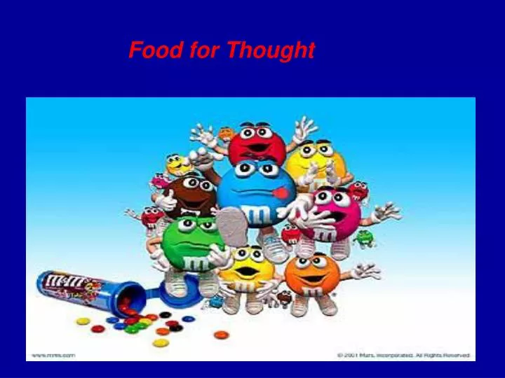
Food for Thought. Did you ever wonder…. How many M&M’s are in each bag? How many different color chocolates there are? Is there an equal amount of each color?. Go to Start, programs, and click Microsoft EXCEL.

E N D
Did you ever wonder…. • How many M&M’s are in each bag? • How many different color chocolates there are? • Is there an equal amount of each color?
Go to Start, programs, and click Microsoft EXCEL • In cell A1, type the word color. Press Tab. In cell B1, type the word M&M’s. In cell C1, type the word Prediction. • In cell A2, type the word blue. Press Enter. • In cell A3, type the word red. Press Enter. • In cell A4, type the word yellow. Press Enter. • In cell A5, type the word orange. Press Enter. • In cell A6, type the word green. Press Enter. • In cell A7, type the word brown. Press Enter • In cell A8, type the word Total. Press Enter.
Predictions • Predict the number of the different colors of M & M’s in your bag and the total number. • Record these numbers on your EXCEL chart. Starting with cell C2 record how many blue M&M’s you think are in the bag. • Then go down to C3 to record how many red M&M’s and so on.
Open your bag of M&M’sDO NOT EAT THEM!!! • Open the M & M’s, and sort them by color. • Count the blue ones and type the number in cell B2. • Count the red ones and type the number in cell B3. • Count the rest and record your results in column B. • Highlight cells B2 to B7. Go to the toolbar and click the AutoSum button. The total number of M & M’s should appear in the column.
You’re chart should look something like this… • Now highlight cells in your chart A1 to C8. Right click on top of the chart. • Click Format Cells from the pop-up menu. • Click the Font tab and change to Arial 14. • Click the border tab and apply a border.
There are many different was to represent data collected using Microsoft Excel. We can use bar, line, or even pie charts. • Charts represent data in a visual way. While there are no sure-fire rules that state which chart type to select for a particular data set, it is important to select a chart type which gets a message across in the most effective way. • In other words, when using mathematics, you've got to make choices about what operations will give the best results. Results should be judged by whether they make sense and are useful.
Bar charts • bar charts, which are useful for comparing several values for a single category or at one point in time, a company might compare monthly sales at several of its stores to determine which one it should close
Line charts • line charts, which are helpful for representing changing values over time or a progression of change like, daily temperature readings (from September through December)
Pie charts • pie charts, helpful for showing the relationship of parts to whole (e.g., how many girls wear the color blue compared to other colors).
Highlight the cells from A1-C8 Go to Insert, then chart Step 1-click next Step 2-click next Step 3-click on the Titles tab Under chart title type in Predictions Category (x) axis: type Color Value (y) axis: type Numbers Go to the data labels tab and click on show value Then click next Step 4-make sure it is set on as objects in- and click Finish Now we are going to make our own bar graph using our data
Highlight from A1-B7 Don’t highlight the total number or predictions. Go to the toolbar and click the chart wizard button. Step 1 shows all the different graphs. Choose Pie graph. Click Next to go to Step 2. We will stick to these default settings. Click Next to go to Step 3. Under the title tab type in a title such as Food for Thought. Under the data labels tab click on Show labels and percentages Click Next to go to step four. Select the default, As Object in Sheet. Click finish. Move the handle bars on the graph to expand to the desired size. Percentage of different color M&M’s in a bag
**Conclusion** • Are some colors more numerous? • Do all bags have the same number of candies? • Identify the most popular M&M color • Compare your observations with the findings of other students in other groups