Download
1 / 2
20 likes | 22 Views
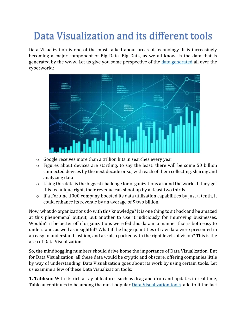
Data Visualization is one of the most talked about areas of technology. It is increasingly<br>becoming a major component of Big Data. Big Data, as we all know, is the data that is<br>generated by the www. Let us give you some perspective of the data generated all over the<br>cyberworld:<br><br>o Google receives more than a trillion hits in searches every year<br>o Figures about devices are startling, to say the least: there will be some 50 billion<br>connected devices by the next decade or so, with each of them collecting, sharing and<br>analyzing data<br>o Using this data is the biggest challenge for organizations around the world. If they get<br>this technique right, their revenue can shoot up by at least two thirds<br>o If a Fortune 1000 company boosted its data utilization capabilities by just a tenth, it<br>could enhance its revenue by an average of $ two billion.

E N D
Data Visualization and its different tools Data Visualization is one of the most talked about areas of technology. It is increasingly becoming a major component of Big Data. Big Data, as we all know, is the data that is generated by the www. Let us give you some perspective of the data generated all over the cyberworld: oGoogle receives more than a trillion hits in searches every year oFigures about devices are startling, to say the least: there will be some 50 billion connected devices by the next decade or so, with each of them collecting, sharing and analyzing data oUsing this data is the biggest challenge for organizations around the world. If they get this technique right, their revenue can shoot up by at least two thirds oIf a Fortune 1000 company boosted its data utilization capabilities by just a tenth, it could enhance its revenue by an average of $ two billion. Now, what do organizations do with this knowledge? It is one thing to sit back and be amazed at this phenomenal output, but another to use it judiciously for improving businesses. Wouldn’t it be better off if organizations were fed this data in a manner that is both easy to understand, as well as insightful? What if the huge quantities of raw data were presented in an easy to understand fashion, and are also packed with the right levels of vision? This is the area of Data Visualization. So, the mindboggling numbers should drive home the importance of Data Visualization. But for Data Visualization, all these data would be cryptic and obscure, offering companies little by way of understanding. Data Visualization goes about its work by using certain tools. Let us examine a few of these Data Visualization tools: 1. Tableau: With its rich array of features such as drag and drop and updates in real time, Tableau continues to be among the most popular Data Visualization tools. add to it the fact
that it is highly interactive, and you understand why so many businesses from around the world, right from startups to multinationals, use it so extensively to represent data. 2. Sisense: Sisense is known for its dashboards and other usability features which make reading data very easy and attractive. It has the robustness to perform data analysis on high amounts of data. Plus, it is known for its very reliable support. 3. Google Charts: Ideal for mobile devices and browsers, Google Charts has an array of charts with which the user can customize according to her needs. 4. Infogram: Infogram is intuitive, and it helps the user create engaging infographics and reports in virtually no time and helps create beautiful data. 5. Power BI:Microsoft’s Power BI is another highly popular Data Visualization tool that helps users explore and analyze data both in premises and on the cloud, all in one view. It enables users to collaborate and share dashboards and interactive reports with ease, and can be scaled very easily. Closing thoughts Now that we have given you some idea about the tools used for Data Visualization, we want to draw your attention to how you can start becoming a Data Visualization professional right away! Simpliv offers online courses in Data Visualization that you can take up and start taking the first steps to a lively and rewarding career in Data Visualization. These courses, being designed by industry experts, offer you tremendous insights into how to make Data Visualization work in a very efficient manner, so that you or your organization derives maximum value from your work! And, before signing off, do let us know if you liked this blog and what else you would have liked us to write in this!