Download

1 / 53
530 likes | 650 Views
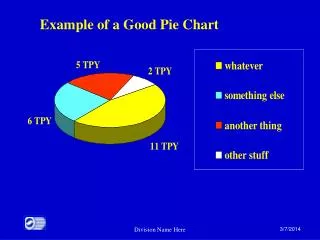
Project Pie Chart. Chapter 2: Organizing and Presenting Data. In this chapter, we will look at how to use tables and graphs to organize, to summarize and to display the important characteristics of a data set. DEFINITION: Raw Data

E N D
In this chapter, we will look at how to use tables and graphs to organize, to summarize and to display the important characteristics of a data set.
DEFINITION: Raw Data is data before it has been arranged in a useful manner or analyzed using statistical techniques. The type of raw data collected will determine the technique used to present the data.
CLASSIFICATIONS OF DATA The type of graph you use depends on the type of information about a person or thing you have collected. For example: • a person’s educational degree, • a student’s GPA, • an individual’s age • the circumference of a redwood tree, • the pollen count for a given day, or • a person’s sex illustrate types of information that can be obtained about a person or thing. These types of information are called variables.
DEFINITION: Variable is a type of information, usually a property or characteristic of a person or thing, that is measured or observed. A specific measurement or observation for a variable is called the valueof the variable. Suppose you are interested in the variables: height, sex and GPA for the students in your class. A female student is 63 inches tall and has a GPA of 3.23. The variable sex has the value: female, 63 inches represents the value for the variable height and 3.23 is the value for the variable GPA. A collection of several data pertaining to one or more variables is called a data set. DEFINITION: Data set is a collection of several data pertaining to one or more variables.
Categorical and Numerical Variables There are basically two types of variables: Categorical &Numerical. A categorical variable yields values that denote categories. In this graphic, the variable food is a categorical variable with five categories.
DEFINITION: Categorical variable represents categories, and is non-numerical in nature. These values are known as categorical data.
DEFINITION : Numerical variable is a variable where the value is a number that results from a measurement process. The specific values of numerical variables are called numerical data. A numerical variable yields numerical values that represent a measurement. Examples: GPA is a numerical variable because it represents a numerical measurement of a student’s academic performance. Study hours is a numerical variable since it numerically measures the number of hours per week a student studies.
In this graphic, the variable is sun block levels. Sun block level numerically measures the effectiveness of the medication to protect a person’s skin against exposure to UV rays.
Continuous and Discrete Data • Numerical data can be further classified as either continuous or discrete depending upon the numerical values it can assume. • Numerical data such as height, weight, temperature, and distance are examples of continuous data because they represent measurements that can take on any intermediate value between two numbers. The values of continuous data are usually expressed as a rounded-off number.
DEFINITION: Continuous data are numerical measurements that can assume any value between two numbers. • A person’s height is an example of continuous data since it is a measurement that can assume any value between two numbers. For example, a person’s true height could be any value between two numbers such as70.5 and 71.5 inches. Usually, we represent this person’s height as the rounded-off height of 71 inches.
DEFINITION:Discrete data are numerical values that can assume only a limited number of values. Numerical data such as the number of: • F/T students attending Yale Law School, • automobile accidents in Arizona per year, or • unemployed people in New York City are examples of discrete data because these data can only take on a limited number of values. Usually discrete data values represent count data and are expressed as whole numbers. However, the main characteristic of discrete data is the break between successive discrete values.
EXPLORING DATA USING THE STEM-AND-LEAF DISPLAY Before any conclusions can be drawn from data set, the data must be carefully explored to discover any useful aspects, information, or unanticipated patterns that may exist. This approach to the analysis of data is called Exploratory Data Analysis.
The idea of exploratory data analysis is to learn as much as possible about the data before conducting any statistical testing of hypotheses or relationships, or drawing any conclusions about the data. • The emphasis of exploratory data analysis is to use visual displays, such as tables or graphs, of the data to reveal vital information about the data. To help examine the shape or pattern of the data values, it is necessary to organize the data values to form a distribution.
stem-and-leaf display • One such visual technique used to explore data is the stem-and-leaf display developed by Professor John W. Tukey of Princeton University. • The stem-and-leaf display helps to provide information about the shape or pattern of the data values of the variable. To help examine the shape or pattern of the data values, it is necessary to organize the data values to form a distribution using a stem-and-leaf display.
DEFINITION: Stem-and-leaf display is a visual exploratory data analysis technique that shows the shape of a distribution. The display uses the actual values of the variable to present the shape of the distribution of data values.
Stat Student Heart Rates (bpm) 78(M) 80(F) 70(F) 70(M) 65 (F) 45(M) 59(M) 57(F) 70(M) 75(F) 63(F) 34(F) 63(M) 71(M) 65(F) 77(F) 59(M) 73(F) 60(M) 67(M) 61(M) 52(F) 68(F) 78(M) 91(M) 68(M) 86(F) 73(F) 66(F) 76(F) 73(M) 71(M)
Cholesterol Levels • To see how the stem-and-leaf display is constructed, let’s analyze the following data values representing the cholesterol levels of 50 middle-aged men on a regular diet. • Cholesterol Levels (expressed as milligrams of cholesterol per 100 milliliters of blood) • 263, 258, 240, 233, 225, 222, 199, 282, 239, 236, 232, 283, 200, 212, 225, 235, 240, 258, 263, 274, 250, 259, 241, 237, 226, 213, 269, 199, 253, 201, 265, 226, 238, 242, 259, 233, 238, 229, 215, 202, 319, 277, 229, 239, 243, 248, 245, 219, 276, 246
Frequency Distribution Tables • Another way to represent data is called a frequency distribution. • A frequency distribution lists the values of a variable(s) & how often each value occurs. • The frequency distribution of a variable can be displayed by a table or graph to help determine such things as: the highest and lowest values, apparent patterns of a variable, what values the data may tend to cluster or group around, or which values are the most common.
DEFINITION: Frequency Distribution Table is a table in which a data set has been divided into distinct groups, called classes, along with the number of data values that fall into each class, called the frequency.
DEFINITION: Distribution of a numerical variable represents the data values of the variable from the lowest to the highest value along with the number of times each data value occurs. The number of times each data value occurs is called its frequency. When examining the data, it is important to know what to look for in the data. The important aspects of the data are called the characteristics of a distribution.
Identifying Characteristics of a Distribution Center of the Distribution- determine the location of the middle of all the data values. Overall Shape of the Distribution - look for the number of peaks: Is there one peak or are there several peaks? How are the data values clustered? Are they symmetric about the center or skewed in one direction?
Spread of the Data Within the Distribution - Examine the distribution of data values to determine whether the data values are clustered or spread out about the center. Look for any gap(s) within the distribution or for any individual data value that falls well outside the overall range of the data values, that is, look for anyoutliers. DEFINITION: Outlier is an individual data value which lies far (above or below) from most or all of the other data values within a distribution. The outlier is due to an unusual occurrence which may help to provide valuable information about the data set.
Frequency Distribution Table for Numerical Data Procedure for Constructing a Frequency Distribution Table for Numerical Data Step 1: Decide on the number of classes. Step 2: Determine the class width. The approximate class width formula is: Approx. class width = (largest value – smallest value) number of classes Always round up the approximate class width result to the next significant digit used to measure the data. This rounded up number is used to represent the CLASS WIDTH of each class.
Step 3: Constructing the class limits for the first class : a) Select the smallest data value as the lower class limit (LCL) of the first class, and b) Obtain the upper class limit (UCL) of the first class using the formula: upper class limit = lower class limit plus the class width minus one unit The remaining class limits of the frequency distribution table can be constructed using the formulas: lower class limit = lower class limit of previous class plus class width upper class limit = upper class limit of previous class plus class width
Step 4: To determine the class marks for each class, use the formula: Class Mark =(Upper Class Limit + Lower Class Limit)/2 Step 5: For continuous data, determine the class boundaries by finding the midpoint between two successive class limits using the formula: Class Boundary = (Upper Class Limit of one class + Lower Class Limit of the next class) /2 Step 6: Determine the frequency for each class by finding the number of data values that fall within each class.
DEFINTION: RELATIVE FREQUENCY of the class is the proportion of data values within the class. The formula is: Relative Freq = (class frequency of a class) total number of data values DEFINITION: RELATIVE PERCENTAGE FREQUENCY of a class is the percent of data values within a class. The formula is: Rel. Percentage Freq = ( class frequency ) (100%) total # of data values
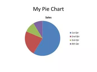
Section 2.5 GRAPHS • A graph is a descriptive tool used to visualize the characteristics and the relationships of the data quickly and attractively. A well-constructed graph will reveal information that may not be apparent from a quick examination of a frequency distribution table. • There are many different types of graphs, one is a Bar Graph.
DEFINITION:Bar graph is generally used to depict discrete or categorical data. A bar graph is displayed using two axes. One axis represents the discrete or categorical variable while the other axis usually represents the frequency, or percentage, for each category of the variable.
Horizontal Bar Graph Type of pitch thrown in a baseball game
Histogram DEFINITION:Histogram is a vertical bar graph that represents a continuous variable. To depict the continuous nature of the data, the rectangles are connected to each other without any gaps or breaks between two adjacent rectangles. The width of each rectangle corresponds to the width of each class of the frequency distribution and the height of each rectangle corresponds to the frequency, or relative frequency, of the class. The vertical sides of each rectangle of a histogram correspond to the class boundaries of each class. Thus, there are no breaks or gaps between the rectangles.
Frequency Polygon A frequency polygon is similar to a histogram. It depicts a frequency distribution by using line segments to connect the midpoints of the bars in a histogram. Frequency polygons are very useful when comparing two or more distributions on the same set of axes.
DEFINITION: Frequency polygon is a line graph that uses the class marks of a frequency distribution to represent continuous data. • Construct a frequency polygon by placing a dot corresponding to the frequency or percentage of each class above each class mark or midpoint. Use straight line segments to connect these dots.
Page 80 #115. Given the following distribution of statistics test grades: 73, 92, 57, 89, 70, 95, 75, 80, 47, 88, 47, 48, 64, 86, 79, 72, 71, 77, 93, 55, 75, 50, 53, 75, 85, 50, 82, 45, 40, 82, 60, 55, 60, 89, 79, 65, 54, 93, 60, 83, 59 • a) Construct a stem-and-leaf display. • b) Describe the shape of the distribution. • c) Construct a frequency distribution table and a histogram using six classes. • Using the histogram, answer the following questions: • d) How many test grades are greater than 89? • e) What percent of the test grades are greater than 79? • f) What percent of the test grades are lower than 70? • g) What percent of the test grades are between 70 and 79 (inclusive)?