Download
1 / 18
180 likes | 298 Views
PROGRESSION FROM PRELIMINARY TASK AND FINISHED VERSIONS. Sheldon School AS Media. DIFFERENCE BETWEEN PRELIMINARY FRONT COVER AND FINISHED FRONT COVER. Lots have improved whilst getting to my final music magazine front cover from my preliminary school magazine front cover.

E N D
PROGRESSION FROM PRELIMINARY TASK AND FINISHED VERSIONS Sheldon School AS Media
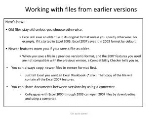
DIFFERENCE BETWEEN PRELIMINARY FRONT COVER AND FINISHED FRONT COVER • Lots have improved whilst getting to my final music magazine front cover from my preliminary school magazine front cover. • For example; I have adapted the style and colour of the title, the way that the cover lines are set out across the page, and also the commercial elements.
TITLE CHANGES • To start with, I realised that the font and colour of the title of ‘Sheldon Sixes’ was not a great one to use on the final music magazine; this is because it red is not a good colour for a folk magazine. From looking at magazines like ‘Classical Music’ and ‘NME’ their titles have a much larger font. So therefore, I have made my title larger than that of the ‘Sheldon Sixes’.
TITLE CHANGES CONT. • The red of ‘Sheldon Sixes’ somewhat gets lost within the smudged background of the cover and so for that reason I learned not to smudge the background of the final music magazine front cover. Instead, I kept the background a clear white of the sky and added a green title which matches the natural side of acoustic music that is inside the music magazine. I used the idea of a clear background from ‘Classical Music Magazine’.
COVER LINE CHANGES • The cover lines used on the two magazines are different. On ‘Sheldon Sixes’ some of the cover lines have been placed in circles which help them stand off the page, because the ones that are not in circles on this page, are quite difficult to read, however, this does make the page look somewhat unprofessional. So, I learnt to not put the cover lines in boxes/circles and instead just running down the side of the page. I chose black and white fonts for this cover lines because you can easily read them against green of the field in the background of the picture.
COVER LINE CHANGES CONT. • I chose black and white fonts for the cover lines on my final music magazine front cover because you can easily read them against green of the field in the background of the picture. The white font also works on the school magazine, because of the smudged background.
COMMERCIAL ELEMENTS CHANGES • Next, the commercial elements on the two front covers of the two magazines. On ‘Sheldon Sixes’ the barcode is rather large and quite intrusive on the page, which is not how many of the major magazine producers have the barcode for example NME have a small barcode in the corner of their front covers. So, from the preliminary task I learned that the large barcode doesn’t look good on the page, and intrudes on the potential space for other elements. I therefore, made the barcode smaller on ‘Three Days Before’ and tucked it in the bottom corner near the spine of the music magazine.
COMMERCIAL ELEMENTS CONT. • I also added an issue date and price to the cover of ‘Three Days Before’ to make it suitable for sale in a shop. Both barcode and issue date are situated in the same area on the page, bottom left. A banner was also added to give away the genre of the magazine easily, to someone that is not so aware of this new magazine.
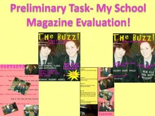
WHAT THE CHANGES LOOK LIKE • Here is what the two magazine front covers look like, after all that has been taken into account from what was good and what was bad from the preliminary front cover, these changes mainly come from my development in Photoshop skills.
CONTENTS PAGE CHANGES • Lots have improved whilst getting to my final music magazine contents page from my preliminary school magazine contents page. • For example; I have adapted the style and colour of the title, the way that the articles and page numbers are set out across the page, and also the commercial elements; by this I mean the advertisement box at the bottom of my music magazine contents page.
TITLE CHANGES • I have adapted the title used on my contents page, from the stencil look of my school magazine to a more professional looking white title with a highlighted black border. I learned that the title needs to stand out from the page and by highlighting the title it does achieve this in the end.
TITLE CHANGES CONT. • I also learned that by having the title stretching across the whole length of the page, it restricts space available for writing stories and page numbers of space for imaging. By having the title on one side of the page, it follows the way that major magazines have their contents title.
IMAGE USE CHANGES • From the preliminary contents page, there was not so much a main image, but one in its own box on the right of the page, representing a story. I learned that this does not give a flow to the page, and so for the music magazine I used an image to fill the whole of the page.
IMAGE USE CHANGES CONT. • I also found out, not to use the same image from the front cover as in the contents page, as I did on ‘Sheldon Sixes’; my preliminary task magazine. Also not to use the same model because existing magazines do not do this with their magazines.
LAYOUT OF STORY CHANGES • I adapted the way that my stories are laid out within the magazine on the contents page. On my school magazine I could get away without using a opaque box behind the stories as they are readable against a white background but this was not possible on my music magazine. So, I added a black box behind my stories to make them stand out more easily.
LAYOUT OF STORY CHANGES CONT. • I also added some small images next to two of the most important articles in my music magazine to make them stand out against the other articles. • The page numbers, I learned do not need ‘page’ in front of all of them, because without them the page looks more concise and easier to look at/read.
ADVERTISEMENT OF FUTURE ISSUES • I added an advertisement box to the bottom of my music magazine contents page. This was not anywhere on my school magazine contents page. This is useful on the contents as it advertises future issues of the magazine and therefore may increase sales. Though, I did not realise the necessity of this on my school magazine.
WHAT THE CHANGES LOOK LIKE • Here is what the two magazine contents pages look like, after all that has been taken into account from what was good and what was bad from the preliminary contents page. My InDesign skills have improved a great deal and therefore my final contents page looks much more professional than that of my original preliminary task trial. My photography skills also improved to give a nicer main image.