Download
1 / 12
140 likes | 273 Views
Preliminary Task- My School Magazine Evaluation!. Front Cover Page. MASTHEAD. SKYLINE. ASPIRATIONAL COVERLINE. COVERLINES. PUFF. Contents Page. MASTHEAD FOR CONTENTS PAGE. IMAGES RELATED TO TOPIC. INFORMATION ABOUT WHAT YOU WILL READ IN “THE BUZZ ”.

E N D
Preliminary Task- My School Magazine Evaluation!
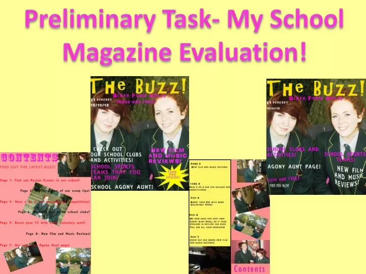
Front Cover Page MASTHEAD SKYLINE ASPIRATIONAL COVERLINE COVERLINES PUFF
Contents Page MASTHEAD FOR CONTENTS PAGE IMAGES RELATED TO TOPIC INFORMATION ABOUT WHAT YOU WILL READ IN “THE BUZZ”
1) In what ways does your media product use, develop or challenge forms and conventions of real media products? • I feel that my school magazine follows the usual layout of any school magazine. • I have placed my masthead across the top with my skyline directly below. My Cover lines are situated on the right third and left third of the magazine with my puff in the bottom corner of the right third. • My cover lines are spaced out due to the fact that I would like the masthead and the main image to stand out and be the centre of attention. • Nearly my whole magazine layout is the traditional layout of any school magazine front cover, however I have put my own twist on where I have placed my Puff. Traditionally the Puff would be placed at the top of a magazine but to be different I have placed mine at the bottom. • By using a similar fonts for my masthead, skyline and puff and I have created a house style; therefore my magazine front cover will look more professional. • I spent most of my time editing my main image. I used a blurr effect and changed the lightening of the image to a soft light. I have also enhanced the colour of the image so that it will stand out more.
2) How does your media product represent particular social groups? • I wanted to direct my magazine toward sixth formers only as I want to base it from the age group of 16-19. I hope to grasp their attention through my choice of colour, font and images. • I have chosen Pink, White and Yellow as my colour scheme as I feel that these are vibrant colours and will appeal to my chosen social group. The fonts that I have also used are modern and quirky instead of boring and plain in order to grab the attention of the sixth formers. • The images that I have used a bright and relevant to the title of the magazine. My main image is of two sixth former prefects therefore it is showing what audience I have directed my magazine towards. Also, inside I have included a photo of my models interacting and speaking which interlinks with my magazine title “The Buzz”
3)What kind of media institution might distribute your media product and why? • Due to the fact that I am creating a school magazine I feel that the School might be the media institution that would distribute my magazine. However, our local newspaper The Ulster Gazette would also be very open to any suggestions for advertising and is always involved in what events are going on in our school and our results and top achievers. • Everything that I have included in my magazine relates to sixth formers and they can get more involved with the school by doing the quizzes and competitions that I have included in my magazine. • The Teachers can get a better insight into the minds and interests of the sixth formers in our school. The Public may also benefit from this if they are made aware of our school magazine. • The teachers can also benefit from our exam and study tips as well as the students.
4) Who would be the audience for your media product? • My specific audience for my media product would be 16-19 year olds. • I have carried out my questionnaire and all of my results such as colours, images, ideas for competitions all focus around this age group. • Although, I would like some of the teachers to read my school magazine as well so they are also aware of what is happening in the school. • There is information and gossip for all ages in The Buzz!
5) How did you attract/address your audience? • I used various sources of research to attract an audience for my magazine. • I created a target audience questionnaire in order to find out what age group I would be writing for. This questionnaire was very helpful, in order for me to choose my target audience I printed 20 questionnaires and distributed them among students in the school . • I got great feedback on what colours, texts, images and contents that I should use for my media product. Afterwards, I analysed all of my questionnaires by creating pie charts and graphs to get a clearer idea of what my target audience are looking to see in their school magazine.
6) What have you learnt about technologies from the process of constructing this product? • I have used many new technologies during the process of creating my media product. • I have learned about different camera shots and how they make an impact on a magazine for example- I used a mid shot for my images. • A new site that we have just started to use for our media blogs is Wordpress. It allows us to create pages for our tasks so we can upload our work onto the page at anytime. We are also able to personalize our blog and upload our own images. • A programme that was new to me was Photoshop. This programme took up most of my time as I had to take time to understand how to insert and edit images. Also I had to know how to include effects, shapes, text and create different page sizes. I found Photoshop difficult to work at the start but now that I understand how to use it I will be able to • use it more effectively for my main task!
Front Cover Comparison I like how this magazine has Incorporated the image into the front cover. I think that My Masthead stands out better. I think that the colour scheme is quite dull compared to mine. I included a Puff to make the magazine more professional. Using more shapes create a nice effect on this front cover.
Contents Page Comparison I like the font better in my masthead because it is different and more suited towards my target audience. The Layout of the information is very good and clear to read. The colour scheme in this contents page is vibrant and appealing. I feel that mine has more school related images such as images of the students and locations in the school.