Download
1 / 19
190 likes | 290 Views
Principles of Design. By: Anna Davenport Head Instructor: Dr. Wilson EDUC 6307. Alignment. Contrast. Repetition. Proximity. Credits. Alignment:.

E N D
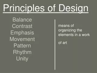
Principles of Design By: Anna Davenport Head Instructor: Dr. Wilson EDUC 6307
Alignment Contrast Repetition Proximity Credits
Alignment: The design principle of alignment is when Items are arranged in order relative to each other. Alignment provides cohesion to the product so that it is not seen as many different parts but in its entirety. This is an example of alignment because the people are arranged in descending order of height. The height of the tallest person is the same height as the tree line on the opposite side. Click the squares to see additional examples. Example 1 Example 2 Example 3 • Menu
Alignment Example 1 This is an example of alignment because the category titles on the left are all centered. Also, the levels within each horizontal category are arranged in columns so that the range for each grade can still be understood.Alignment allows a lot of detailed information to be clearly communicated. Click the squares to see additional examples. • Example 3 • Menu • Example 2
Alignment • Example 2 This is an example of alignment because the people are arranged in three rows. They are also aligned vertically in female, adult, and male categories. Menu Example 1 Example 3
Alignment • Example 3 This is an example of alignment because the text is arranged in groups that are aligned on the left margin of each section. It is alignment that helps the reader differentiate between the black titles in the middle section and the blue links. Example 1 Example 2 • Menu
Contrast: The design principle of contrast is a result of differences in images, fonts, size or colors. Contrast helps provide emphasis and causes objects stand out. This is an example of contrast because the white color of the iPod causes it to stand out against the black silhouette and the pink background. The white color of the text is in contrast to the pink background. The size difference between the iPod text and the advertising at the bottom is also a contrast and helps bring emphasis to the product name. Click the squares to see additional examples. Example 1 Example 2 Example 3 Menu
Contrast: • Example 1 This is an example of contrast because the brown shades of the background contrast with the blue and red of the girls clothes. Also, the straight lines and right angels in the building and street are in contrast with the soft curves and flowing lines of the girl and her accessories. Click the squares to see additional examples. Example 2 Example 3 Menu
Contrast: • Example 2 This is an example of contrast because the white section above and below draw the eye to the green grass in the middle. The red of the flower is in contrast with the surrounding green blades of grass. Click the squares to see additional examples. Example 1 Example 3 Menu
Contrast: • Example 3 This is an example of contrast because the color scheme surrounding the poster is grayscale while the poster on the wall is printed in full color. The orange text of the title is in contrast with the blue background of the sky. Also, it is raining in the poster but clear for the people viewing it. Click the squares to see additional examples. Example 1 Example 2 Menu
Repetition: The design principle of repetition is when elements are recurring throughout the piece. Repetition helps build unity and maintain attention of the viewer. This is an example of repetition because the white cross is recurring frequently in the add. The white of the text in the “non smoking area” is the same as the white of the crosses and creates unity between both. The consistent green of the grass in the picture is also an example of repetition. Click the squares to see additional examples. Example 1 Example 2 Example 3 • Menu
Repetition • Example 1 This is an example of repetition because the gold of the Sun is continued and used as the color of the Earth and Moon models. The spherical shape of the Sun, Earth and Moon is also repeated in the photograph. Click the squares to see additional examples. Example 2 Example 3 Menu
Repetition • Example 2 This is an example of repetition because of the alternating red, blue and white rays coming from the bust. There are white stars repeated in each red and blue ray. Click the squares to see additional examples. Example 1 Example 3 Menu
Repetition • Example 3 This is an example of repetition because the shape and format of each category title is the same. Also, each image is in a clip-art style and in full color. There is also repetition in the placement of each image title. Click the squares to see additional examples. Example 1 Example 2 Menu
Proximity: The design principle of proximity communicates relationship of items to the viewer. By placing objects near each other, the creator is indicating there is some connection or relationship between them. This is an example of proximity because it is the placement of yellow circles close to each other that gives the outline of a Dalmatian. The image of a Dalmatian is the result of the mind connecting the spots and circles into a unified whole, even though there is no consistent outline to the figure. Click the squares to see additional examples. Example 1 Example 2 Example 3 • Menu
Proximity • Example 1 This is an example of proximity in several places. The address lines are all together in the upper right. The types of products are all in a yellow box at the lower right and their images are in a row to the left. The 30 years of innovation logo is next to the company logo. This placement shows a connection between the two graphics. Proximity enables the viewer to easy locate details within larger categories on the website. Click the squares to see additional examples. Example 2 Example 3 Menu
Proximity • Example 2 This is an example of proximity because the postage stamps appearing as hair occurs because of their location relative to each other and the facial features of the girl. The proximity of the stamps creates an outline for the figure so that she is created out of negative space. Click the squares to see additional examples. Example 1 Example 3 Menu
Proximity • Example 3 The proximity of “One outfit Two ways” to the title communicates that it is a subtitle. The placement of accessories close to each set of clothing communicates there are two outfit groupings. The proximity of the two outfits communicates they are related but different from each other. Click the squares to see additional examples. Example 1 Example 2 Menu
Credits: • Accessories - http://www.polyvore.com/cgi/img-set/BQcDAAAAAwoDanBnAAAABC5vdXQKFlI0S1VjTnN0UlJlWjBDLXZndXJnZVEAAAACaWQKAXgAAAAEc2l6ZQ.jpg • Brady Bunch - http://alicia-prague-blog.com/category/brady-bunch/ • Solar Eclipse - http://reikitrainingprogram.files.wordpress.com/2012/05/annular-eclipse-sun-moon-this-saturday-may-2012_53394_600x450.jpg • Dalmatian - http://1.bp.blogspot.com/-q9jS3NYVz5c/TVravpkk_sI/AAAAAAAAAC0/AS_DI4rlJd4/s1600/gestalt_proximity__dalmation_by_gderanidaye.png • DRA Reading Levels Chart - http://dobsonslittlegraders.blogspot.com/p/dra-reading-levels.html • Flower - http://www.brighthub.com/multimedia/photography/articles/954.aspx • George Washington - http://neshnyc.com/happy-birthday-george-washington/ • Girl with iPod - http://f10323jdelapena.blogspot.com/2010/11/week-11-contrast.html • Girl with postage stamp hair - http://www.trendhunter.com/trends/creative-ram-fm-ads • Graveyard with crosses - http://conceptsmedia.blogspot.com/2010_09_01_archive.html • Horizon Systems Website - http://horizonsystemsinc1.tru-m.com/index.php/products • Sun, Earth, Moon Model - http://www.google.com/imgres?imgurl=http://www.pendulum.es/estudiolo/imgnegr/E26.jpg&imgrefurl=http://www.pendulum.es/english/estudiolo/astrofisica_geofisica.html&h=349&w=500&sz=21&tbnid=ExAtpd5VnDZ91M:&tbnh=90&tbnw=129&zoom=1&usg=__PdS22GKzDLV_WLjCJbd2KTqvpOw=&docid=2CcdZwT1yBkIrM&sa=X&ei=5Ay_UbKuFoa60gG_94CgCw&ved=0CEUQ9QEwAw&dur=196 • TEA screenshot - http://www.tea.state.tx.us/index2.aspx?id=2147496890&menu_id=2147483718 • Types of Energy - http://physicsindaytodaylife.blogspot.com/2010/07/forms-of-energy.html • Pleasantville poster - http://en.wikipedia.org/wiki/Pleasantville_(film)