Download
1 / 10
100 likes | 240 Views
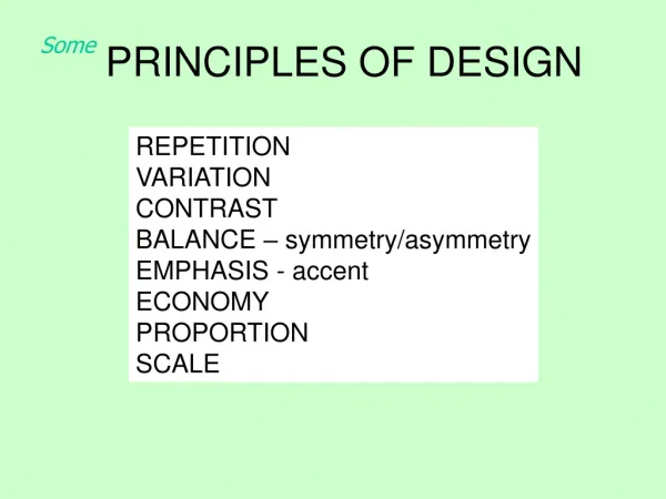
Principles of Design. By Derice Layher Adapted from Visual Arts 10, 20, 30 Curriculum.

E N D
Principles of Design By DericeLayher Adapted from Visual Arts 10, 20, 30 Curriculum
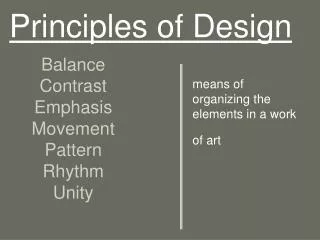
Balance-All images have visual weight and balance in the visual arts is very similar to balance in physics. It can be achieved by placing equal or similar objects (in color, shape or size) on either side of a central axis, or radiating from a central point. It can also be achieved by placing unlike objects, such as many light objects with a few dark objects. • wii.ign.com goyohidalgo.com 50502_60785794326_7706666_n.jpg facebook.com
Emphasis– Often called the “focal point”, this is where one part of the design has been created to be more important than the other parts. It is the part that the viewer sees first and can be created using contrast, isolation, location, convergence and the unusual. • aeyc-sea.org psfk.com aqnb.com
Variety-Variety can add interest by using elements such as colour, texture and subject matter. Your work does not have to have variety to be interesting. Some works are interesting in their simplicity. designinthevisualarts.blogspot.com fismitharts.com
Contrast- Contrast can be used to emphasize, provide variety and interest, or to create a certain feeling in the work. High contrast (black and white, large and small) can be used to emphasize differences, low contrast (two shades of grey, two heart shapes) to de-emphasize differences. • squidoo.com edkphoto.wordpress.com
Proportion/Scale–Proportion deals with the size relationship of one part to another. Correct proportions depict realistic works, while exaggeration and distortion can depict alternate reality, moods and experiences. Scale refers to the size relationship between an object and a standard reference, such as the human body. Scale of an object within a design can be correct or exaggerated. projectarticulate.org annaereed.wordpress.com naturalmath.com
Proximity- Proximity is closeness or distance of individual design elements. Close proximity indicates a connection while distance creates a feeling of separation. • artsmemphis.org wisethoughts.org asteriskpix.blogspot.com
Repetition (Rhythm, Pattern)- Visual rhythms are often created through repetition (shape, form or color). The way the images are arranged or presented can imply meaning or express ideas and feelings. • blogs.walkerart.org behance.net
Harmony - Harmony refers to ways similarities in a work are accented or repeated to create a uniform appearance. Harmony may be achieved through organization of space (equal space between objects) or similar images, colours, and shapes. • fineartamerica.com ems-brainstorm.blogspot.com
Unity - Unity is perhaps the most important of the principles and the most difficult to define. Unity is achieved when all the separate parts work together to make a complete whole. The elements, ideas, principles and media are combined in such a way that all are essential to the finished product. • vincent‑van‑gogh_starry‑nig.jpg final_fantasy_12_box_art.jpg