Download
1 / 9
90 likes | 209 Views
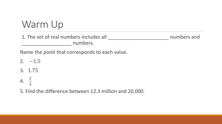
Warm Up. 1. The set of real numbers includes all ______________________ numbers and __________________ numbers. Name the point that corresponds to each value. 2. 3. 4. 5. Find the difference between 12.3 million and 20,000. Lesson 22, Analyzing and Comparing Statistical Graphs.

E N D
Warm Up • 1. The set of real numbers includes all ______________________ numbers and __________________ numbers. Name the point that corresponds to each value. 2. 3. 4. 5. Find the difference between 12.3 million and 20,000.
Lesson 22, Analyzing and Comparing Statistical Graphs Probability and STatistics
Vocabulary • Bar graphs: use vertical or horizontal bars to represent data • Double bar graph: shows groups of two bars side by side in order to compare sets of data • Stem and leaf plot: data display that displays some digits as stems and some as leaves; useful for organizing and ordering data • Line graph: a line drawn through points on a grid to show trends and changes over time • Double line graph: compares two related data sets using a line graph • Circle graph: (aka pie chart) uses sections of a circle to compare parts to a whole; each “slice” represents a specific percent/fraction of the whole
Example Sal and Harry both own sandwich shops. The double bar graph shows the number of shops they owned at the end of each year. What conclusions can be made from the graph?
Example Scores on Math Test 2 • The stem and leaf plot shows the scores of students on a math test. • What was the lowest score? • What was the highest score? • What score appeared most? • What is the median score? • How many students took the test? Stem Leaf 6 6 8 1 3 6 6 7 7 1 4 4 4 6 7 7 8 1 8 8 9 0 6 7 8 9 10
Example • The double line graph shows the same data as the double bar graph from the first example. • What conclusions can you make from the graph?
Example • The table shows Andre’s bank account transactions. Make a graph to compare the deposits and withdrawals.
Example • The circle graph shows Art Online’s total yearly sales by quarter. The total amount of sales for the year was $20 million. Find the sales each quarter.
Correcting Homework • Let’s correct • Be kind • Hold questions until the end • Write “C.B _____________” with your name