Download

1 / 12
120 likes | 288 Views
Warm Up. Complete on your own paper Where can you collect make up work when you are absent from class? What happens if you leave your desk a mess when you leave the classroom? What will we use to keep track of our work and warm ups each week? . WARM UP.

E N D
Warm Up Complete on your own paper • Where can you collect make up work when you are absent from class? • What happens if you leave your desk a mess when you leave the classroom? • What will we use to keep track of our work and warm ups each week?
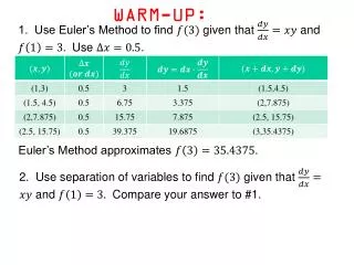
WARM UP On your tracker complete the following An experiment was designed to investigate the effect of caffeine on heartbeat in water fleas. Two populations had all conditions alike except the fleas in population one had caffeine administered five minutes before their heart beat was checked. Every two hours both populations were selected and heartbeats were monitored. • What is the independent variable in the experiment? • What is the dependent variable in the experiment? • Which group was the control?
Graphs are used to show numerical information in a useful format. There are three main types of graphs: circle graphs, line graphs and bar graphs.
Tables Tables are used to neatly organize data before placing in a graph. Create a table from the following information: A biology studying a plot of lab in a forest studied the 5 different type of trees in the plot. Oak- 539 Maple- 758 Beech- 319 Birch- 1,327 Hickory- 222
Circle Graphs/Pie Chart Shows different parts of the data in relation to all the data. Useful in depicting percentages.
Bar Graph A bar graph is used to show data that are not continuous. Often used for comparisons.
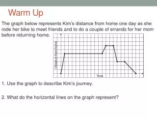
Line graphs Used to demonstrate continuous change.
When creating a bar or line graph: • The independent variable is put on the horizontal (x) axis • The dependent variable is put on the vertical (y) axis • Label your axis and give the graph a title • Use an appropriate scale on each axis. For example, 1 cm = 10 years so, 3 cm = 30 years
Let’s Practice • What kind of graph should we create from the following set of data:
Extrapolate The process of going beyond the data points. The further from the data points we extrapolate the less accurate our findings. • Predict what the population of the US will be in the year 2010. • Can you be as certain for this prediction as you were for a prediction for the year 2000? • Use the graph to determine the approximate population in 1935, 1945, 1985.