Download

1 / 33
330 likes | 460 Views
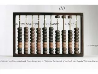
DATA MASTERY BOOST. DATA MASTERY BOOST. DATA MASTERY BOOST. Look at the numbers in the box on the right. Which number is equivalent to the values in the box?. UNIT “SURPRISE!”: DATA, STATISTICS, and PROBABILITY. How do we make sense of the world around us?.

E N D
DATA MASTERY BOOST Look at the numbers in the box on the right. Which number is equivalent to the values in the box?
UNIT “SURPRISE!”: DATA, STATISTICS, and PROBABILITY How do we make sense of the world around us?
I can decide the right times to use bar graphs, circle graphs, line graphs, and data tablesI can determine the right time to use bar, pie, line, and scatter graphs.
HOOK IN MINI LAB: DATA COLLECTION! • What is your birthday month? • What percentage of people in the classroom prefer chocolate ice cream? Strawberry? Vanilla? Cookies and Cream? Mint chocolate Chip?
Mini Lab Data (continued) 3. At 7 AM how awake do you feel on a scale of 1-5 (1=least, 5=most)?_______ List a time when you feel least awake ______ 4. At 10 AM how awake do you feel on a scale of 1-5 (1=least, 5=most)? List a time when you feel most awake ______ 5. At 1 PM how awake do you feel on a scale of 1-5 (1=least, 5=most)? 6. At 4 PM how awake do you feel on a scale of 1-5 (1=least, 5=most)?
BAR Chart/Graph • Has bars • Comparing frequencies or how much per category • Comparing parts : parts or whole : whole
BAR GRAPH AXES QUANTITY
PIE/CIRCLE Chart/Graph • Is a circle or cylinder with slices • Slices are proportional to percents. • Comparing parts : whole and parts : parts
LINE Plot/Graph • Has points connected by lines. • ALWAYS shows change over time • Y↕axisbehavior depends on x↔axis
SCATTER Plot/Graph • Has dots for data points • Helps explore other relationships between two sets of data.
When you have an answer with reasoning (use notes). CFUIdentify the bar, pie, line, and scatter plot.
FOR COMPARING BAR PIE Categories Percentages • Categories • Frequency
CHANGE & RELATIONSHIP SCATTER PLOT LINE GRAPH Change over time • Relationship between two sets of data
B,P, S, or L graph to represent a set of data? Is it comparing categories? Is there a relationship, or change over time?
CFU: Which pairs are true? • Comparison Bar graph • Percentages Pie Chart • Changes over time Line graph • Relationships between two data sets Line graph • Relationships scatter plot
HOOK IN MINI LAB: DATA COLLECTION! • What is your birthday month? • What percentage of people in the classroom prefer chocolate ice cream? Strawberry? Vanilla? Cookies and Cream? Mint chocolate Chip?
B,P, S, or L graph to represent a set of data? Is it comparing categories? Is there a relationship, or change over time?
IP • Are you comparing something? Or finding a relationship between two variables? • Are there frequencies or percentages? • What is the most appropriate graph to use?
IP • Are you comparing something? Or finding a relationship between two variables? • Are there frequencies or percentages? • What is the most appropriate graph to use?
EXIT TICKET: Sketch the graph you choose.