Download
1 / 5
50 likes | 152 Views
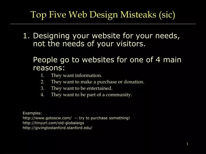
Top Five Web Design Misteaks (sic). Designing your website for your needs, not the needs of your visitors. People go to websites for one of 4 main reasons: They want information. They want to make a purchase or donation. They want to be entertained. They want to be part of a community.

E N D
Top Five Web Design Misteaks (sic) • Designing your website for your needs, not the needs of your visitors. People go to websites for one of 4 main reasons: • They want information. • They want to make a purchase or donation. • They want to be entertained. • They want to be part of a community. Examples: http://www.gotoscw.com/ -- try to purchasesomething! http://tinyurl.com/old-globalaigs http://givingtostanford.stanford.edu/
Top Five Web Design Misteaks (sic) • Designing your site in a way that people can’t figure out what they’re supposed to do. ‘good’ examples: http://www.learningguitarnow.com/ http://www.w3schools.com/ ‘bad’ examples: http://www.genicap.com http://web.archive.org/web/20070115231803/http://www.marshill.org/ http://www.snarg.net/
Top Five Web Design Misteaks (sic) • Using fonts or content that makes it difficult to read (low contrast, small size, dense text, using graphics as text). ‘good’ examples: http://metaverse.stanford.edu http://www.duckduckgo.com/ ‘bad’ examples: http://www.tjkdesign.com/ http://www.fiddlers.co.uk/ http://www.thomasedison.org/main.htm http://www.countryquilter.com/
Top Five Web Design Misteaks (sic) • The WTF? effect – making your website so completely different from the norm that it makes it difficult to understand what your site is all about (too much material, excessive use of animations, music, etc.) ‘good’ examples: http://www.dell.com/ http://www.stanford.edu/ ‘bad’ examples: http://www.dpgraph.com/ http://www.dokimos.org/ajff/ http://web.archive.org/web/20060312010453/www.ty.com/ http://www.havenworks.com/
Top Five Web Design Misteaks (sic) • Using “Mystery Meat Navigation” – using buttons, links, etc., that do no indicate what those buttons are all about. ‘good’ examples: http://www.amazon.com/ http://web.stanford.edu/ http://www.npr.org/ http://www.alistapart.com/articles/indefenseofeyecandy ‘bad’ examples: http://web.archive.org/web/19970113160303/http://www.stanford.edu/ http://www.daltonmailingservice.com http://www.webpagesthatsuck.com/web-design-question-which-looks-like-a-dentist-1.html